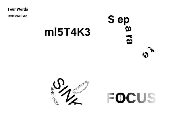
Ni_Wei_TT_Felix
Leave a reply
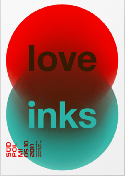

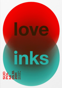
In this poster, Felix builds a strong hierarchy with scale and arrangement. ‘love’ and ‘inks’ are the largest and was placed in the center of this poster which drags viewers’ attentions. All the informational texts are legible in its size and style.
Colors also play a important role here. By using complementary primary colors like green and red, black and white. It creates a high contrast and a lot of visual vibration. Which is visually appealing to the viewers.
This design works best for me because the colors and picture catches my attention and the lettering is easy to read unlike with other posters that caught my attention, but was a bit difficult to read. However, in a way if someone was passing by those other posters and was not in a rush to go anywhere, then they could really stop and try to figure out the other posters. But this one was more easy and still caught my attention.
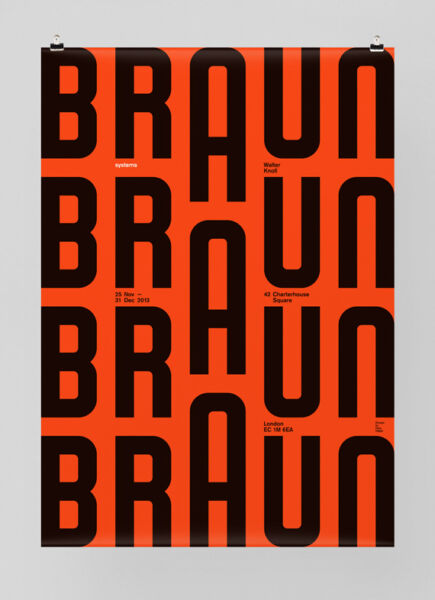
This work is the best to me because the A being a larger point size than the other letters and not being aligned to the baseline of the word braun creates movement in the poster to me.


The OpenLab is an open-source, digital platform designed to support teaching and learning at City Tech (New York City College of Technology), and to promote student and faculty engagement in the intellectual and social life of the college community.

