
In the post, document your thoughts about this project. Think about what you learned, what you could have done better (planning, material use, craft), and how you will apply what you learned to your next project.
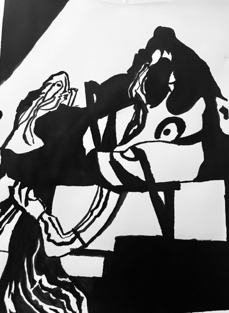
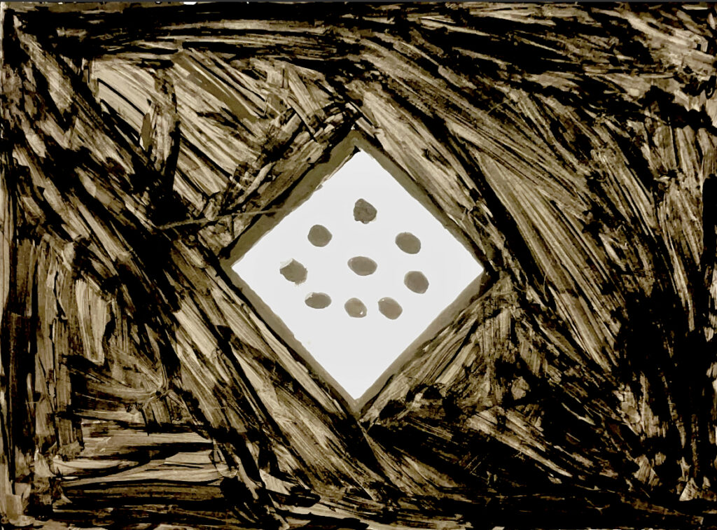
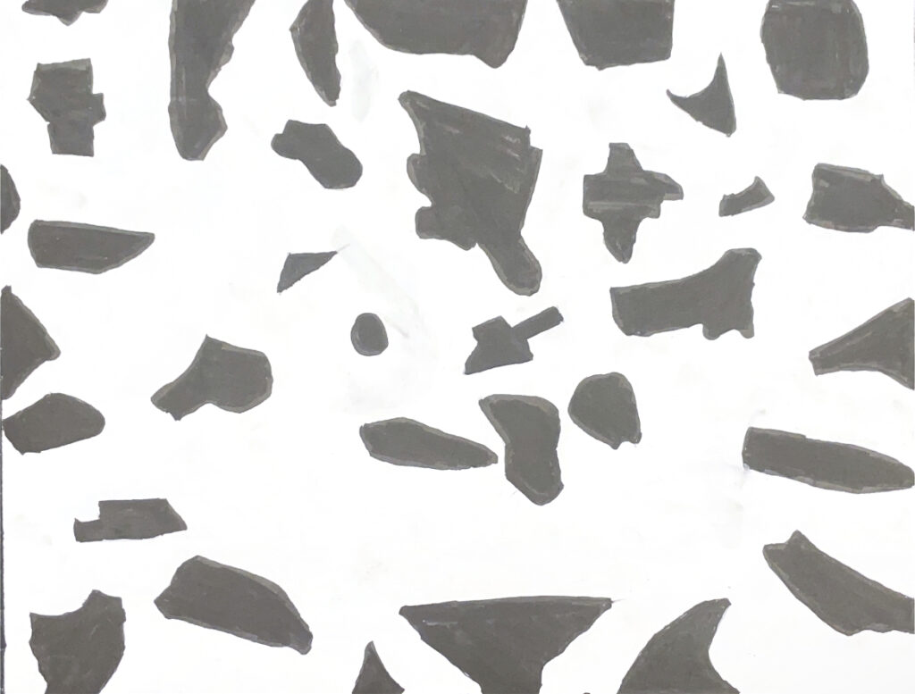
One thing I could’ve done better was the neatness as the black paint was a little bit out of place and I had to cover it with white paint. Aside from that, I learned about Ambiguous and Obvious figures, and now I know how to tell which is which, also now I can view images differently as most images tend to have ambiguous or obvious figures.
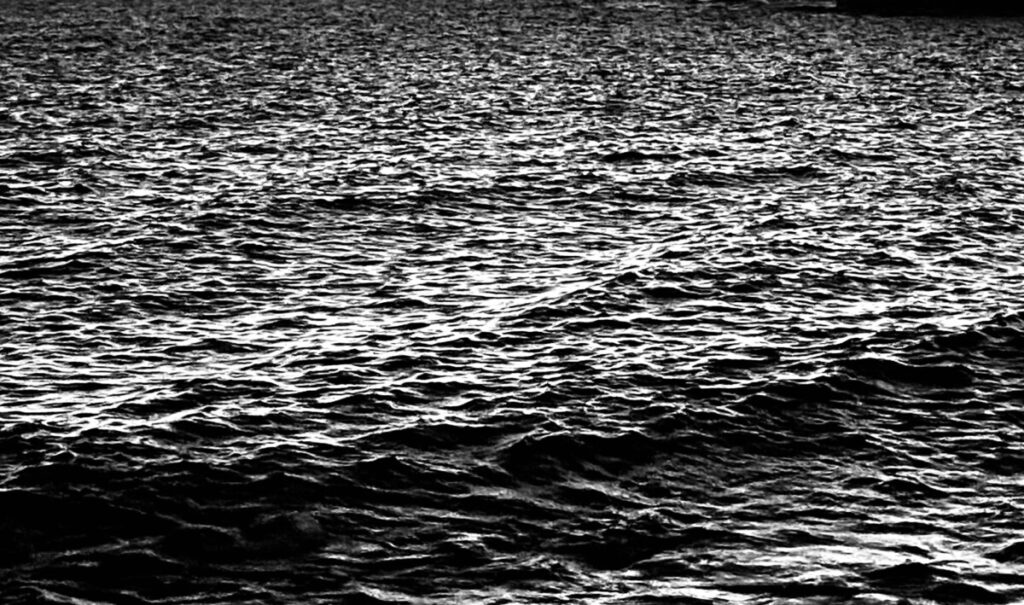
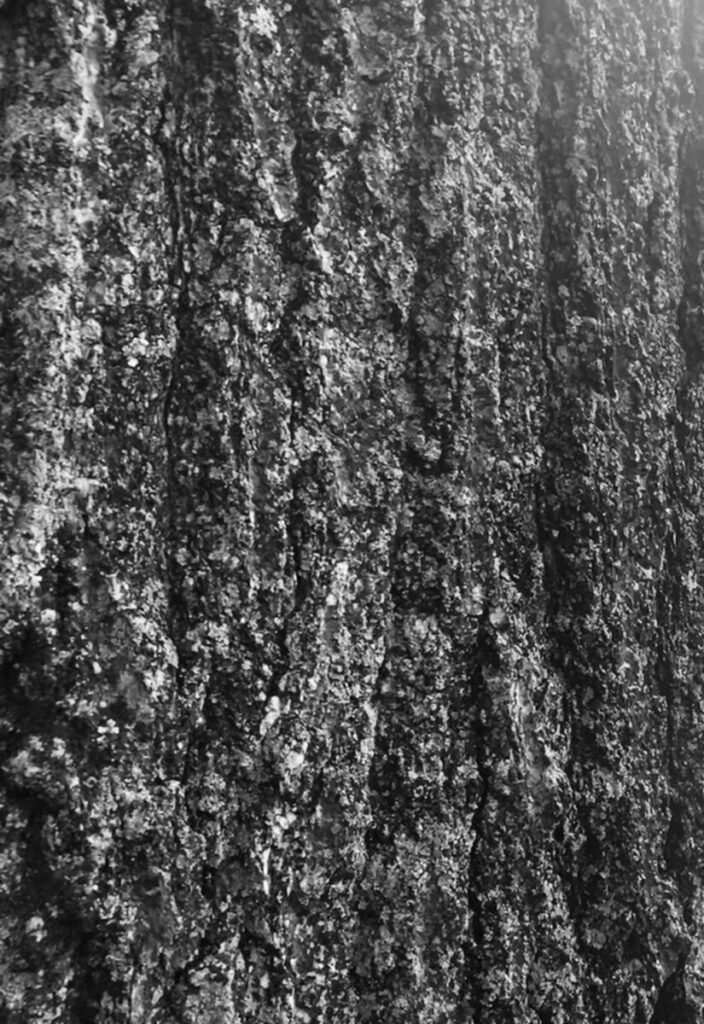
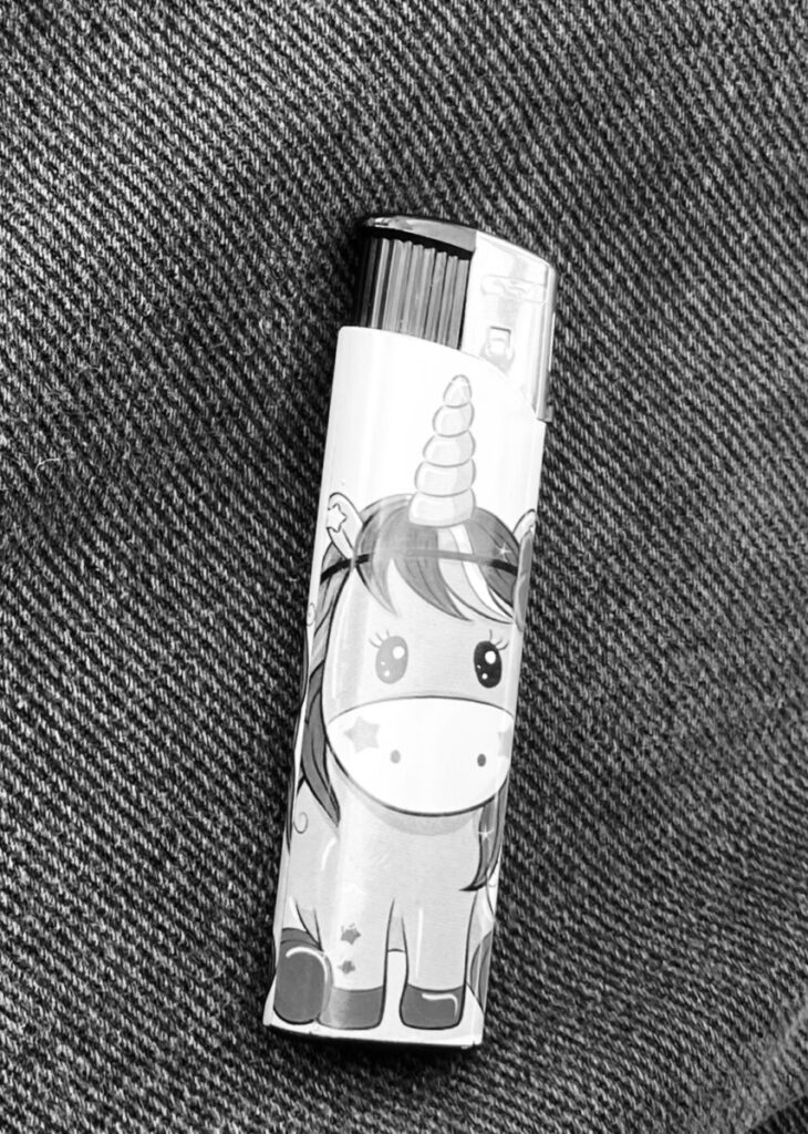
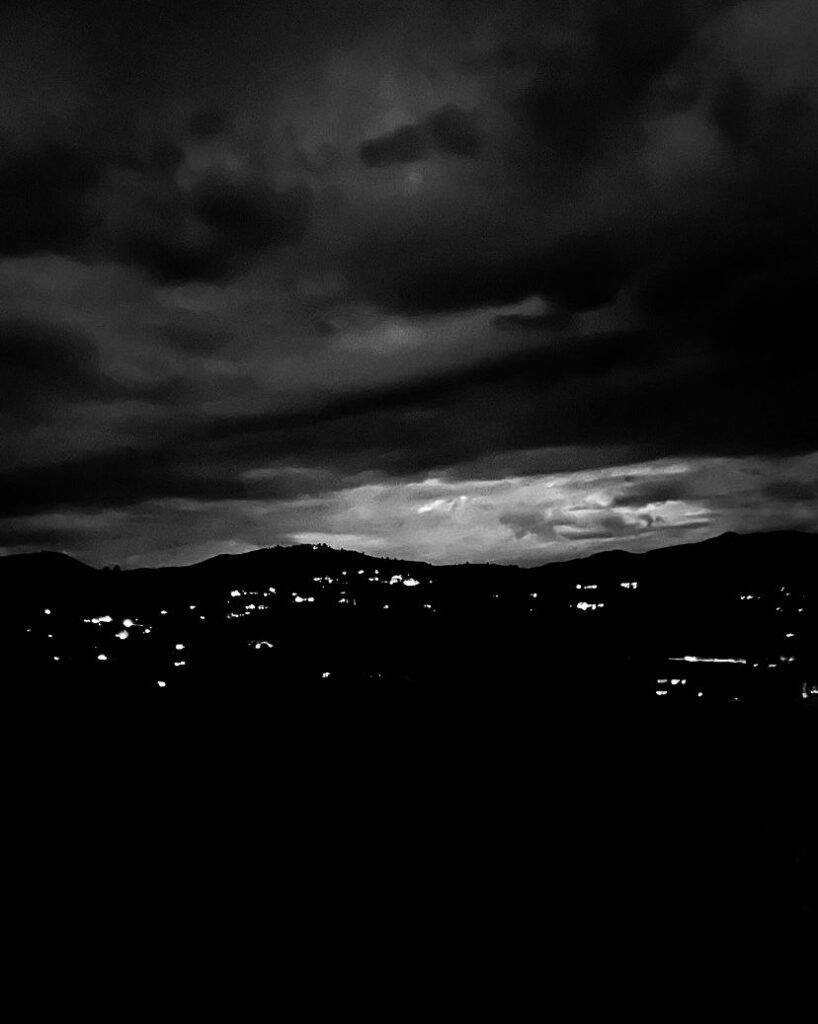

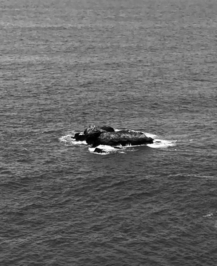
this photo is ambiguous. this is my wall and its hard to tell where it begins
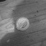
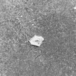
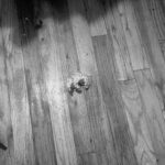
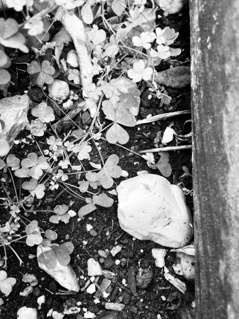

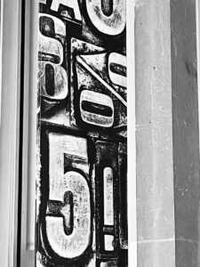
The image depicts a banner that was used to promote mathematics and or number’s/symbols. it was mounted on the wall to grab people’s attention, and make you want to choose said activity that is trying to be portrayed by the poster.
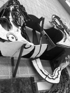
The sculpture was made as an abstract creation of an electrical circuit, you can see cables being adapted inside the circle and its very eye catching because of its unnatural looks. it was mounted onto a wall to decorate and make people understand off the bat what the building is primarily focusing on informing you on.
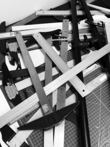
The rulers although its name may depict ruling, you really cant tell which one is ruling the other, this caught my eye as it shows the user ran out of time to organize, and although messy it made a great picture for this project.
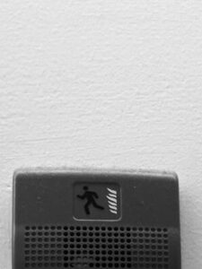
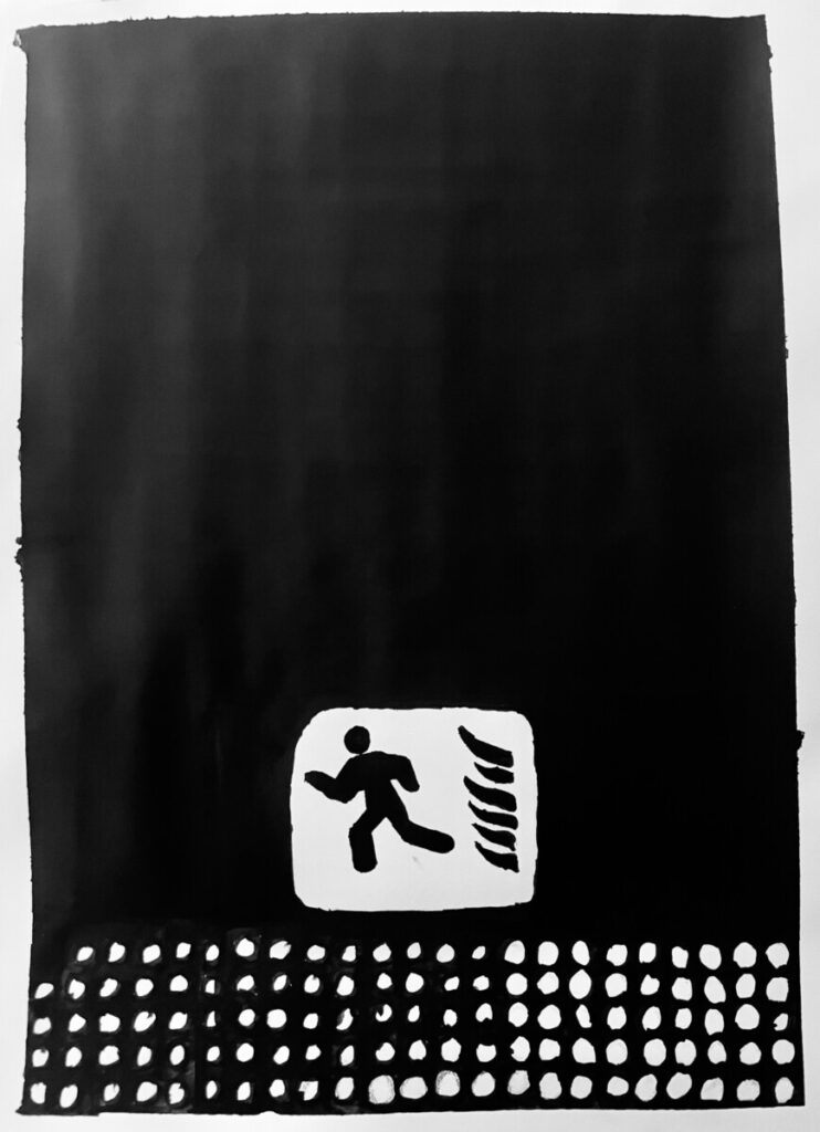
The idea that the fire alarm has its own image to describe what you should do in case the alarm was to sound, seems to be very funny as, if the alarm was to sound you wouldn’t look for instructions, and instead your instinct would tell you to run.
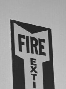
Fire extinguisher logo, when you zoom in it seems as though it was a Fire Exit, i liked said idea but it really brings out a contrast of the white background between red and white.
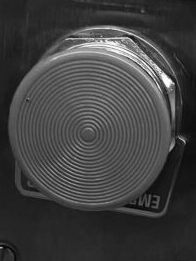
the button although it is black and white, you can tell the button is red and a super important, i liked the image because it was just catching my eye as buttons are always something that you want to press and although i wanted to press said button, i know i shouldn’t because of the contrast it has between other buttons you are allowed to press.