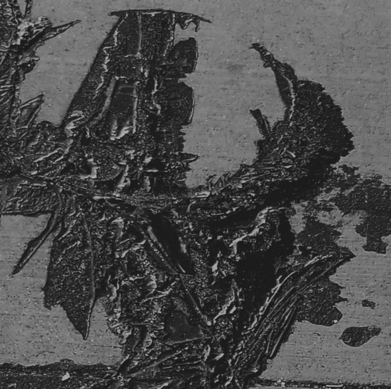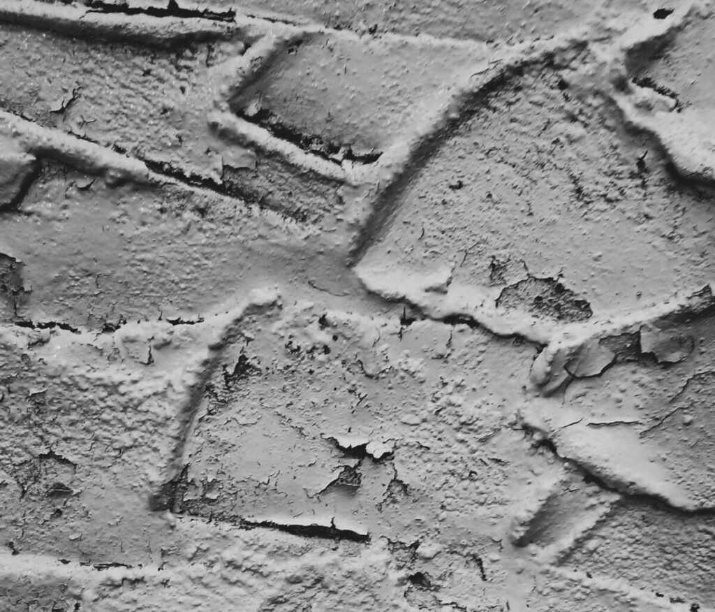
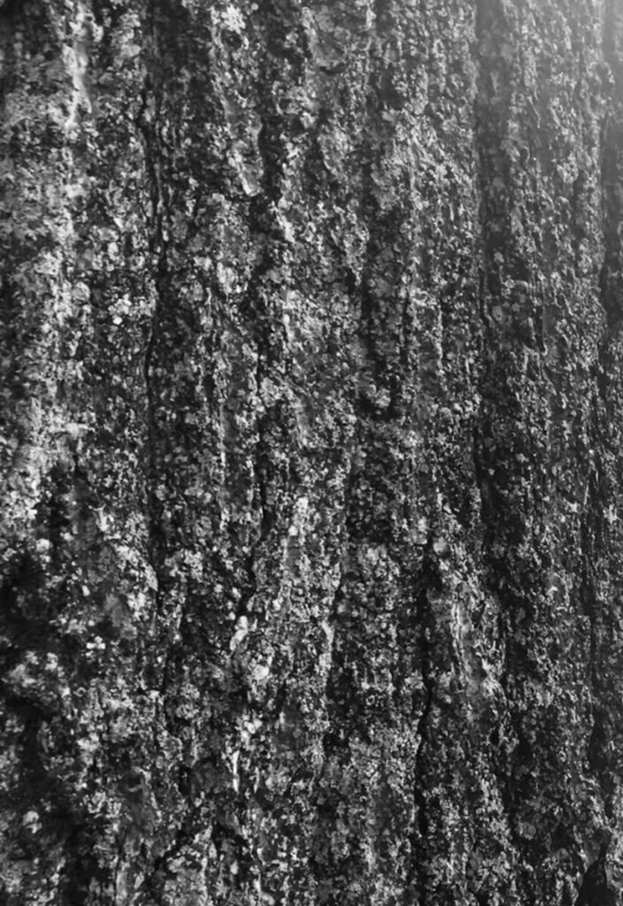
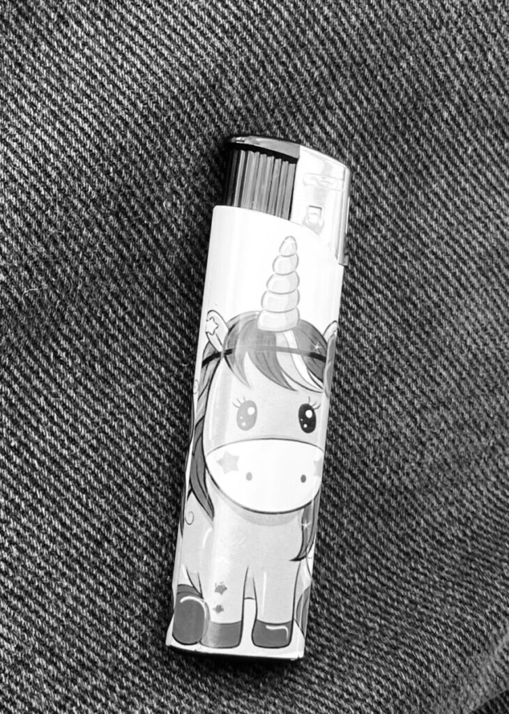
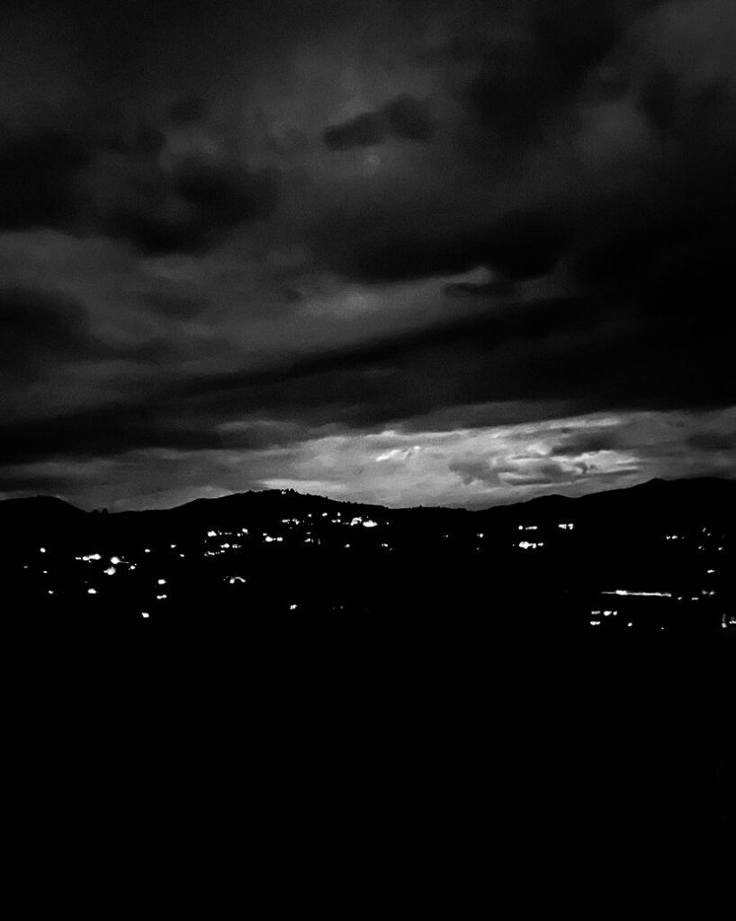

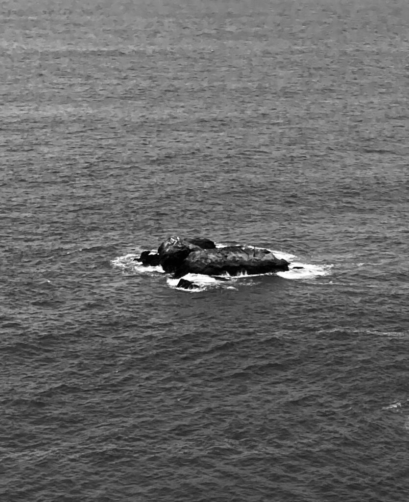


this photo is ambiguous. this is my wall and its hard to tell where it begins




The image depicts a banner that was used to promote mathematics and or number’s/symbols. it was mounted on the wall to grab people’s attention, and make you want to choose said activity that is trying to be portrayed by the poster.
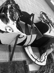
The sculpture was made as an abstract creation of an electrical circuit, you can see cables being adapted inside the circle and its very eye catching because of its unnatural looks. it was mounted onto a wall to decorate and make people understand off the bat what the building is primarily focusing on informing you on.
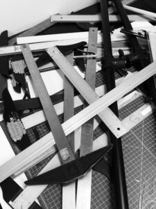
The rulers although its name may depict ruling, you really cant tell which one is ruling the other, this caught my eye as it shows the user ran out of time to organize, and although messy it made a great picture for this project.
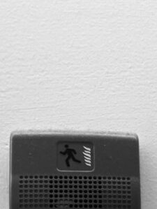
The idea that the fire alarm has its own image to describe what you should do in case the alarm was to sound, seems to be very funny as, if the alarm was to sound you wouldn’t look for instructions, and instead your instinct would tell you to run.
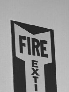
Fire extinguisher logo, when you zoom in it seems as though it was a Fire Exit, i liked said idea but it really brings out a contrast of the white background between red and white.
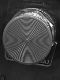
the button although it is black and white, you can tell the button is red and a super important, i liked the image because it was just catching my eye as buttons are always something that you want to press and although i wanted to press said button, i know i shouldn’t because of the contrast it has between other buttons you are allowed to press.

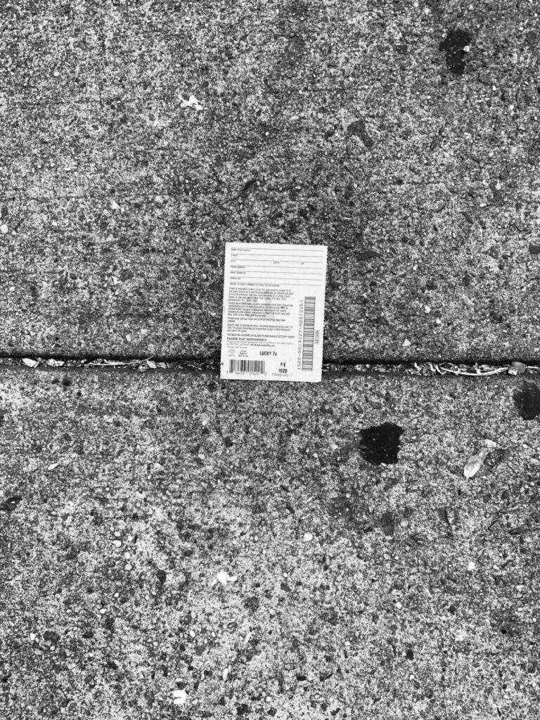
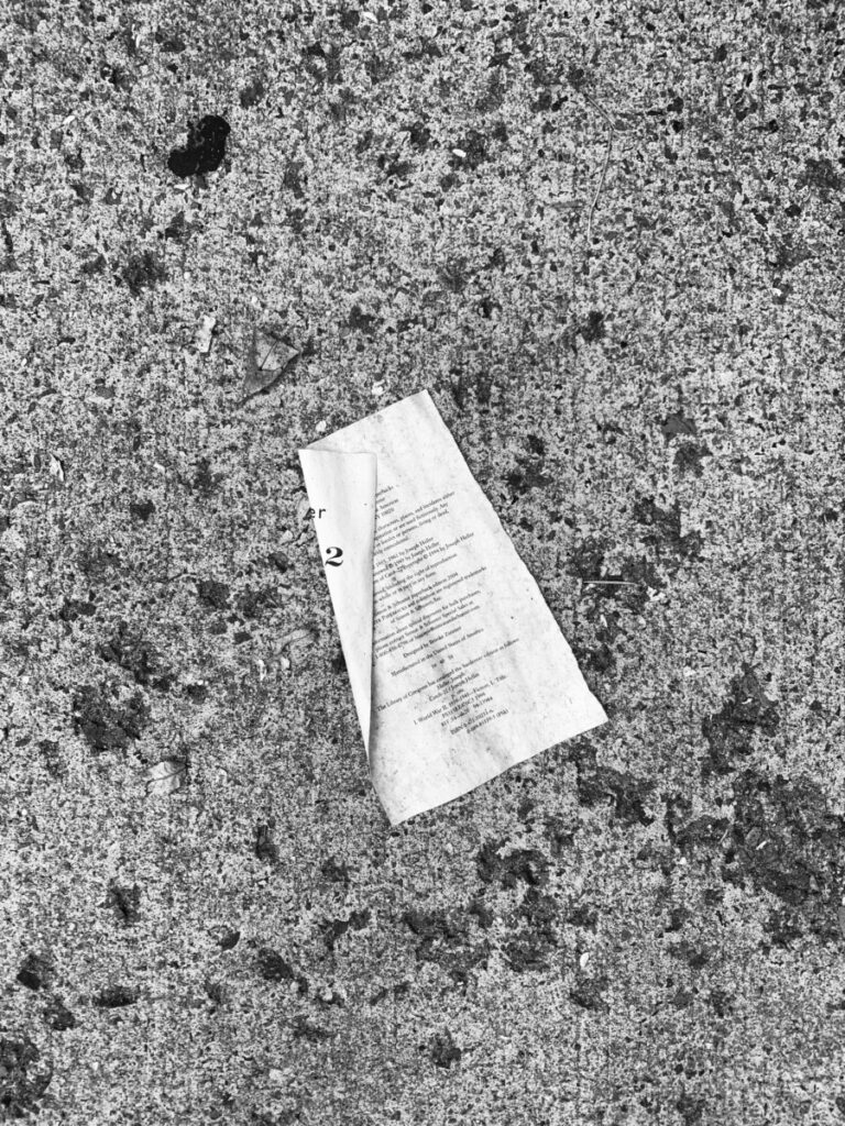
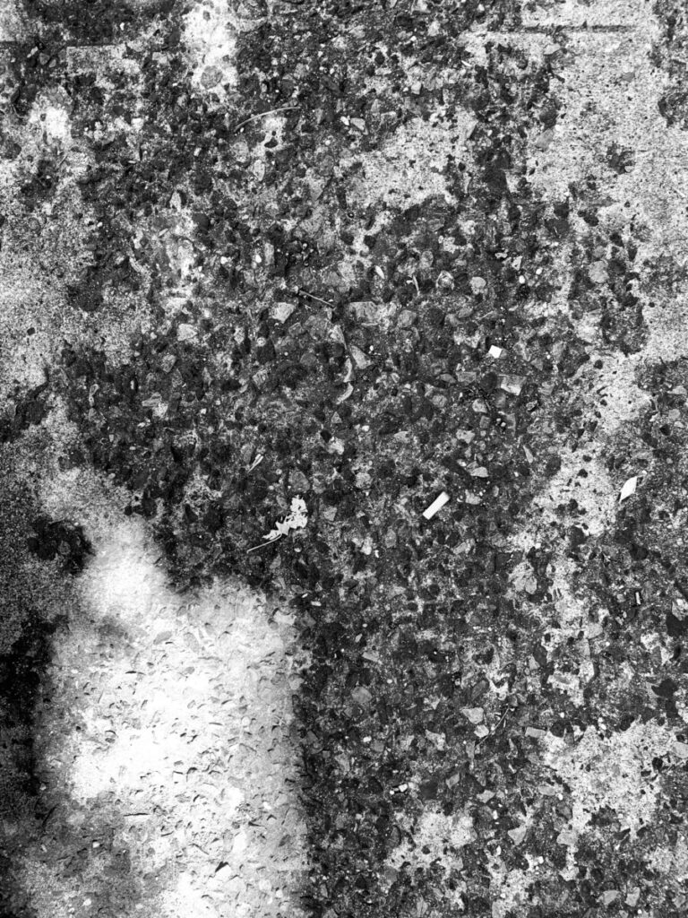
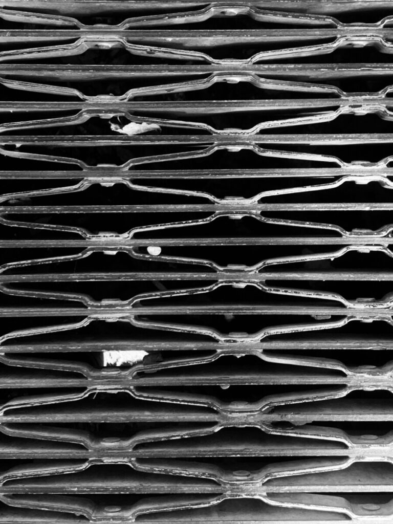
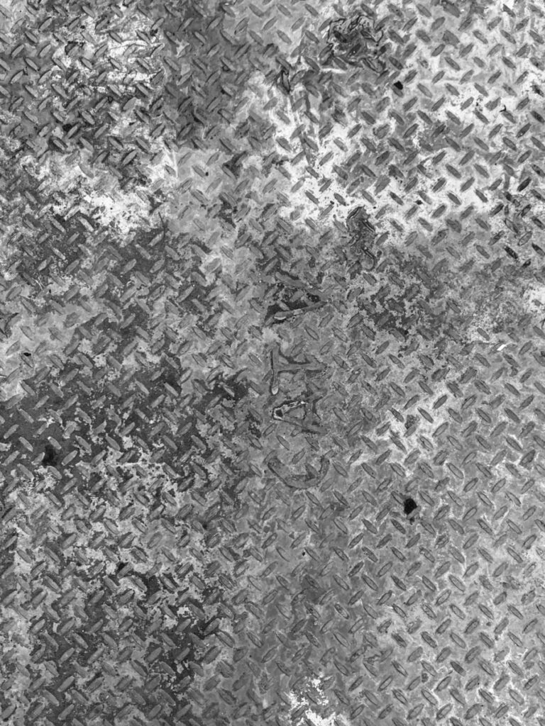
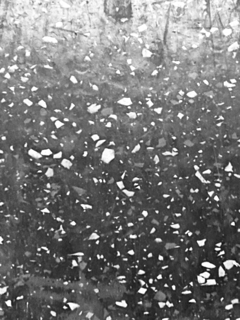
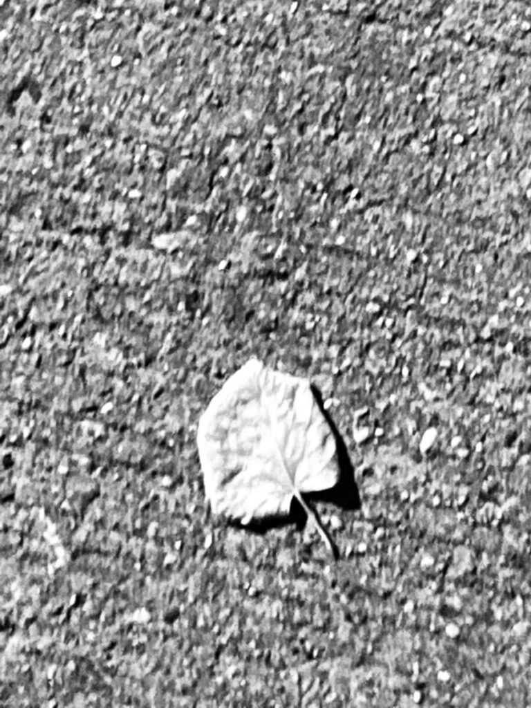
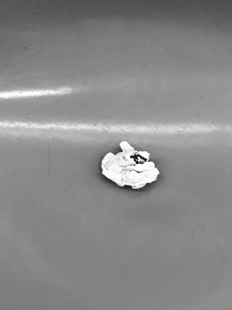

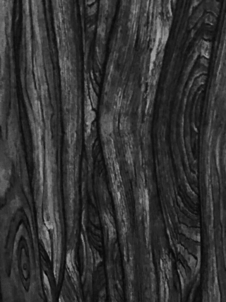
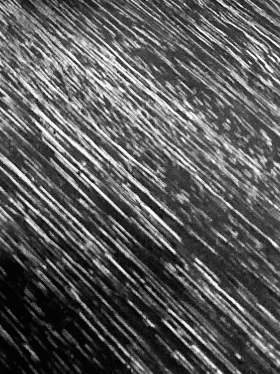
This is the grain on the wooden boardwalk in Jones Beach. It’s interesting to see that it is mostly straight lines and rarely curves. Inspecting the image, it would be difficult to tell what it was, and it is difficult to tell which color is the foreground and the background, which creates an ambiguous figure/ground relationship.

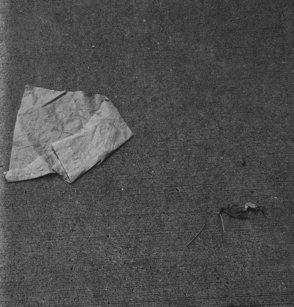
This is an obvious figure/ground relationship because it is obvious which is the background as it takes up the most volume in the image. Although it has an obvious figure/ground relationship, it is not obvious what the actual thing in the image is.

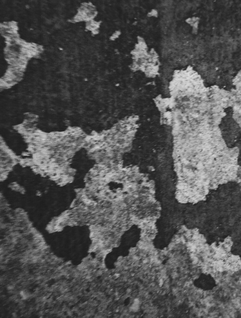
This is ambiguous because it is hard to tell which is in front and which is in the back due to the ratio of light to dark. There seems to be an even amount of each within the image.
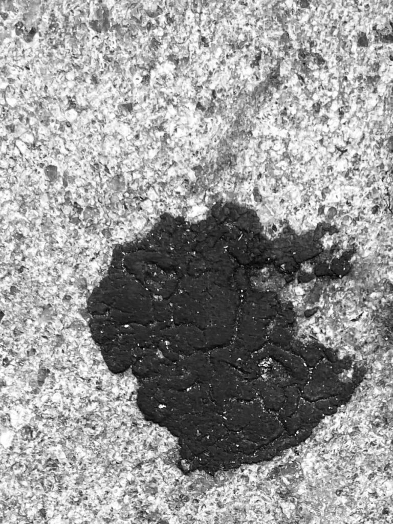
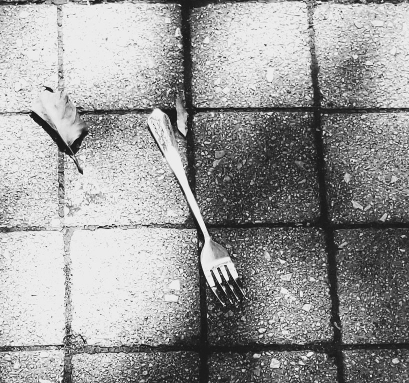
This is obvious because it is obvious what the figure is. The contrast between the elements in this photo makes it obvious which is the figure. There are also shadows on the dark item, which makes it obvious it is on top of the ground.
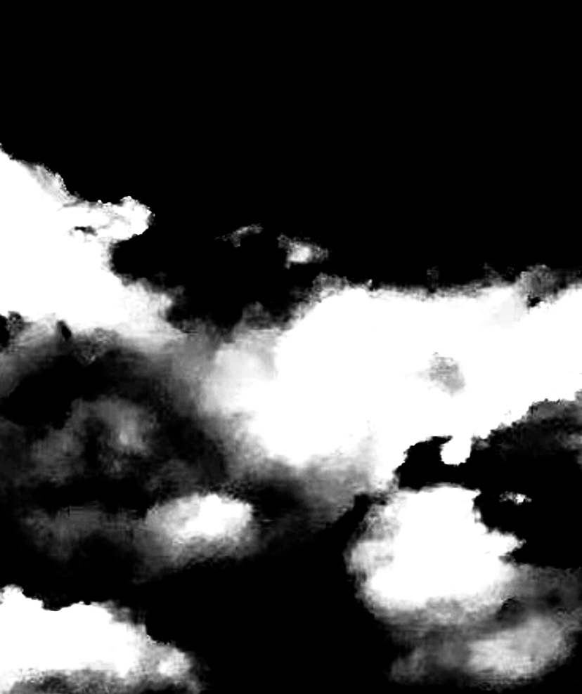
This is an ambiguous figure/ground. It is hard to tell which is the figure because even though there is contrast, they take up about the same amount of space in the photo.

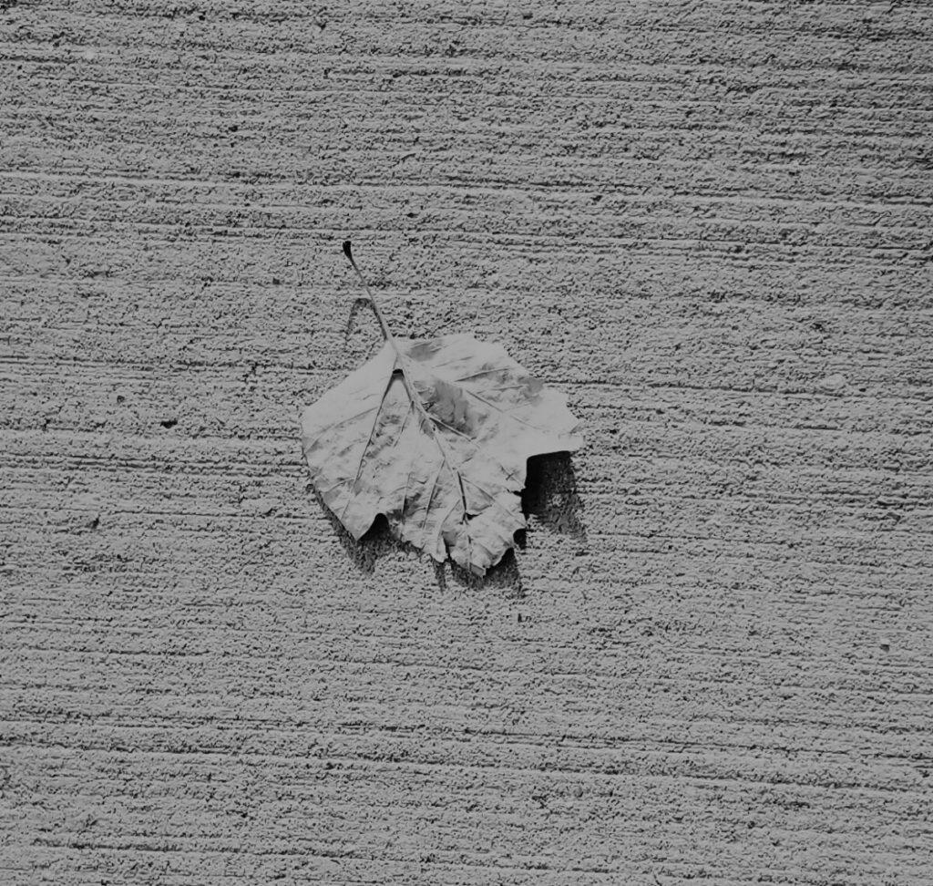
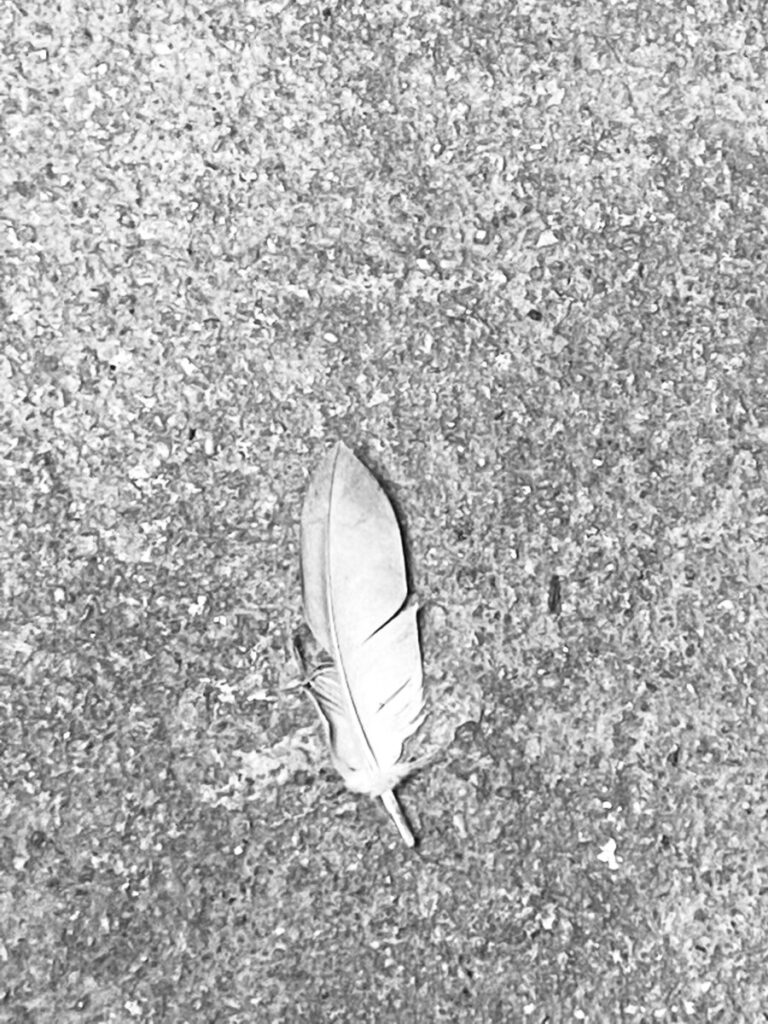
This photo of a leaf on the street is an example of an obvious figure/ground relationship. The shadows that the leaf is casting on the ground shows that it is on top of the street.
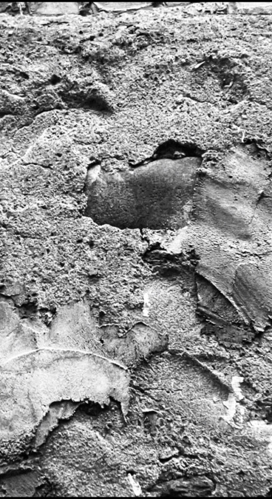
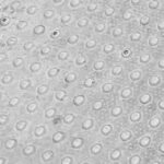
The first image is ambiguous; it appears to have a rough texture and resembles bricks. It comes from a structure close to where I reside. It ended up there because it was needed to hold the other bricks in the apartment building, but based on how it appears, it was probably manufactured a long time ago because it is quite rusted out or old-looking.
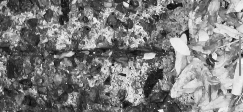
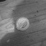
The second image is ambiguous since it’s difficult to discern what stands out between the leaves and the concrete floor. This picture was captured next to a tree on a sidewalk. There are many leaves on the ground since fall is approaching and the leaves are dropping.
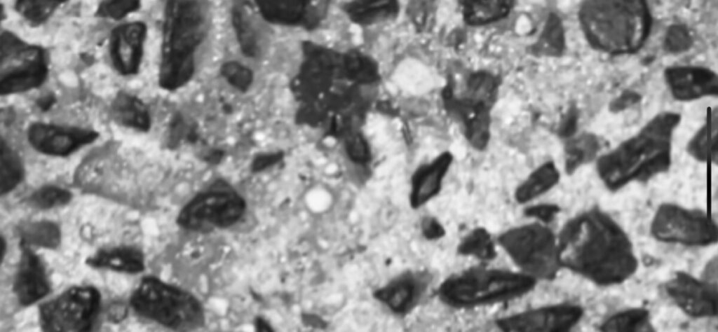
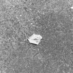
This is also ambiguous and there are rocks or pebbles in the image, which appear to show a concrete floor. This has a rough feel that is consistent with a concrete floor. Those stones probably ended up there as part of a design to add interest rather than keeping it basic.
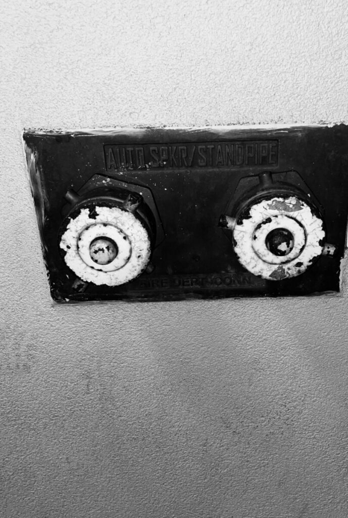
This picture is Obvious, we know what to focus on, as we can see the sprinkler/standpipe which is used when there’s a fire, and this picture was built near a gym, which means the purpose of it, was it to prevent a fire if there ever was a fire. But there is also a knob stands out because the color is the brightest one and it looks like it’s on the top.
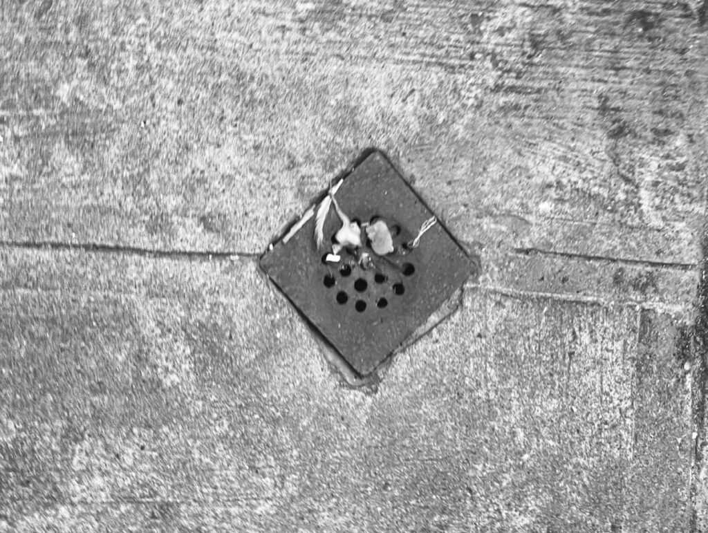
The second image is obvious in seeing; a drainer is visible, it’s outside, and there is rubbish on top of it. Given that the photo was taken at a waste disposal area, it seems reasonable that there is some trash on top of the drainer. The drainer’s function is to allow rainwater to drain into the sewer when it rains.
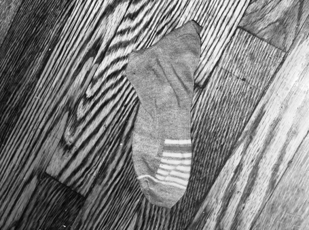
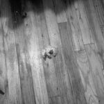
The image depicts a sock on top of a floor; given that socks have a smoother surface than, say, a concrete floor, the texture may be soft. The purpose of socks is to cover the feet. It could drop to the ground after being dropped, possibly from a garbage sock or a wash bag. This illustration is obvious.
