
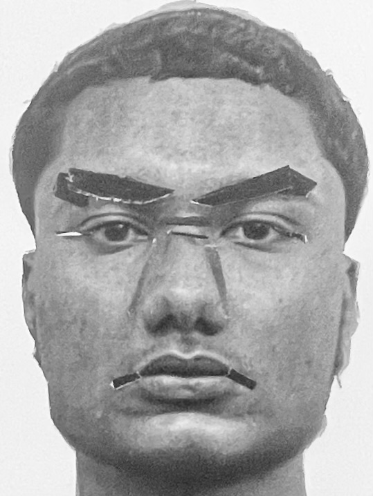
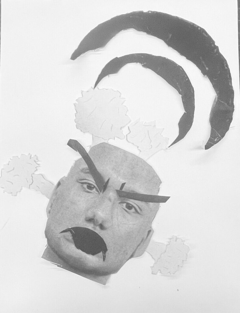
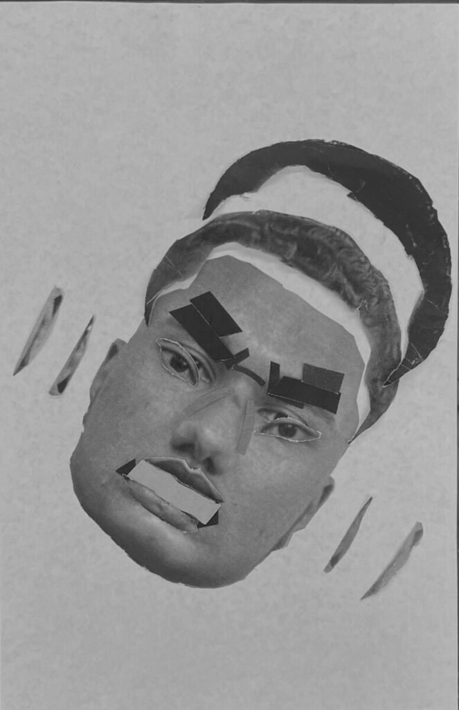
Post selfie, your name, mood chosen and description of the facial movement and feelings of that chosen emotion.
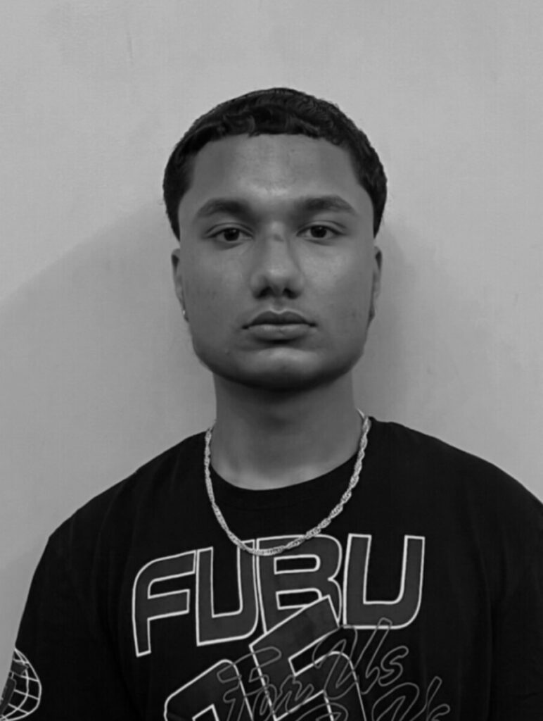
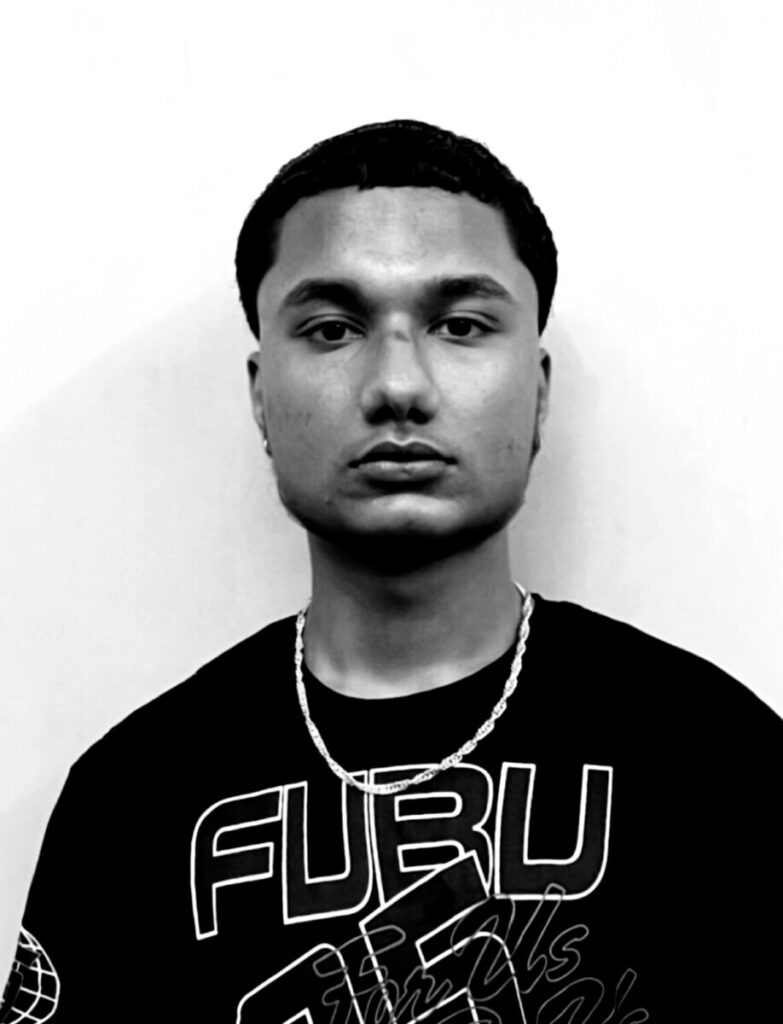
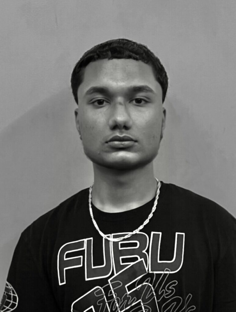
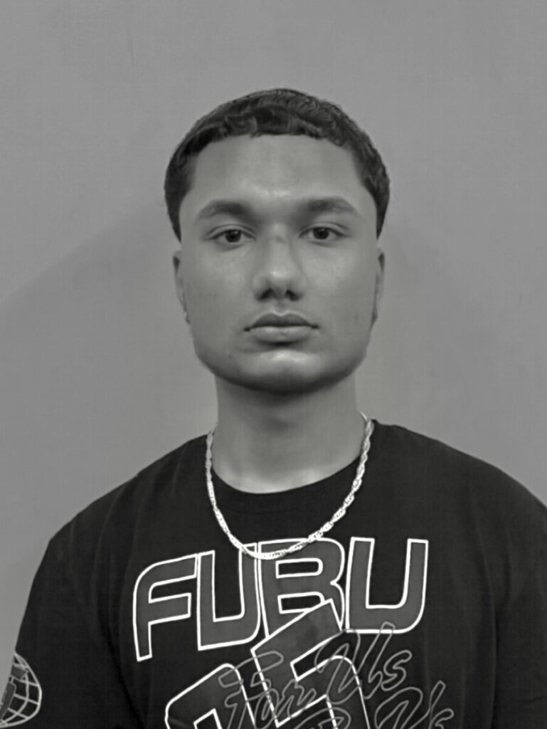
The mood chosen for the project will be “Anger.”
For a description of the facial movement:
Eyebrows are lowered and closed to each other, with wrinkles (a line going straight down) between your eyebrows, also the mouth will be open as when someone is angry, they could be yelling. The hair, ear, and lips will all come off as if your head is exploding with rage.
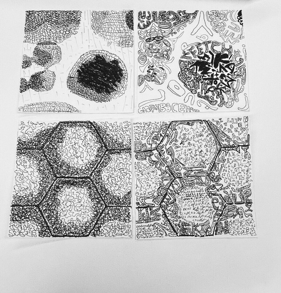
The use of line and type, such as loose lines and how they can help my shading and also match the picture, are some of the things I learned from this project. When it came to typing, I learned to use different types of font rather than just one, and this other kind of font helped me fill up space in a particular area. Some things I could have done better include drawing the image to make it consistent with the original, as well as cutting the last portion using an Exacto knife because the 5×5 had some minor bumps. I may use some of the knowledge I gained, such as type and line drawing, in my subsequent project and maintain a consistent aesthetic with the typefaces or lines.
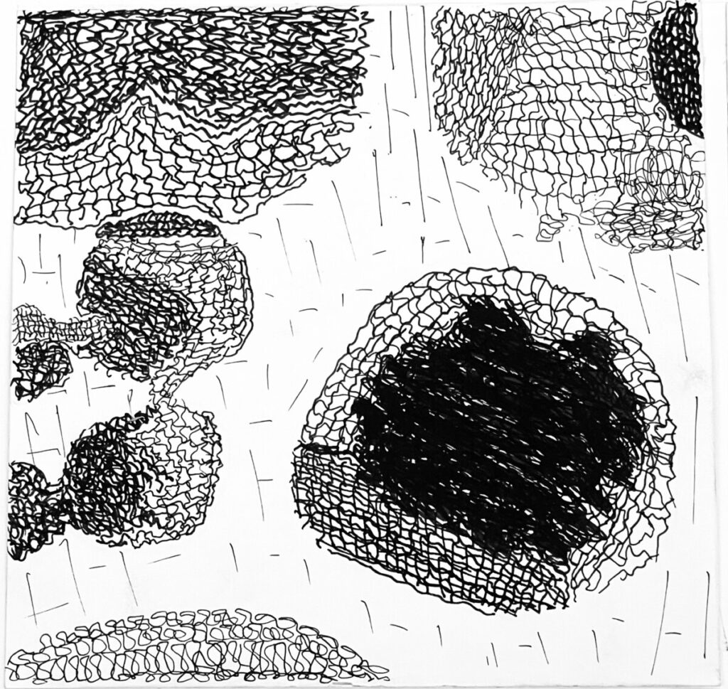
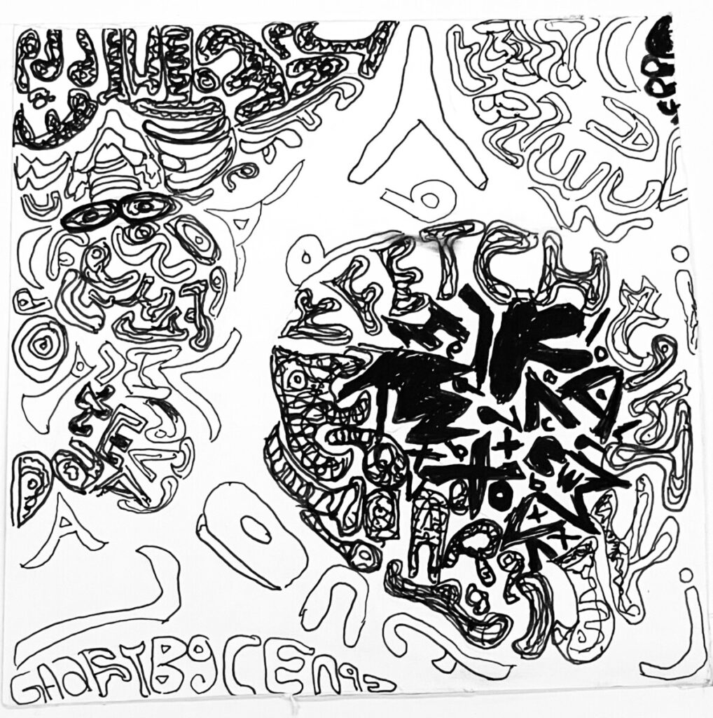
Texture
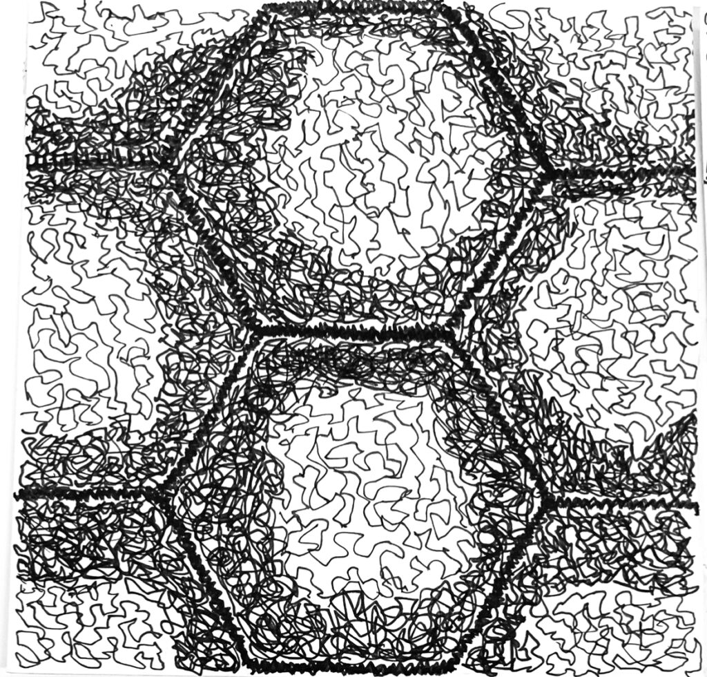
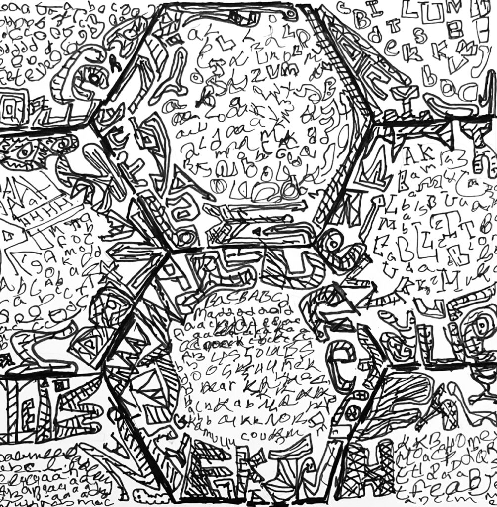
Pattern
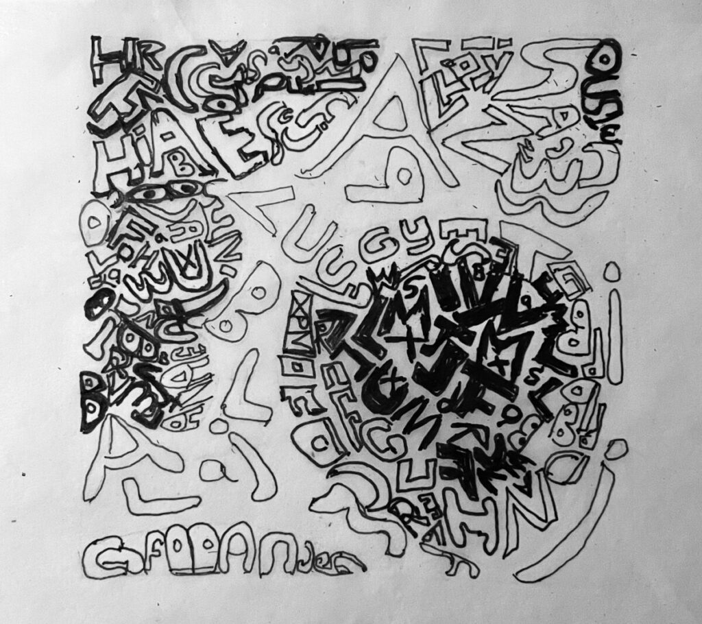
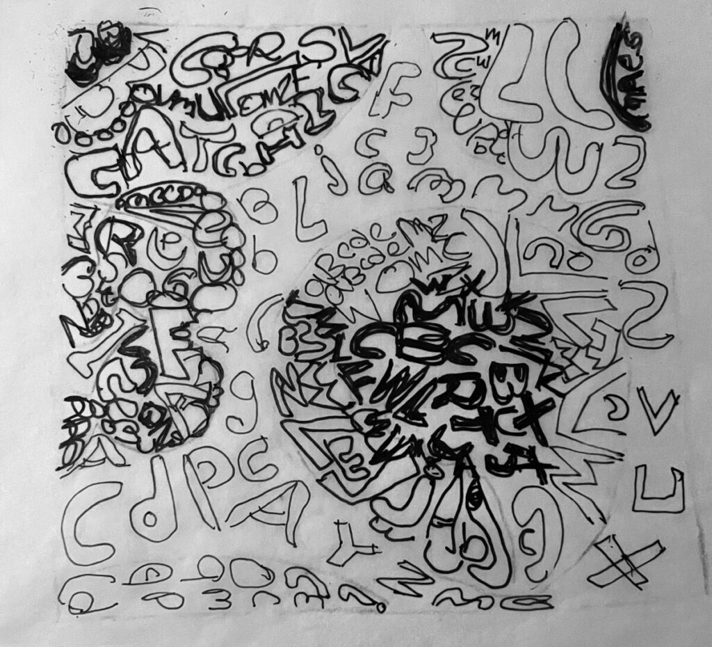
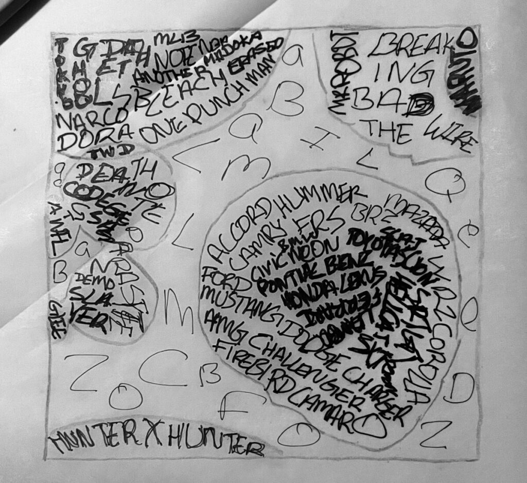
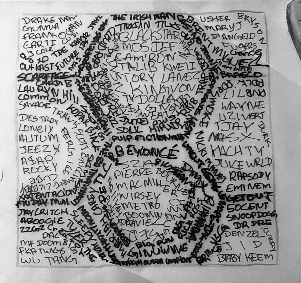
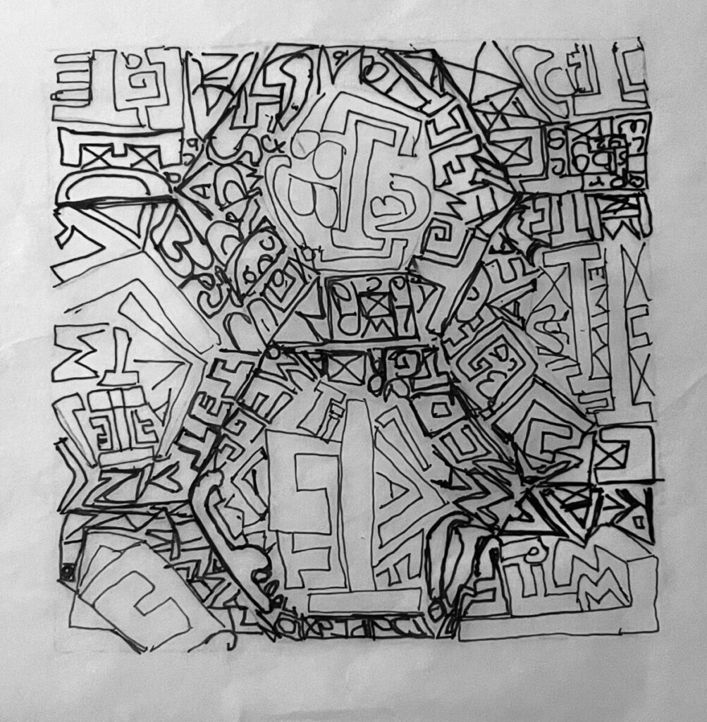
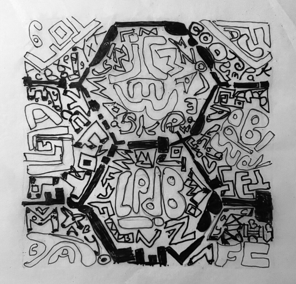
Final pencil sketch
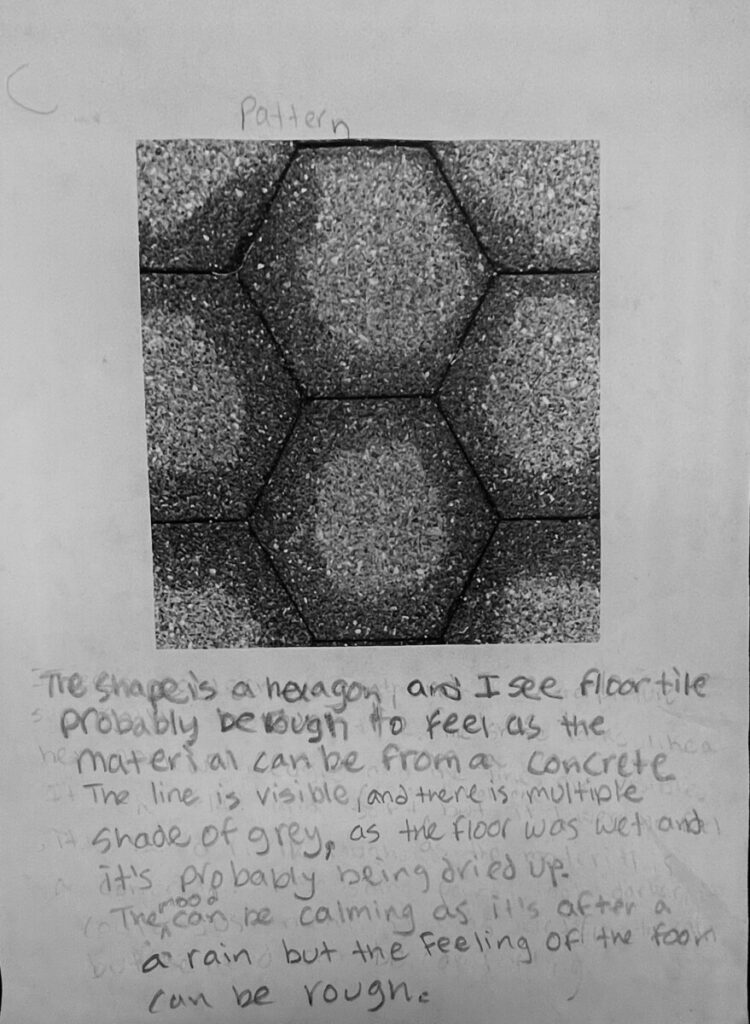
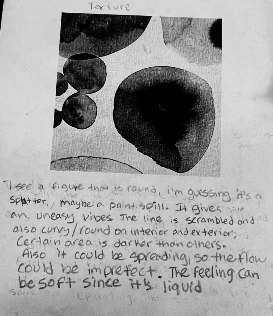
The texture design I tried to make sure both line and type showed the the spreading, and I also matched the shading of the grey as there were multiple different type of shades. When it comes to the Pattern, in the type some type had draken line to match the the edges of the shape, which was hexagon. For both, I made the line loose but made sure the line from pattern and texture weren’t similar.