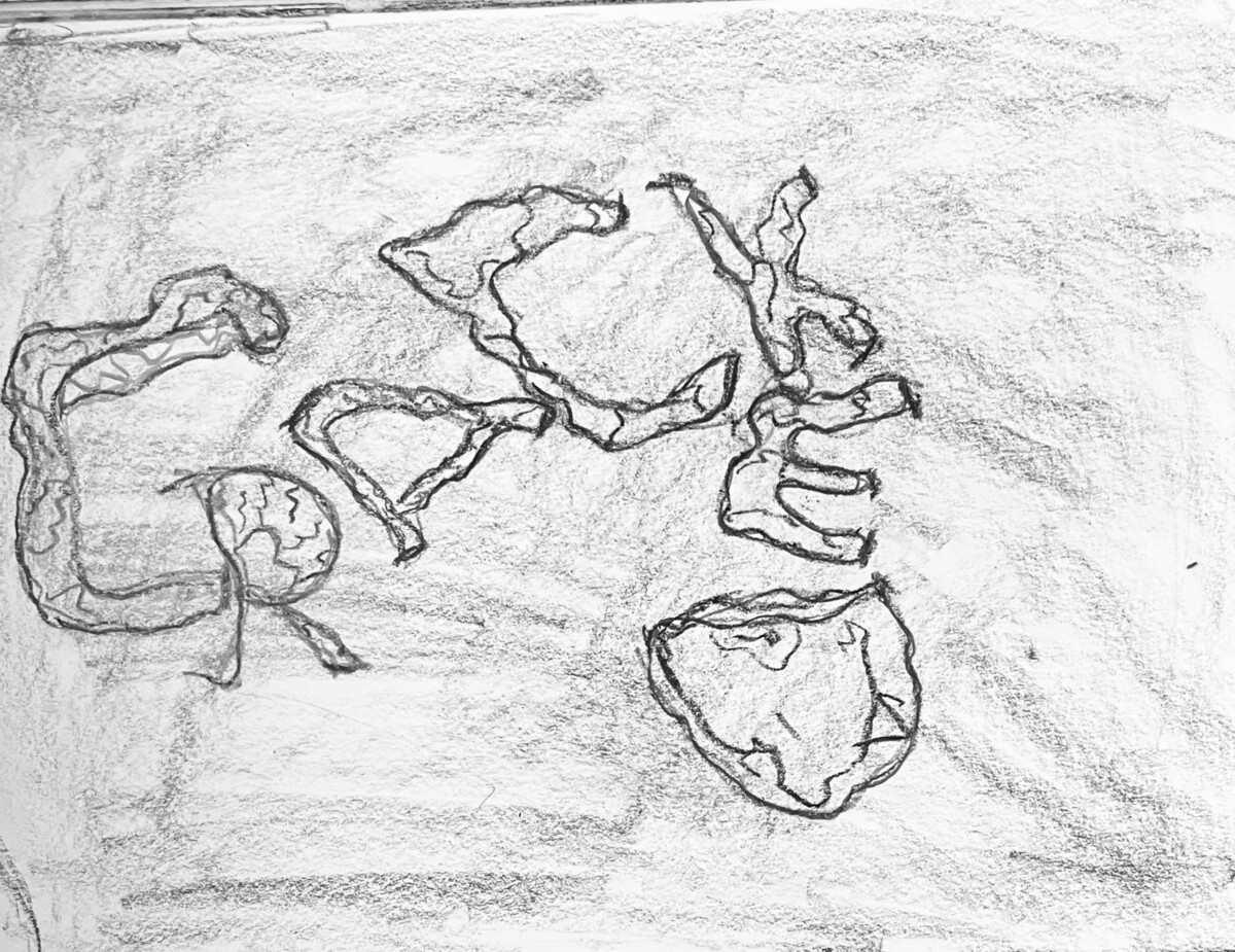
I went for a typeface design where it matched the picture and I added some elements, in the drawing the word “Cracked” is scattered and in a different position, but they are very close to each other, the typeface is very loose, and in the typeface, I made it look like the letter is cracking.


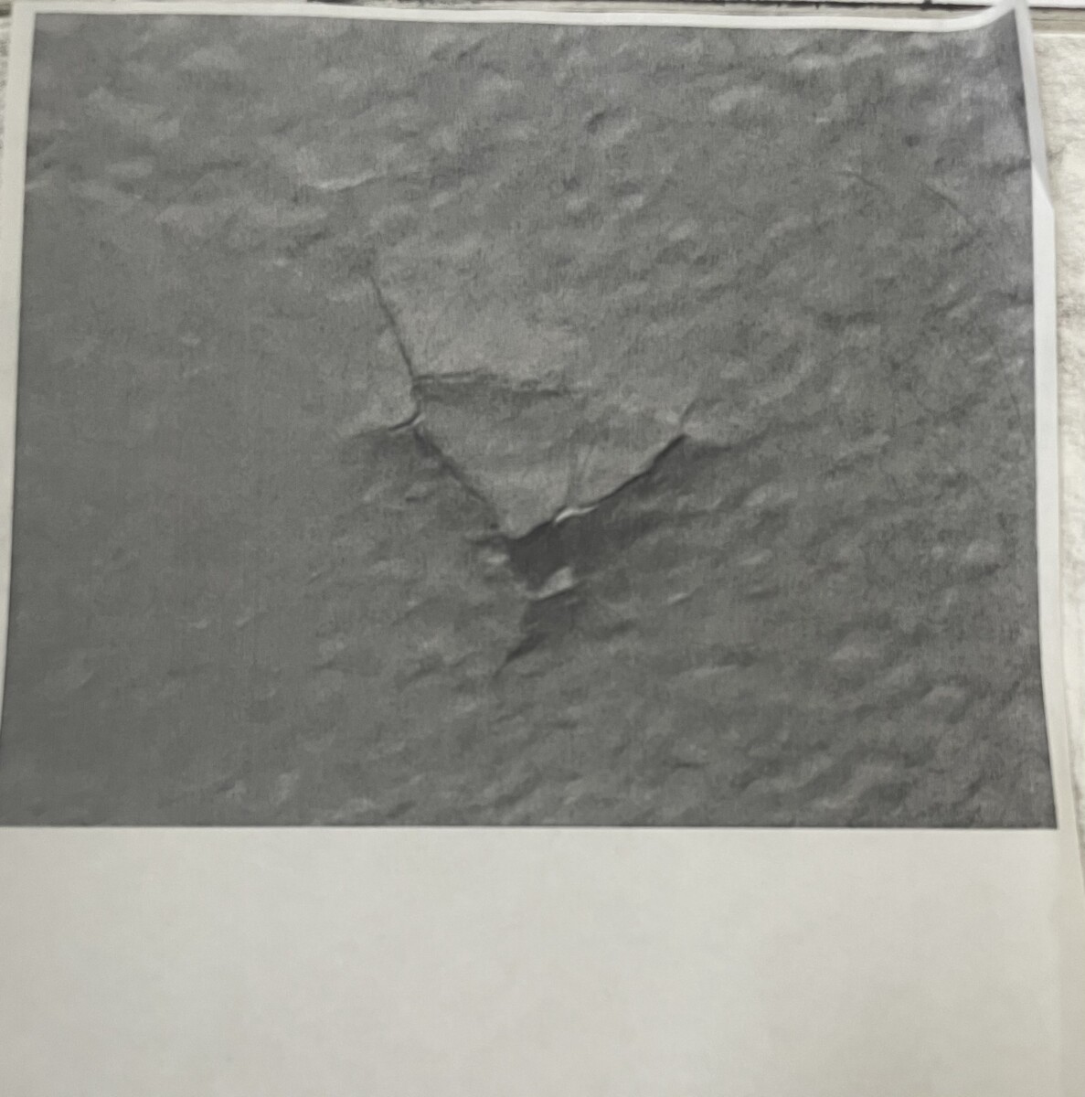
I really like your creative process for developing the typeface, and your final composition captures the true essence of the cracked pavement.
Your process for creating this design is interesting and I think the flow of your composition works really well.