11” x 14”- Full Color (can be vertical or horizontal)Art should tell a visual story that reflects your illustration aesthetic. Typography is Optional.ALL media is acceptable.
Subjects can be:
A Person (Historical/Contemporary/Fictional) A NarrativeAn Original Character An Animal A Political or Philosophical statement … OR? YOU TELL ME.
BRIEF: Create a portfolio piece that you would use to woo your dream client!
• Revisit your Week 1 assignment in which you identified who you are as an illustrator and the Art Directors and Companies you’d most like to work with.
• Create an illustration sure to capture their attention!
METHOD:
• Revisit the Week 1 Assignment in which you identified who you are as an illustrator and the Art Directors and Companies you’d most like to work with. Also, look at your Midterm Writing Assignment, where you researched these dream clients.
• Make a list of the KEY WORDS describing the kind of illustration this targeted group buys. (whimsical, children’s, gritty, sci-fi, horror, multicultural, etc.)
• Using those Keywords as a starting point, create a word web to help you come up with at least four original ideas for an art piece that would be attractive to your targeted clients.
• For EACH idea, create at least four thumbnails. (Total of 16 thumbnails minimum)
CHOOSE 2-3 images out of your 20 thumbnails from which to create TIGHT Sketches.
BRIEF: Create a portfolio piece that you would use to woo your dream client!
• Revisit your Week 1 assignment, in which you identified who you are as an illustrator and the art directors and companies you’d most like to work with.
• Create an illustration sure to capture their attention!
11” x 14”- Full Color (can be vertical or horizontal)Art should tell a visual story that reflects your illustration aesthetic. Typography is Optional.ALL media is acceptable.
Subjects can be:
A Person (Historical/Contemporary/Fictional) A NarrativeAn Original Character An Animal A Political or Philosophical statement … OR? YOU TELL ME.
BRIEF: Create a portfolio piece that you would use to woo your dream client!
• Revisit your Week 1 assignment in which you identified who you are as an illustrator and the Art Directors and Companies you’d most like to work with.
• Create an illustration sure to capture their attention!
METHOD:
• Revisit the Week 1 Assignment in which you identified who you are as an illustrator and the Art Directors and Companies you’d most like to work with. Also, look at your Midterm Writing Assignment, where you researched these dream clients.
• Make a list of the KEY WORDS describing the kind of illustration this targeted group buys. (whimsical, children’s, gritty, sci-fi, horror, multicultural, etc.)
• Using those Keywords as a starting point, create a word web to help you come up with at least four original ideas for an art piece that would be attractive to your targeted clients.
• For EACH idea, create at least four thumbnails. (Total of 16 thumbnails minimum)
CHOOSE 2-3 images out of your 20 thumbnails from which to create TIGHT Sketches.
DUE Next Class: FINAL ART for your conceptual portrait, and at least two different LIMITED PALATE color mock-ups for your conceptual portrait.
Method:
GO to a paint store. Browse the paint chips. Choose 3-5 paint chips per color concept as inspiration. Use color theory to guide your decisions.
Using Digital Media or traditional media, create 2 different Limited Palate color mock-ups for your Fully Rendered Portrait Sketch, and use reference to finalize line art.
POST your FINAL DRAWING, color mock-ups, and a paint store selfie to the openlab for feedback. Accompany the post with a few sentences answering the following questions:
Why did you choose this subject?
How does your final art represent the spirit/personality of the subject?
What informed your color choices?
What questions do you have for your instructor or the class?
PRINT FINAL ART for critique next week.
SUBMIT FINAL ART and PROCESS BOOK including color roughs to DROPBOX
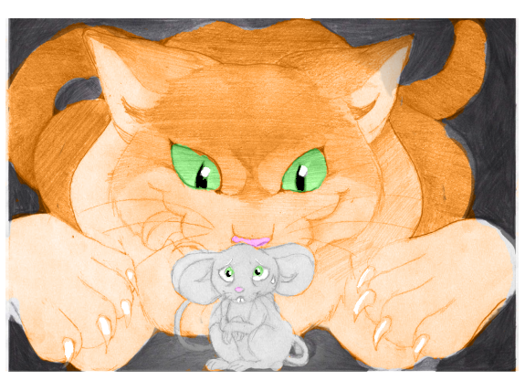
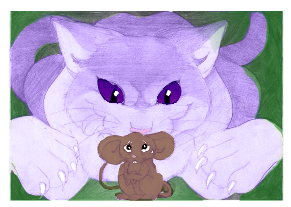
Color Studies are a necessary step in the illustration process. This allows the artist to test out different color schemes quickly.
Ideally, these should be done AFTER Value Studies.
Instructions:
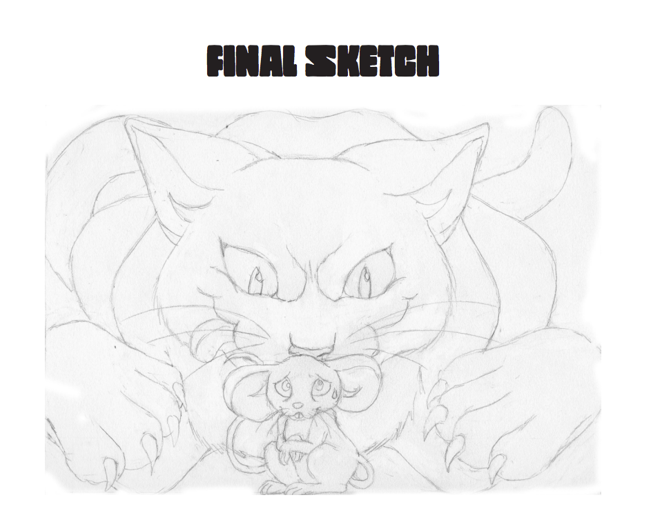
Refine and finalize your drawing based on feedback and suggestions you have received.
Do not shade your drawing. Focus on drawing clean line art only.
Do tape off the edges of your composition.
Edit your drawing by using photo editing software.
Scan or Carefully Photograph final art.
Adjust Brightness and Contrast
Carefully Crop Art
Save your Artwork as a HighRez file (to continue working on)
Save a Copy as a LoRez file (to post to Openlab)
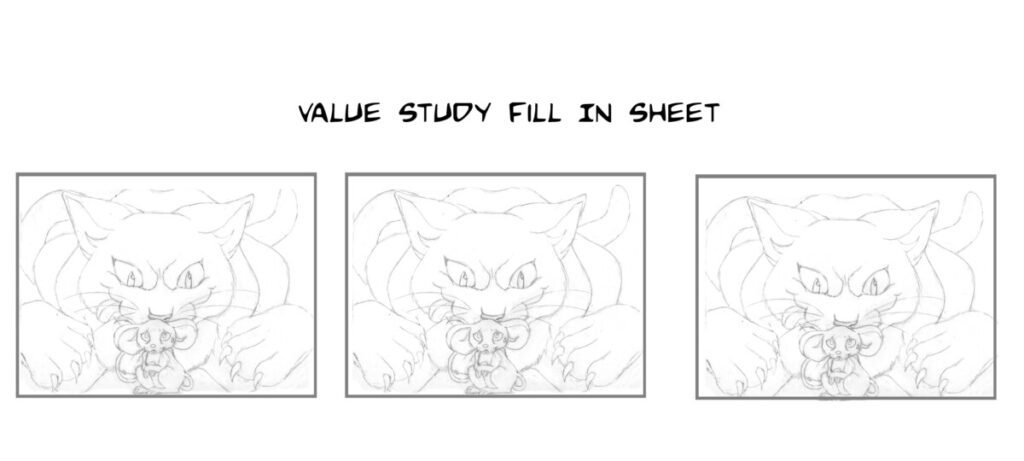
Create fill in sheets for Color Studies using one of the following methods:
Using a Adobe PS, copy/paste your design to create a fill in sheet.
Reduce the size of your artwork, using Adobe PS or Photocopier.
There’s no hard and fast rule, but studies should be small enough to fill in quickly.
About 25% of the FINAL ILLUSTRATION SIZE usually works
Copy and Paste the artwork so that you have 3 or more to Fill in .
PRINT this sheet, so you can and fill in traditionally with colored pencils or markers, OR create DIGITAL COLOR STUDIES by using Adobe PS/ or Procreate etc. to color.
Color each Color Study.
Create one Lo-Key, one Middle-Key and one High-Key Design.
Consider Focal Points, Image Hierarchy, and Contrast.
PRO TIP:
*Try coloring digitally in Adobe PS on a transparent layer on top of your Value Study. Try setting your layer to “COLOR”.
COMD 3633 Advanced Strategies in Illustration Fall 2023 Assignment #3: Conceptual Portrait
Select a subject. They can be a celebrity (alive or deceased), a historical figure, an athlete, or someone from the news. Create a conceptual portrait illustration. Image Size 9”X12” Portrait, Full Color.
For Next Week :
1. Create a series (minimum 5) of thumbnail sketches exploring various conceptual poses focusing on an aspect of their personality.
2. Work Realistically or in Caricature, whichever suits your personal style and portfolio.
3. Once you’ve chosen a concept and pose, find reference images, and create your own photographic reference for poses if necessary.
FINAL ART DUE : 11/16
Specs: Image Size 9”X12” Portrait, Full Color.
Things to consider when creating a conceptual portrait:
Strategies in Illustration COMD3633 – Class Plan Fall 2023 October 12
Class #6 – Project 2 (New Yorker Cover) –
1. Attendance
2. Warm Up Drawing
3. Student Questions about last week.
4. Class Critique of Thumbnails.
Please have the Thumbnails scanned For Class Critique.
Prepare to answer these questions during the Critique:
a. What Theme did you choose for the cover art?
b.Why did you choose this article?
c.Does the Illustration you intend to create fit the market you want to reach?
5. 10 minute Break
6. Lecture/ Finding & Establishing Clients
7. Student Questions.
HOMEWORK :
Project 2: New Yorker Cover
DUE Next Class:
1. Refined pencil sketch for the New Yorker Cover.
2. Google Doc of Dream Clients & Written Assignment on Freelancing
Based on MAILING LIST PROJECT as prescribed on page 102 of Inside the Business of Illustration CH5 , complete the writing assignment below.
SHARE BOTH To this DROPBOX by the start of Week 8 class. (You can link to the Google doc from your writing assignment, and you may share this doc with another student if you choose to work as a team.)
Please have the Art Scanned For Class Critique. If it is not in our class dropbox by start of class, it will be considered late work.
Prepare to answer these questions during the Critique:
What Is the Title of the Editorial or Article?
Why did you choose this article?
Does the Illustration you intend to create fit the market you want to reach?
4. 10-minute Break
5. Intro Project 2/New Yorker Cover
6. Student Questions.
DUE NEXT WEEK
Project 2: New Yorker Cover: DUE Next Class: 5Thumbnails for New Yorker Cover.
Answer this question: How does the theme you chose to illustrate reflect the type of work you want to do in the future?
CONTINUE MAILING LIST PROJECT as prescribed on page 102 of Inside the Business of Illustration CH5 . You may share your list with other who are interested in the same markets that you are. You may work as a team. You SHOULD combine all the information you have gathered by researching your illustration heroes. DUE Week 7
Prepare to answer these questions during the Critique:
a.What Is the Title of the Editorial or Article
What is your source (where did it come from?)
Why did you choose this article
Does the Illustration you intend to create fit the market you want to reach
Explain your thinking process for your thumbnails.
6. 10-minute Break
7. Lecture / Working in Multiple Illustration Styles
8. Discuss Expectations for next week
DUE NEXT WEEK
EDITORIAL ILLUSTRATION FINAL – 9×12 finished color art (medium is the artist’s choice, but work will be reviewed digitally.)
**Submit your work to the Dropbox for Critique BEFORE class time, or it is counted as LATE WORK.**
READ CHAPTER 5: Inside the Business of Illustration
Continue your Mailing List as prescribed on page 102 of Inside the Business of Illustration CH5. You may share your list with others who are interested in the same markets that you are. You may work as a team. You SHOULD combine all the information you have gathered by researching your illustration heroes. THIS PROJECT IS DUE WEEK 7
DO: Based on these readings, start your personalized “list”. Try physically going to the Barnes and Nobles on 16th St. Union Square and looking at magazines and books. Try going to Books of Wonder to look at children’s books. Try going to Forbidden Planet for comics. All of these shops will welcome you browsing and you do not need to buy anything.
*Create a Google Doc to track the information you learn from researching illustrators you admire and publications you’d like to work for.
*You may work as a team on this project with another classmate.
Include things like:
Client List
Art Directors
Markets they work in or hire for (Books (Children’s, Sci-Fi, etc., Editorial Illustrations, Advertising)
Specific Themes or Subjects they are known for or thathtey like (Political, Dark, Sports,Etc.)
Student Presentations of Homework Assignment 1 (Getting to Know You) PART 2
Students have 5 minutes to present: a. Select 2-3 works from 3 artists that are a major influence on your work, or whose career you admire. b. Select 3 of your best pieces of artwork to discuss. c. Please be prepared to speak about how you were influenced, and how that influence is manifested in your current work and what you want to do in this industry.
Student Presentations of Homework Assignment 1 (Getting to Know You)
Students have 5 minutes to present: a. Select 2-3 works from 3 artists that are a major influence on your work, or whose career you admire. b. Select 3 of your best pieces of artwork to discuss. c. Please be prepared to speak about how you were influenced, and how that influence is manifested in your current work and what you want to do in this industry.
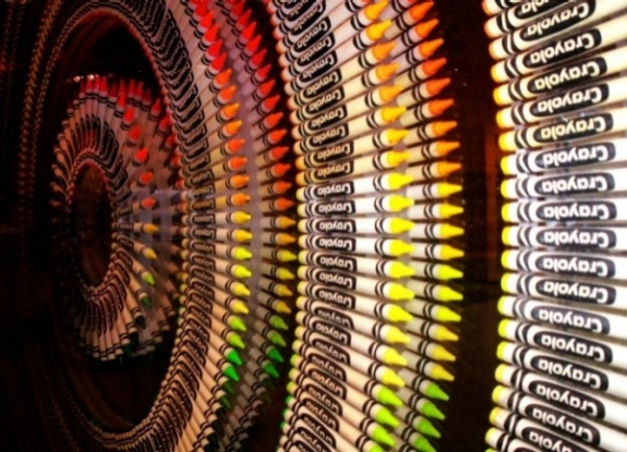
Color is one of the most powerful aspects of making art. Almost everyone who loves to create can remember the childhood excitement generated by a brand new box of crayons!
Everyone has a favorite color, artists and non-artists alike. Our relationship to color is one of the most powerful relationships we have as a species. It is intrinsically connected to how we relate to our world. And so of course it is one of the most powerful aspects to consider when making art.
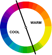
Color Temperature
Much of our relationship to color is based on instinct. For example, we see colors as warm or cool based on our physical response to them.
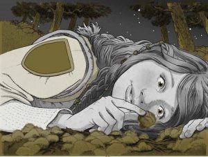
Warm things are warm colors (such as fire, the sun, hot coals, and in this case hot food.)
and cool things are cool colors (such as water and ice, which as blue or bluish).
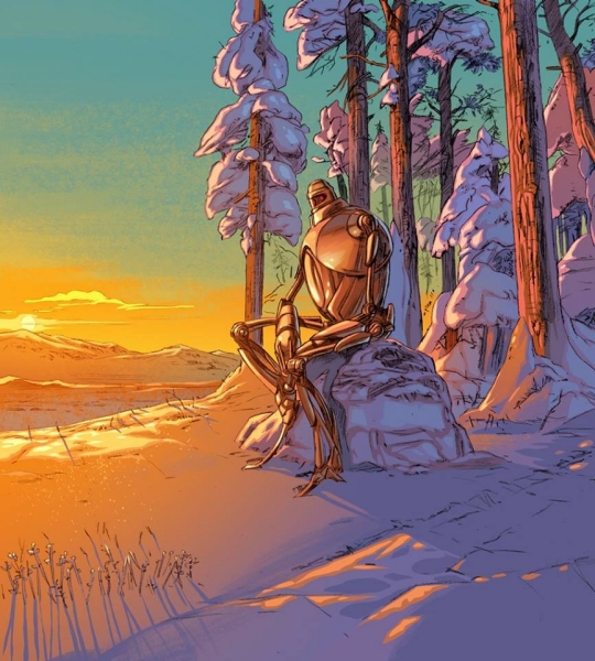
Interestingly warm and cool colors also create a sense of perspective and depth when we look at an image. Warm colors tend to advance towards us, whereas cool colors tend to recede away from us.
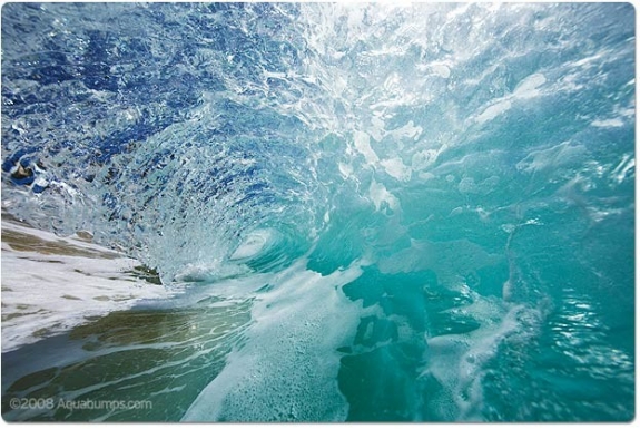
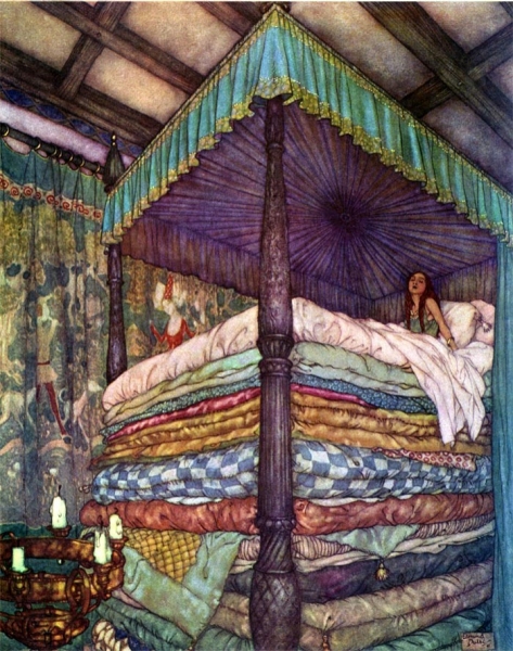
In these two images note how early 20th-century illustrator Edmund DuLac uses this trick. In the first image of The Princess and the Pea he creates a sense of incredible height, as the cold blue-purple recedes from the viewer, effectively raising the height of the bed canopy. And in the second one, A Palace of Wonder, a sense of depth is created between the warmth of the interior space and the cold dark outside.
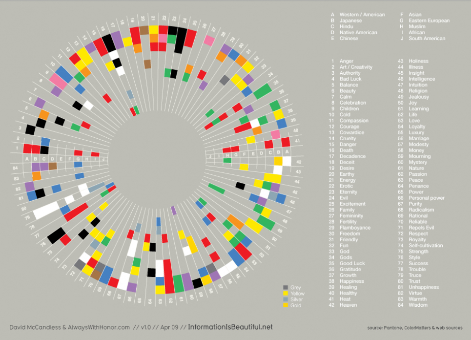
COLOR AND CULTURE
However, a great deal of our reactions to color are not innate, they are in fact cultural. For example Black and Death are associated in many Western cultures, in many Eastern cultures it is associated with white—its direct opposite.
Take a look at this info-graphic. Note how many color associations change, depending on where you are in the world. However also note how HOT and COLD or Color’s Relationship to Temperature do not.
It is however important to understand your target market and the culture that they come from, because culture has a strong influence on the development of cultural-color associations in childhood building the adults eventual perceptions of color.
Throughout this module and the next we will look at these basic reactions we all have to color and learn to compose in color effectively. We will build on what we have learned regarding composition, concept, point of view, and value and we will see how we can use these reactions to color to aid us in our ultimate goal, telling a great story through narrative illustration.
However, before we can do that lets be sure we have down the basics.
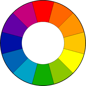
THE COLORWHEEL
The color wheel is one of the most powerful tools artists and designers have to help us understand and use color effectively. It is strongly recommended that as you examine the different color schemes throughout this post, you look at a color wheel and plot them out.
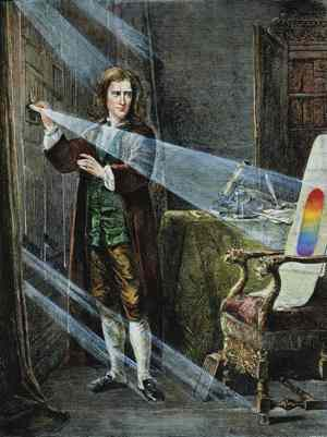
FUN FACT! The first circular color wheel was created by Sir Isaac Newton in 1666. As if the laws of planetary motion and gravity weren’t enough!
Foto: picture-alliance
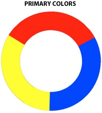
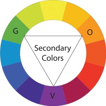
We begin with a three-part color wheel that shows only pure colors, meaning colors which no amount of mixing will result in. These three colors are of course our primary colors: red, yellow, and blue. All other colors are derived from these three hues.
Next we move on to our secondary colors.These are the colors formed by mixing the primary colors with each other: green, orange, and purple.
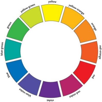
You can further break down the color wheel into tertiary colors.These are the colors formed by mixing a primary and secondary color: yellow-orange, red-orange, red-purple, blue-purple, blue-green, and yellow-green.
And of course, we divide that wheel based on Color Temperature, with warm color opposite cold.
To create a successful illustration, your color palette or scheme needs to support your main idea. It must work to further your narrative and or concept.
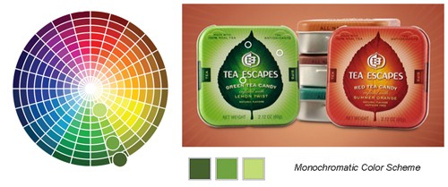
It isn’t always necessary to use many colors to achieve a colorful image — the monochromatic color scheme consists of one color plus black and can be very powerful. A monochromatic color scheme has one principle color in all its various tints, shades, and tones.
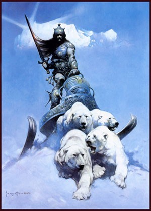
1980s fantasy illustrator Frank Frazetta whose work we’ve looked at in previously, makes great uses of a monochromatic color scheme in this illustration, Silver Warrior.
Note the tiny dabs of warm color he uses to create high contrast focal points within this otherwise completely monochromatic composition. Those warm spots stand out due to color temperature.
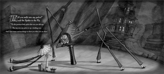
Tony DiTerlizzi’s Monochromatic Palate
Illustrator Tony DiTerlizzi often works in a monochromatic palate. For his book The Spider and the Fly he chose a metallic silver and. The beautifully rendered drawings are printed in black against a silver printed page. Silver is a gray and not, therefore, really a color. But because it’s metallic, it contributes more than a standard gray. Though DiTerlizzi’s color solution may seem basic, it is unique in children’s picture books and greatly enhances the mood of his illustrations.
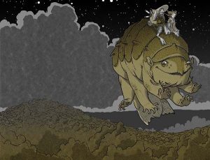
For his more recent series of chapter books, The Search for Wondla, DiTerlizzi chooses a different approach. Here, there are no contrasting dabs of warm color like there were in the Frazetta piece.
DiTerlizzi again works monochromatically, but in this case he chooses a two color printing process, meaning he chooses a principle color and the illustrations are all formed by the various combinations of this ink and black 2 along with the white of the paper.
It isn’t always necessary to use many colors in order to achieve a colorful image — the monochromatic color scheme consists of one color plus black and can be very powerful. Amonochromatic color scheme has one principle color and in all it’s various tints, shades, and tones.
To accurately describe a color and differentiate it from another, there are three attributes to measure.
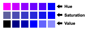
HUE
When the average person says “color” they are actually mean hue. The hue of a color is its particular light wave energy frequency. Remember, light is waves of energy, and white light is contains all possible colors! Violet is the highest visible light frequency and red is the lowest, which we humans have receptors to see.
In this diagram, note how the blue becomes pink, but all of the colors in between are of equal intensity, as it as it moves from right to left.
SATURATION
Saturation (or chroma as it is sometimes called) means a color’s purity. When people are talking about a color’s intensity they mean its saturation or chroma.
In the diagram, note how the blue becomes less saturated as it as it moves from right to left.
VALUE
As we discussed earlier in the course, colors have values just as shades of gray do. A color’s brightness or darkness, and its nearness to white or black respectively, is the color’s value. Value is independent of hue or saturation and can be seen even in a black-and-white photo.
Tints, Shades, and Tones
Value has is has its own color terminology.
Remember that the value of a color is how light or dark a color is, or how close it is to black.
Tints are when we add white to a pure hue:
Shades are when we add black to a pure hue:
Saturation also has its own color terminology.
We get different tones when we add gray to a pure hue:
Another way to envision this is as the hue itself becomes less saturated, it appears more and more gray.
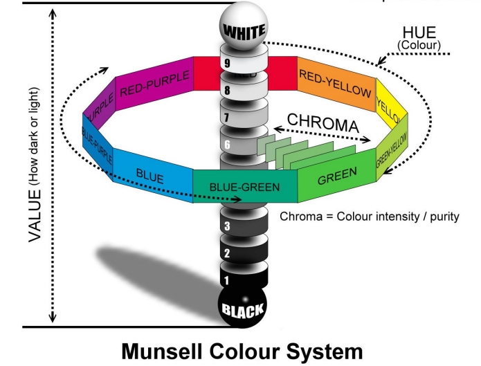
Munsell’s Color Tree
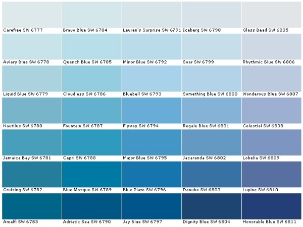
Talking about color can be very misleading! For example, when you go to a paint store, you can buy a can of Honorable Blue, Flyway, or Wondrous Blue! When we say Flesh Tone, what exactly does that mean? Whose Flesh Tone are we talking about? It can be very confusing!
Albert Munsell, an artist and professor the Massachusetts College of Art and Design, felt the same way. In 1905 he developed a “rational way to describe color” using numeric notation instead of names to describe color. To assign these numbers he used the three attributes we discussed above: hue, value, and chroma (saturation).
In the diagram above, you can see the traditional color wheel as the center ring, and Munsell’s Color Tree, as it came to be known, growing from the center. The trunk of the tree represents zero to ten in value. The farther we move from its “trunk” represents an increase in chroma, until the hue—represented by the separate “branches”—is at full saturation, farthest away from the center.


