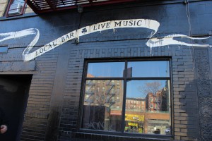
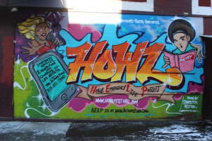
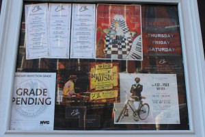
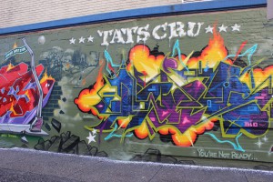
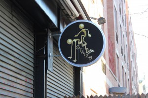
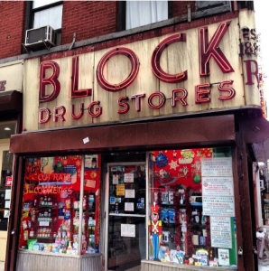
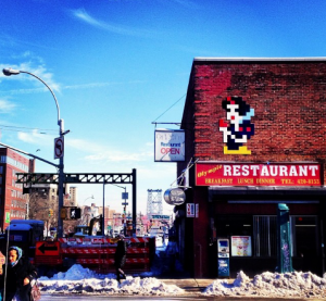
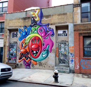
In my neighborhood, typography is used daily. You will see it on a daily basis. Typography is used to advertise a lot and it shows that my neighborhood is very busy. It advertises albums, movies, shows, clothing, merchandise and much more. There is also a lot of graffiti in my neighborhood, which also shows typography. The graffiti presents that there are some talented creative people within the neighborhood but also to get known. There are many posters of bands in my neighborhood as well. Which brings people together to listen to bands at a restaurant. There are also posters that advertise parties. Even the restaurants in my neighborhood would show typography with their menus, and the billboards that they leave outside. My neighborhood also has random pictures with random typographic lettering. There are different styles to the lettering in my neighborhood. There is normal use typography and also fancy, decorative, design type of typography. Since my neighborhood is busy. Basically what the typography in my neighborhood shows, is that my neighborhood is a working community that is also very urbanized.
Category Archives: Homework
My colorful neighborhood
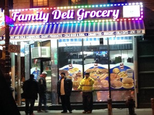
Third Avenue in the Bronx has always been a commercial place. I have lived here for 12 years and there always seem to be something new. The typography in the neighborhood varies depending on what it is about, but for the most part everything looks colorful with bright lights. While walking through Third Avenue one can notice the extravagant type almost to catch peoples attention since it is a commercial place. On the other hand while walking on the other side of Third Avenue one can see the church, schools, bodegas, and the type starts to get simple. The colors on the commercial side are very vibrant, attracting, and eye catching. At night all the neon lights are turned on making the type stand out and illuminate the streets. The stores signs have different kind of types like bold, italic, script. The type seems professional such as the Mc Donalds, Walgreens, Rite Aid, etc. On the other side of Third Avenue one can see that the colors are consistent and formal. The type is simple, dull and for the most part everything is in regular type. The type looks professional, however I saw a couple of signs that looked like they were handmade and therefore did not look well done. I can say that they type in my neighborhood is not boring but very noticeable and interesting, one that catches peoples attention.
Typography in LES, NYC
The text in my neighborhood is variant. There are few similar and distinctive styles. On public areas, like market and stores the type of their brand names appears to be bolder than the other words around them. Yet most signs and graffiti have a focus to the center, where the type grows in size towards the center, and shrinks towards the sides, making it easier to read the main signs, main words, main idea. Though a part of the neighborhood are the elderly, the size of font also creates visibility.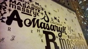
Most of the type are not just words but mostly labels. What I mean by labels is the names of people and categories of the isles in store. Though with both signs and graffiti, each one has their own style distinctive to the other, if it is being bold or light, large or small, or having the variety of many. 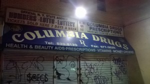
From most type, it is crowded. Most of the type is squished with saying most it can largely in one space. Though signs may overlap another, people know that of what is in store that matters.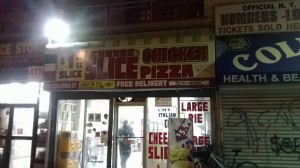
Yet there’s the color and symbolism in each to advertise or show a glare of interest that can cause one to stare and read what is up front, demonstrating that every one and every place has their own display on type.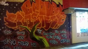
Typography in Alphabet City.
Living in The Lower East Side of Manhattan I see different forms of typography daily. My neighborhood is very diverse. In one end you have the NYCHA buildings where most advertisings are done by the local artist named Chico. Spray painted walls and guerilla art is the cheapest form of getting known around the area. In the other side of town where the more upscale businesses are located the advertising is more “lowkey” or simple. The neighborhood went from being very dangerous grounds to an artsy fartsy hipster welcoming town in a matter of years. My neighborhood definitely is a mix of old school meets new school. Most of the businesses sell to neighborhood people who have been living there for years and are more comfortable seeing simple, modest advertising then modern types and images.
