I am from Staten Island, New York also known as the forgotten borough. For the most part, my neighborhood is suburban, and kind of boring from my perspective. Originally, while photographing for this assignment, I wanted to capture some graffiti and different styles of decorative type. However, my neighborhood consists of many houses and small businesses. Working with my surroundings that I seldom notice being that I’m often out roaming the city or elsewhere, I began to see the significance of the small businesses and street signs around me.

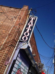
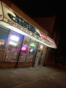
The small businesses are mainly renovated houses or small buildings. You can pretty much find any small business in my neighborhood such as bars, real estate agencies, a yoga studio, tattoo shop, barbershop, corner store, and a couple printing shops. The letterforms used for the small businesses are very cliché for their respected industries especially the tattoo shop. Being that Local businesses sometimes use each other’s resources, I drew the assumption that some of thesignage was made by the local print shops.


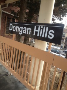
In addition to the small businesses, I also photographed some street signs. Some of the signs are specific to my neighborhood such as the “Jefferson St” and “Dongan Hills Ave” sign, and “Dongan Hills” train stop which is the name of the section of Staten Island in which I live.
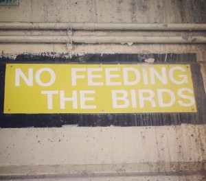
After taking a walk through my neighborhood for the purpose of this assignment, I realized what the people around me haveto offer as opposed to me always travelingelsewhere. My favorite signs are the ones that remind me of the city or the urban areas in which I often hang out. I am fond the “

Your Choice, Deli & Grocery” store sign, and “No feeding the birds” sign located under the railroad tracks. I have a fascination with Corner stores/ Bodegas because of that what they represent in a community as a place where the people living in or passing through the are can go at any time to shop for things without traveling far. I also have a weird fascination with pigeons being that they swarm the city and roam freely like me.

–O’Nysha Thomas
