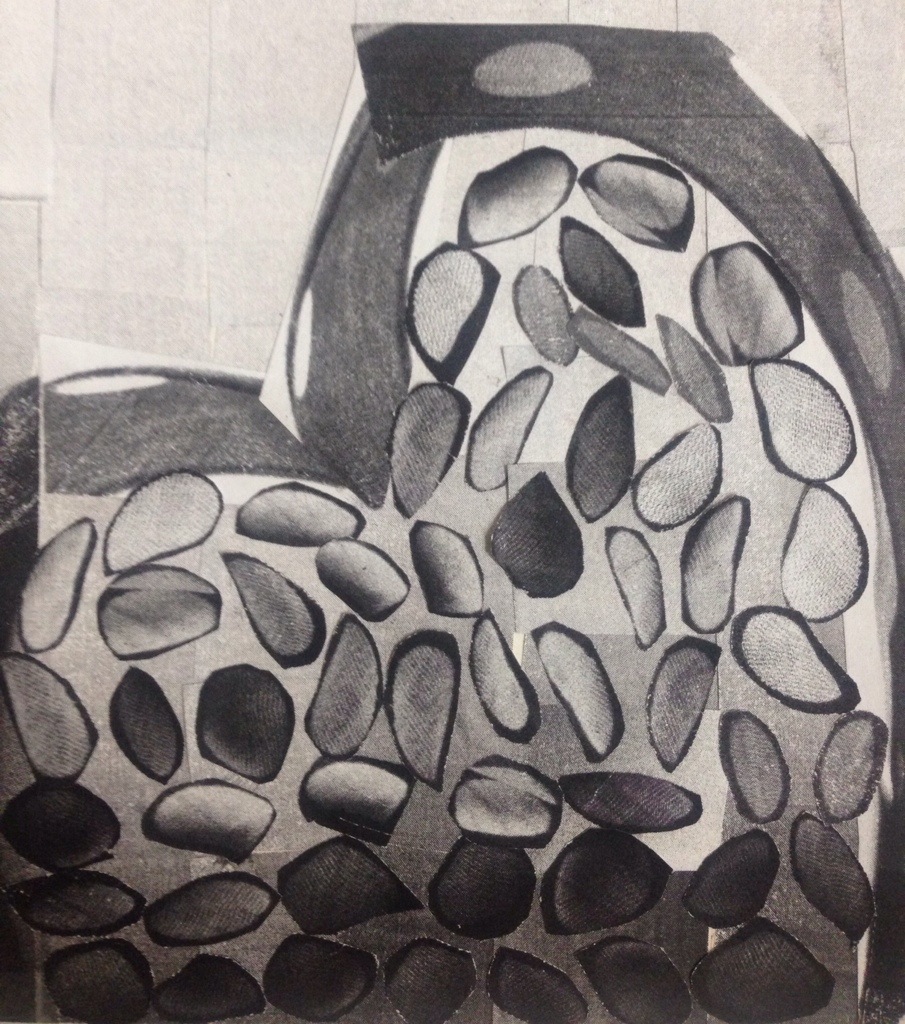
Simultaneous Contrast: When two colors come into contact, the contrast intensifies the difference between them. :
In this image you will see a middle gray is surrounded by dark gray it appears lighter than when surrounded by a lighter gray.
For me this was a very challenging project but at the same time a very fun Project .
I tried to incorporate my interest of fashion and fashion illustration into the theme of Ben metaphor, balance, and the range of saturation (prismatic, muted and chromatic gray).
I used the same color and but in different ways.
My Design Process includes two pieces of art that i later on Merged together
First i started doodling while we were in the train station the birds in the ben art. so i knew i wanted to incorporate into my piece somehow
and here is my last version of my digital paint of this inspired bird 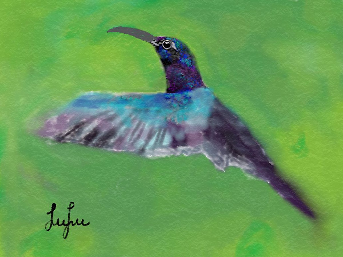
After that i was inspired by the subway so i started sketching that in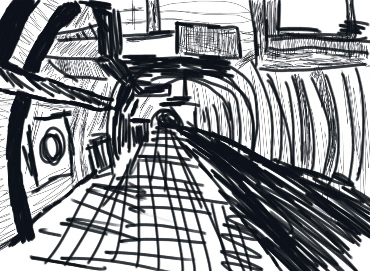
I knew i wanted to incorporate Ben idea of departures and arrivals so i sketched people to add to my scene 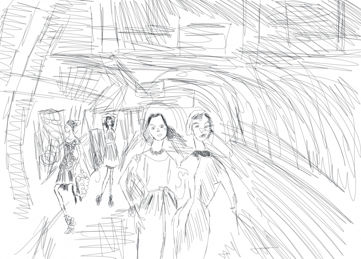
After playing Around in Photoshop for few hours here is my final work 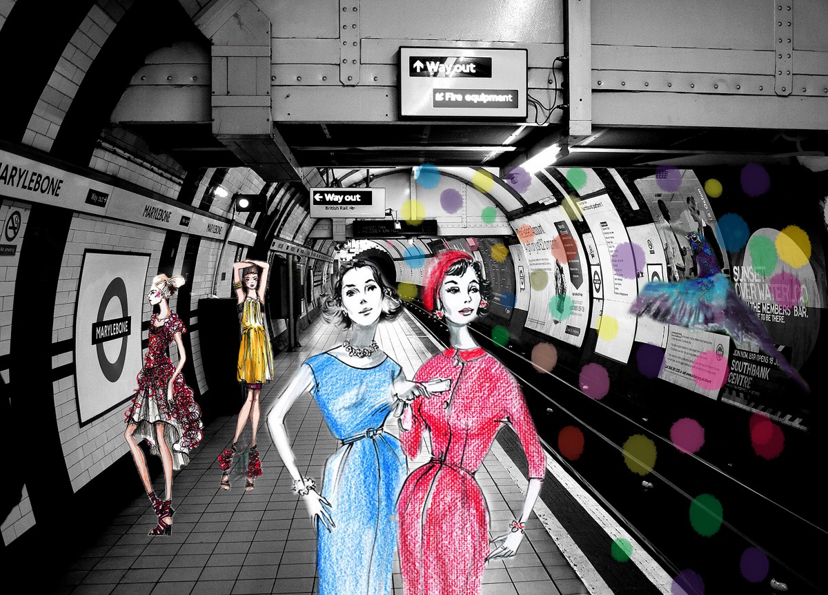
My idea was the arrival and departure of people from different decades in the subway a futuristic subway and i incorporated my bird in the subway wall art . The Colors i chose to add to my are elements of the color theories we been studying in class.
I hope you guys like it .
Thank you for reading
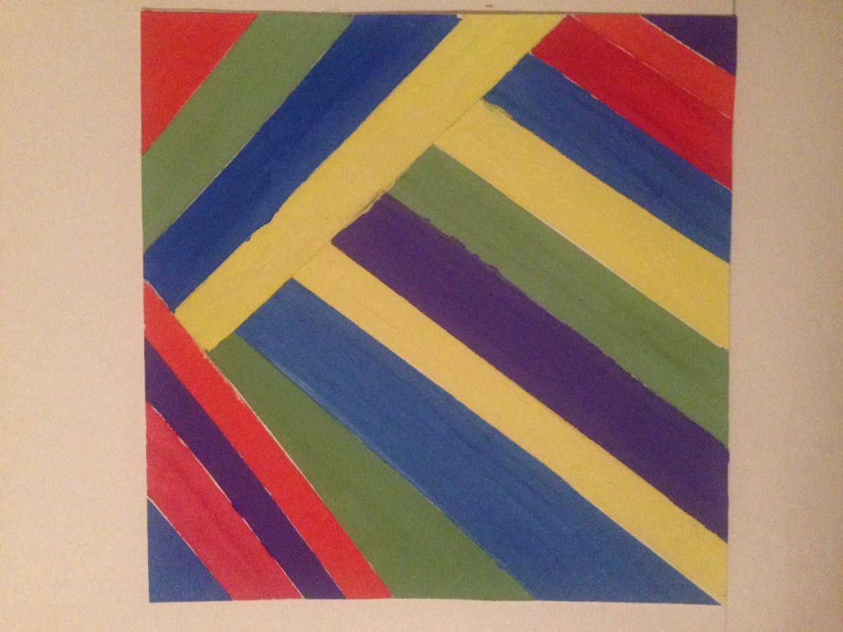
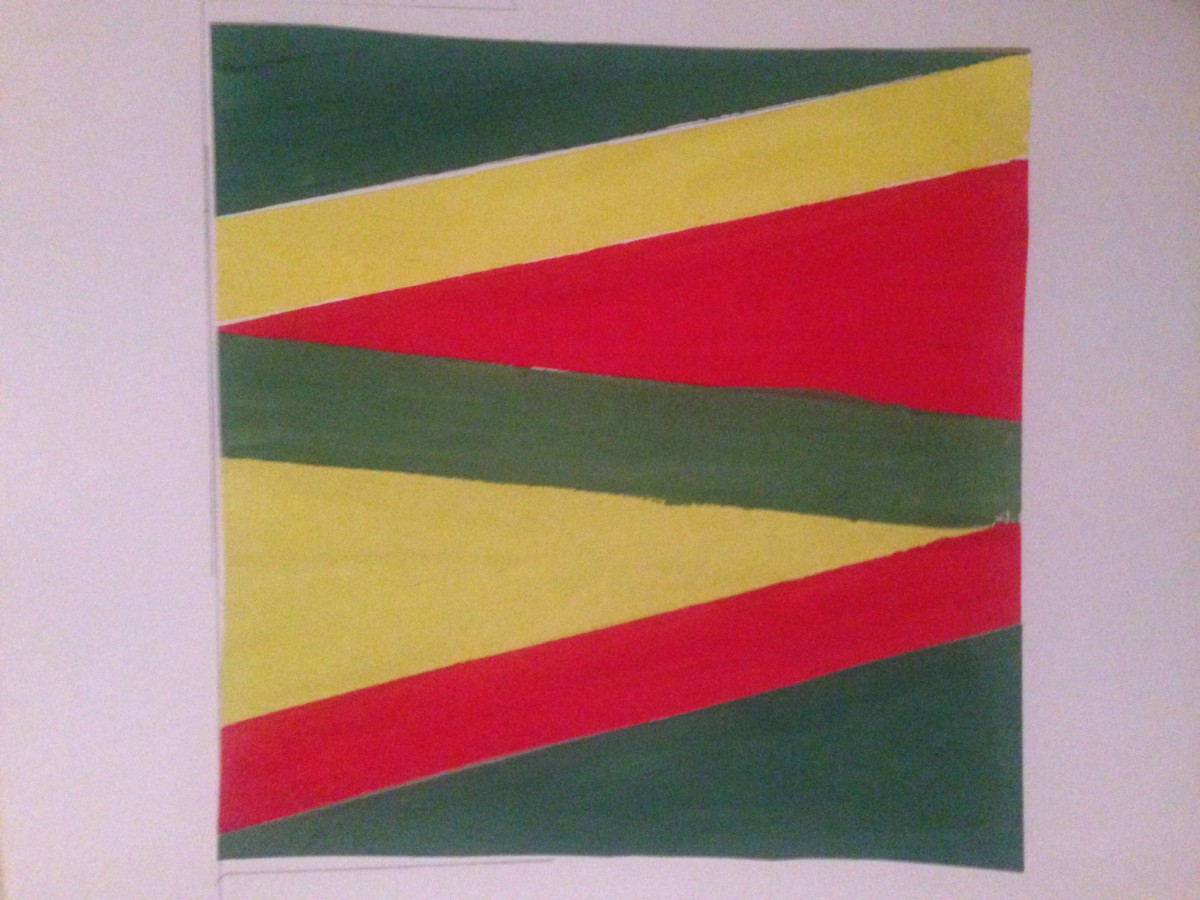
This is my prismatic color composition. For this assignment I could only use primary colors and secondary colors. My personal challenge while completing this assignment was finding ways to accentuate the color scheme but yet not mix colors to create new shades and also having to repaint the same areas twice to bring out the colors.
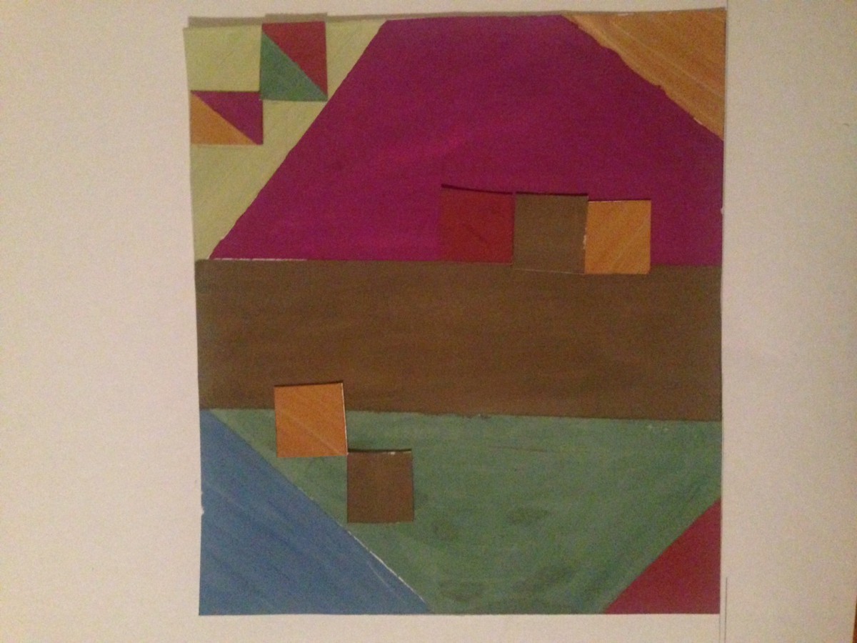
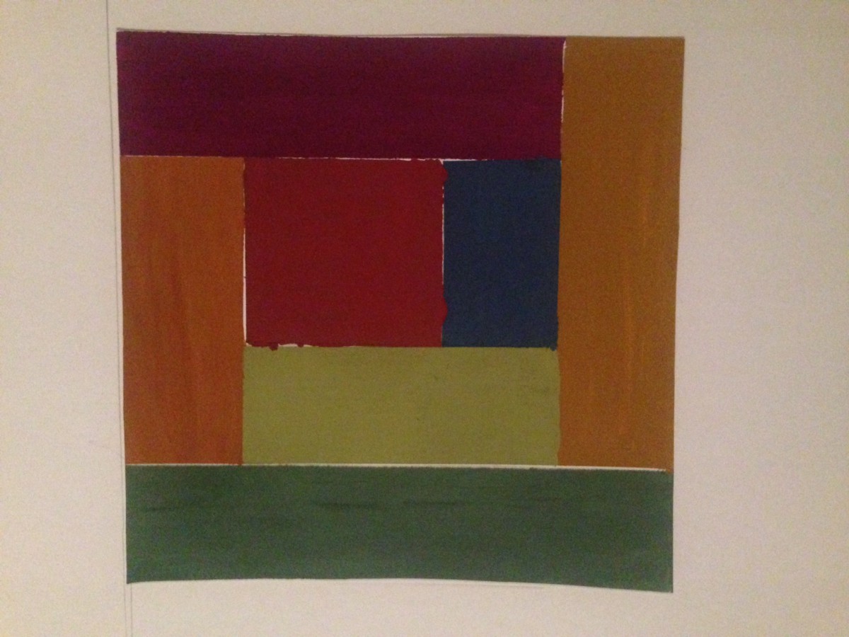
This is my muted colors composition. For this assignment I made many different shapes so I can paint in different shades of the same color. I chose Geometric shapes and colors that i think will stand out compared to the other one. The image to the right is my narrow range value composition. For this image I chose colors that are more relevant to each other, unlike the other image which looks like it has more contrast. This assignment was really fun, the colors were a challenge to make but I really like the outcome.
Hi class..
To me I really enjoyed making this assignment
So what we had to do was Create a Freestudy composition using primary (Red, Yellow, Blue) and secondary (Orange, Green, Violet) triads on a piece of 9″x12″ bristol with gouache.
With our color wheel as a guide, practice mixing and applying colors on a piece of scrap paper, first. Making sure we have achieved the proper hue before applying the paint to paper.
I chose my design of a flower as my color triad free study .
Bye
Xoxo
Amera
Richard Hollis is an British graphic designer that who has a great influence in today's graphic designs and aswell as The history of graphic design .
As an aspiring painter in mid-1950s London, Richard Hollis admired Constructivism and the kalte kunst (cold art) of Swiss artists like Max Bill and Richard Paul Lohse, but at an art teacher’s suggestion he took up graphic design instead, taking on the visual strategies that employ text and images to communicate ideas. Famously part of the team that helped wrestle John Berger’s 1972 BBC series “Ways of Seeing” into a book, Hollis found inspiration in the television format—what had arguably become the predominant way of seeing. At the time, setting images within the relevant parts of text and using a bold sans serif font (to give the text a weight that would echo the series’ emphatic narrator) were, in graphic design.
Richard today counties his journey I. Graphic design in an amazing way the will influence graphic fleshing a students like us for generations to come.
Hi class here are my first drafts and my final draft of my value scale collage I will be working on for the next following blogs
The assignment was Using printouts of the portraits taken in class, transfer the grid provided to the printouts. Measure, mark in pencil, and cut out each square carefully.
Use variety of scale to develop contrast, hierarchy and emphasis. Some of the squares in our grid should be small, some large, some medium.
Rearranging and experiment with your portrait pieces until we developed 2 unified 6″x6″ compositions as follows: 🙂
second and final draft of value scale 