With over 450 stores across 64 countries, IKEA is widely recognized as one of the leading furniture companies of our time. Their iconic branding and visual identity has a huge part to play in it. IKEA was founded by Ingvar Kamprad in Sweden 1943. The word IKEA is an acronym named after the initials of the founder, the farm he grew up in, and the name of his home village: I is for Ingvar, K is for Kamprad, E is for Elmtaryd, and A is for Aggunnard. Ingvar Kamprad stated, “why are beautiful products only made for a few buyers? It must be possible to offer good design and function and low prices,” which exemplified IKEA’s brand values of a no-nonsense approach and increasing accessibility in the furniture industry.

The Beginning
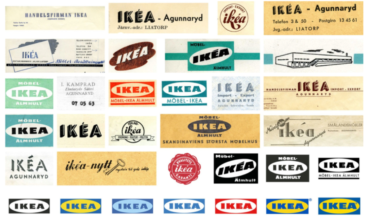
The IKEA logo, typeface, and wordmark have been through many variations and iterations starting from 1943 to as recent as 2018. The first trademark was in 1943 and “the role of the emblem was to certify the company could be trusted” (ikeamuseum.com) The company expanded to include a mail order catalogue as part of their business and updated their logo. This more graphic look led many to read “IKEA” as one word instead of an acronym. An accent was also placed on top of the “E” inspired by French pen manufacturer La Société Evergood and additional words such as ‘Möbelfirman’ (furniture company), import export, and ‘Förlag’ (publishing) started cropping up around the logo.

The very first logo ever created for IKEA was made in 1951 and featured a red small round stamp like shape. It was used in the first ever IKEA catalogue and red was used because Kamprad believed it represented low prices. The logo also wanted “to avoid the association “low price = low quality”, IKEA sought to shape customer perceptions” (pixelartprinting.com) through the surrounding words which meant “quality guaranteed” in Swedish. It was also displayed on the very first IKEA catalog that same year. The logo was hand drawn by Sandströms design and print agency in Sundsvall. They would then go on to design a new logo in 1954 which “contained a cloud and the company name in upper case, along with Möbler (furniture) and Bosättning (setting up a home), and possibly indicated that the company wanted to look more well-established.” (Ikeamuseum.com)
Gillis Lundgren, head of advertising, would go on to redesign the version created by Sandströms into a precursor to what we see today. Lundgren also designed the infamous Billy bookcase which has been produced over 60 million times all over the world. He simplified it into being brown in color to represent furniture and was all caps in a diagonal position with the accent still on the E. The typeface was changed dramatically and became very blocky and bold sans serif compared to the lowercase script of the previous logo.

Later Development
In the 1960s, Gillis Nilsson, who was a professional production designer, was asked to standardize and further simplify the logo. It was once more redesigned by hand and the accent above the E was finally removed, the letters were made horizontal and framed with an oval. The type was replaced with a modified extra bold Futura typeface now named IKEA Sans designed by Robin Nichols who also designed Arial, Cambria, and other fonts. The IKEA logo was found everywhere from print materials to billboards to the sides of their buildings.
The first IKEA store out of Scandinavia opened in Switzerland in the 1970s. The brand identity evolved to include country specific illustrations with the international expansion. The additional words were removed and just the word “IKEA” was first used in the 1977 catalogue. The iconic and instantly recognizable yellow and blue color palette first appeared in the 1980s and “the colors evoke the Swedish flag, but that’s not all: yellow is the color of positivity and energy, and inspires action; blue conveys trustworthiness and reliability, and has a reassuring effect.” (pixelartprinting.com) The colors are primary shades, highly saturated, and are a pivotal point for instant brand recognition. IKEA has always drawn inspiration from its Swedish roots and heritage and stayed true to those values.

The IKEA logo remained the same for many decades before being redesigned once more in 2018. The colors were kept the same but tweaked for legibility and readability in the digital age and the kerning between letters adjusted. The serifs on each letter were also softened and the oval frame was made shorter to look less wide and more round. The registered trademark symbol was also moved to be in the oval frame rather than outside of it.
The IKEA logo is a hallmark of good design and the brand recognition that follows. It has always stayed true to its Swedish origins and values and as the years progressed, simplified into just using the name as the logotype. It exemplifies a reliable, trustworthy, and affordable brand. Today, we can discern IKEA just from the distinct color palette plastered across every store, flyer, and shopping bag.
Works Cited
Photos from ikeamuseum.org
“The History of the IKEA Logo – Free Logo Design.” FreeLogoDesign, 9 Feb. 2020, https://www.freelogodesign.org/blog/2020/09/02/the-history-of-the-ikea-logo.
“#Brandvolution – A Swedish Tale: The Story behind IKEA and Its Logo.” The Pixartprinting Blog, 2 Aug. 2021, https://www.pixartprinting.co.uk/blog/ikea-logo/.
“The IKEA Logo – History and Design.” IKEA, https://www.ikea.com/ph/en/this-is-ikea/about-us/the-ikea-logo-history-and-design-pub55d85f50.
“History of the IKEA Logotype.” IKEA Museum, 22 June 2021, https://ikeamuseum.com/en/digital/the-story-of-ikea/history-of-the-logotype/.
Lamare, Amy. “A Brief History of IKEA: From Cheap Bookcases to Swedish Meatballs.” The Business of Business, Thinknum, 19 Aug. 2020, https://www.businessofbusiness.com/articles/ikea-history-founder-data-hiring/.
McLaughlin, Author: Dillon, and Dillon McLaughlin. “A Comprehensive History of IKEA and Swedish Design: Cool Material.” Cool Material |, 23 May 2022, https://coolmaterial.com/feature/history-of-ikea/.