Discovery
Audience
Working class Americans who enjoy seafood and cooking at home over the age of 25. Most likely on the coast lines or able to import wild fish.
Composition
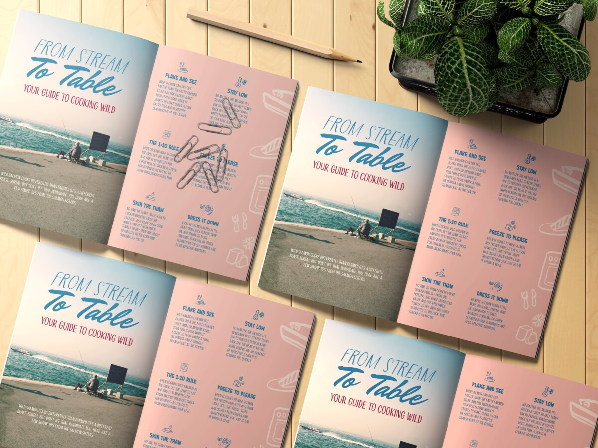
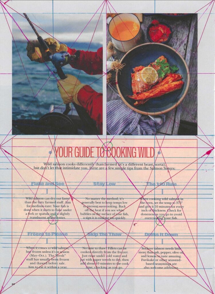
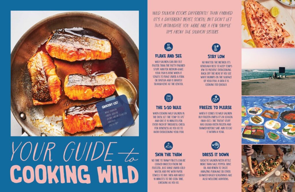
This editorial is very symmetrical and balanced as the text and images take up the same amount of visual weight. The talking points are also in an even number and the length of the copy is the same.
Typography
There is a condensed sans serif typeface for the title, bold sans serif sub headers, and serif body copy to establish hierarchy with scale of type. Mostly for contrast and juxtaposition. Text is centered throughout to draw the eye straight there and to maintain symmetrical balance.
Colors
Colors are neutral and muted, utilizing a salmon pink to connect the audience to the editorial content. Sub headers are blue, most likely in relation to the ocean/water, and title is red, offering nice contrast. Images also use the same color palette with reds and blues.
Juxtapositions
Page is divided into 3 sections with 2 being images and 1 being text. “Your guide to cooking wild” sits at midpoint of page and the first row of text sits at midpoint of lower ½ of page. Focal point in images also sit at midpoint of the top ½ of page. Baseline of sub headers align with each other as well as the body copy. Negative space is used heavily around the text for easier readability.
10 Criteria for Evaluating an Ad
The most noticeable criterion in this editorial is “Present sequence logically”. There is an unmistakable entry point with the title being larger in scale and the points are easy to read and sequential. The designer did a great job presenting and organizing the information and guiding the reader through.
Concept Development
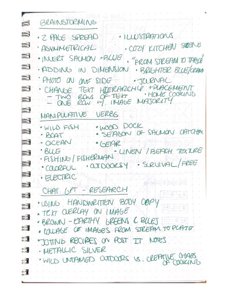

Brainstorming
We worked together to ideate existing ideological aesthetic cultures pertaining to cooking and wild fish. This includes compositional elements, photography, color palette, and words associated with the editorial. Brainstorming was quick and we wrote down any and all ideas without spending too much time explaining.
Research
We then took to google and chat-gpt to research more thoroughly. Through exploring associated words and different aesthetics, we settled on a “cozy kitchen scene” where the author might have jotted cooking tips down in a journal. We also explored a different tagline that more closely matches our redesign.
Sketches
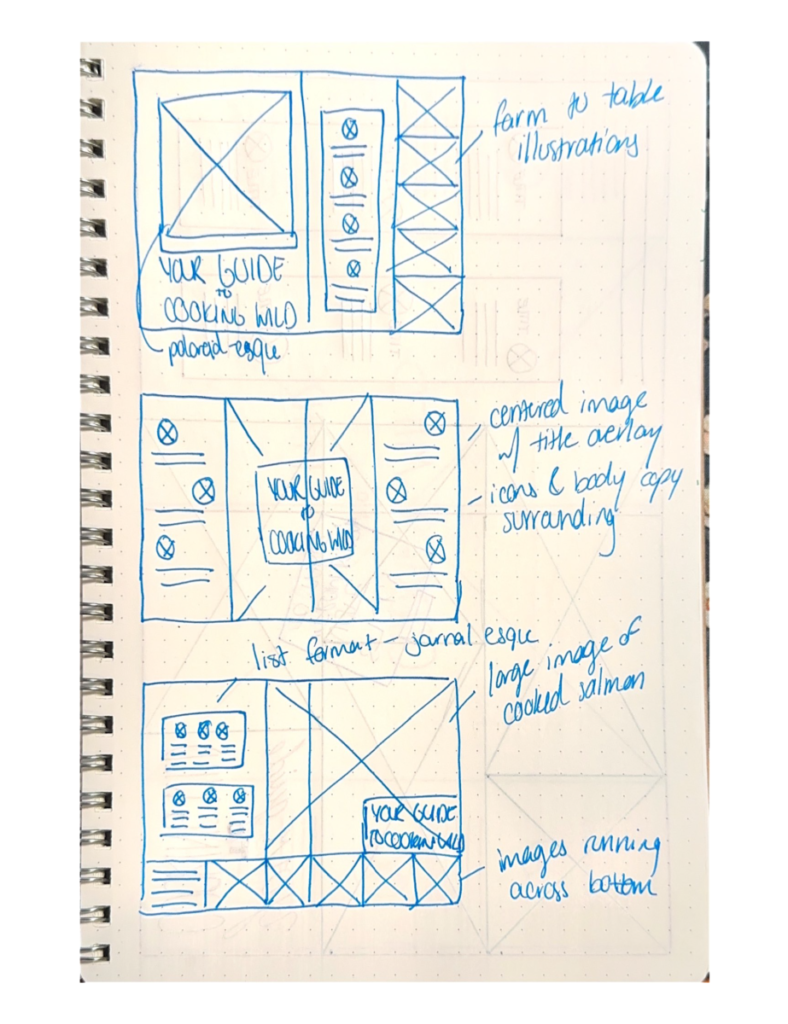
Sketches were done on both paper and digitally and loosely mocked up to understand composition and layout. We abstracted the content elements to play around with the arrangement.
Design Development

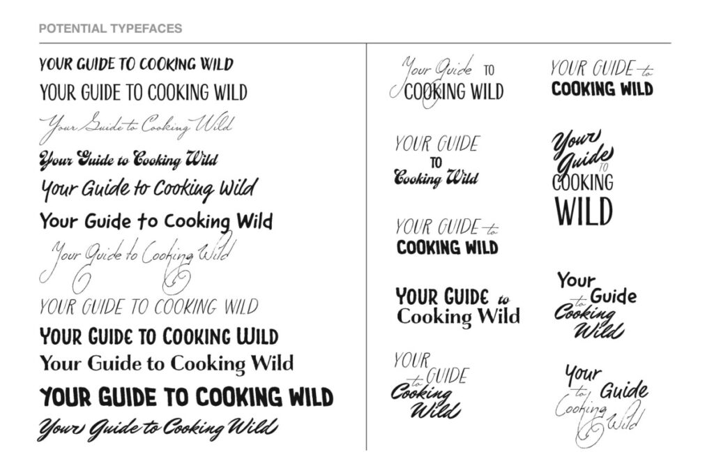
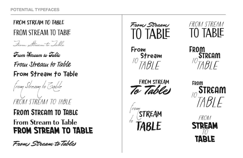
Type Exploration
Since we decided on a cozy kitchen scene, the typography had the potential to drive that point home. We focused on brush script contrasted with leggy rough handwritten typefaces. There were multiple explorations done with varying combinations of typefaces. Some utilized 2 lines while others went up to 4.
Color Exploration
We decided on a more vibrant electric color palette that still related to salmon and the ocean. We experimented with earthy tones and neon tones and corresponding harmonious shades.
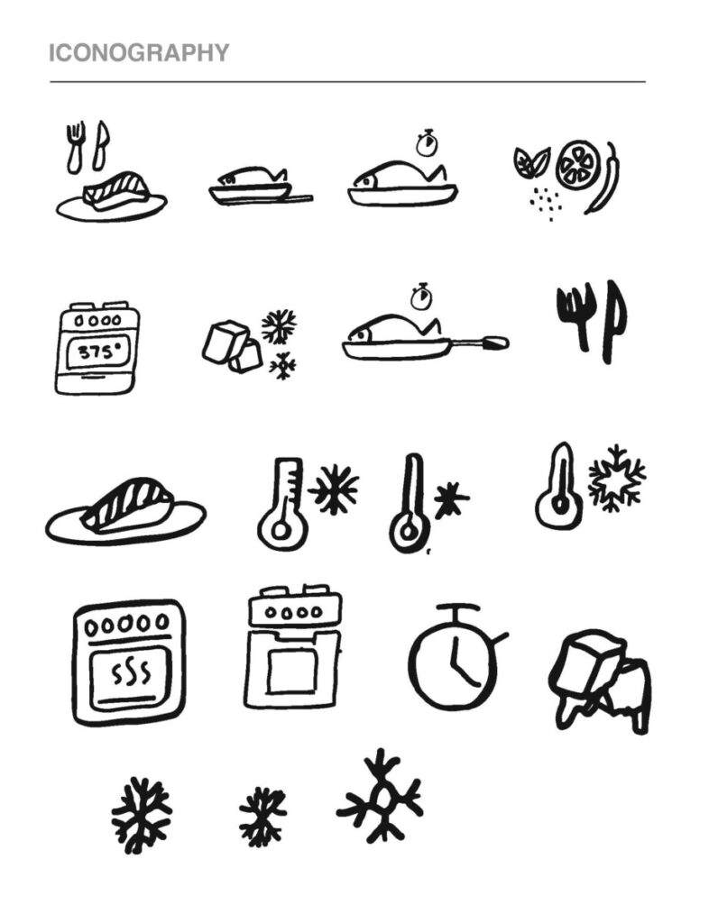
Icon Exploration
From the theme of a cozy kitchen scene, we knew we wanted to include illustrative icons. The icons were hand drawn then brought into illustrator to preserve the look. Multiple variations were done of visual representations of the editorial copy.


Spread Drafts
After analyzing the original editorial we discussed turning the single page editorial into a spread. So we thought one full page of imagery and the other of text with possible imagery. In our drafts we played with color, fonts, placement and different imagery to see what gave us the best outcome. We battled between the use of two different headlines. In some explorations we played around with the small icons and how they are framed to give the page some character so it wasn’t just plain type.
On some explorations we even added a post – it notes to give the page a more of a notebook feeling. Since the editorial was based on tips for cooking wild we explored the notebook idea to have it play as notes someone took while they were fishing and cooking to better help them next time or to help someone else. We designed to the theme of cozy, familial, and inviting.
Final Deliverable
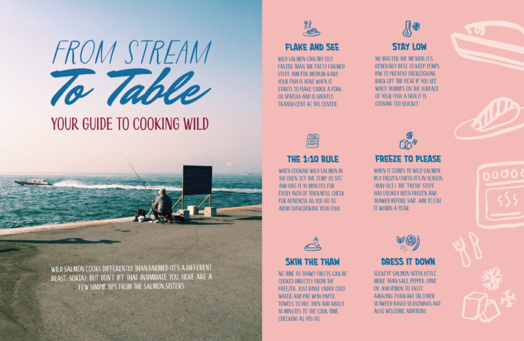
On our final design, we deconstructed our drafts and picked out the most effective parts. We used both taglines together and removed the post it note as we thought it was distracting and took away from the design. Colors were streamlined into 3 and the icons were added to the margins of the page instead of photos. We settled on one impactful image that told a story.
The final product design looks in line with Bon Appetit magazine where the editorial originated from. The pink and blue create a more personable and inviting feel for the home cook. We used a three column grid for the copy to present the sequence logically and separated the icons and the copy through color. We also reduced the opacity of the icons to bring hierarchy to the text. The design is inviting and playful, utilizing high visual magnetism.