Welcome!

Your ePortfolio can be both a Journal and a Portfolio. By default, the Journal is hidden from the navigation menu. To use the Journal and create posts like this one, choose Appearance > Menu and add Journal to your main menu and then save changes.

This is your first Journal post. Edit or delete it and create a new post to get started!

NOTE: Remember to add appropriate Categories and Tags to your posts. This will help your professors and other visitors find the content they are looking for. The Category “Announcements” has already been applied to this post. Feel free to make changes!

Ethics in Design 2A

In the past, I would say that I was influenced by other designer’s work. Never have I once used another designer’s work for my own gain as I believe it stunts my own growth. Being able to find and adapt your own style and appeal is unique to me and every other designer. However, within the field of graphic design, one can say that there are many familiar repetitions with the way certain designs look. I was taught by many designer’s in the industry that looking through artist’s catalogues is okay, as long as you don’t copy or steal their work. It’s important to see what you appeal to as it helps you grow and develop your own styles within said branches. As a designer/artist, you should adhere to the principles of integrity for both your colleagues and clients. According to the “AIGA’s, A Client’s Guide To Design”, it states “A professional designer adheres to principles of integrity that demonstrates respect for the profession, for colleagues, for clients, for audiences or consumers, and for society as a whole.” Breaching such standards can put you at risk to legal actions/repercussions.

While reviewing the Fairey Copyright Case, there are some clear evidence of a breach in copyright laws. Although the Associated Press took the photo of then President Barack Obama, Shepard Fairey took that image and digitally altered it to create a movement during the time. The issue that I see the most within this case is that Fairey generated more than $400,000 off of his altered renditions through stickers, posters t-shirts, and more. He also gained notoriety and recognition nationwide due to the use of the Associated Press’s image. However, in the end, both sides decided to come to a mutual agreement. Their goal is to work together going forward and sharing the rights to make content with the Hope image. This case proves to show how Copyright laws can be in favor to some parties. As a designer, it’s always important to let others know that you own the rights to your work, as long as it’s copyrighted/trademarked. Therefore, it ensures that no one has both the access and rights to use your content in any shape or form.

Citations:

Kennedy, R. (2012, September 7). Shepard Fairey is fined and sentenced to probation in ‘hope’ poster case. The New York Times. Retrieved October 8, 2022, from https://archive.nytimes.com/artsbeat.blogs.nytimes.com/2012/09/07/shephard-fairey-is-fined-and-sentenced-to-probation-in-hope-poster-case/ 

“Use of Photography” AIGA. (2001). PDF. New York City; Richard Grefé, AIGA. 

Ethics In Design 1A

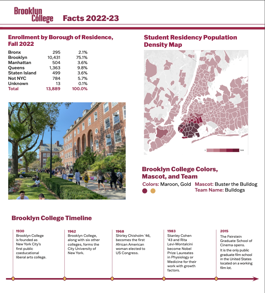
Within my internship, I have completed all of my duties as their graphic design intern. I ensured that I adhered to all ethical principles within the AIGA guidebook when completing any and all assignments. For each and every project that was given to me, I needed to make sure that my images were complaint to that of Brooklyn College’s guidebook. With that comes with both the sourcing of my images and any of their trademarked products and logos. With careful consideration, my supervisor provided me with the college’s brand guide which contained the colors, logos, textures, visual elements, etc. This helped guided me to creating something unique for the college when it came towards me creating some of their publications. However, it’s important to note that we picked the right images. Failure to do so can lead to some action from the college, hence why it’s critical to read the guidebooks provided. According to “AIGA Business Ethics, Use of Photography”, it states “In the first instance, the designer must consider what rights will be transferred to the client. Rights can be limited in many ways, including the duration of use, geographic area of use, type of product or publication, title of the product or publication, and whether the use is exclusive or nonexclusive.” Since being given permission by the college itself, any photos that I used for any publication pieces that I’ve developed within the college has been cleared. Fortunately for me, one of the projects that I’ve developed for Brooklyn College has been cleared and was ready to print.

During the duration of my internship, I did not have to sign any confidentiality or non-disclosure agreements. However, it’s important to note that publishing any project(s) that I completed for Brooklyn College onto my personal portfolio or journal entries needed permission. Our supervisor provided us with a Google drive file that contained every asset that we needed for creating any of our projects. Although, me and my team were given other files from past design interns, we had a responsibility to not tarnish their work. According to the “AIGA Business Ethics, A Client’s Guide to Design”, it states “A professional designer shall be objective and balanced in criticizing another designer’s work and shall not denigrate the work or reputation of a fellow designer.” When given an assignment by our supervisor to tweak or update old files, we’re not meant to tarnish their work. With more and more interns coming in to intern under the college, it’s going to be a continuous cycle of reusing files to update according to their needs.

Citation(s)

“Use of Photography” AIGA. (2001). PDF. New York City; Richard Grefé, AIGA.

“A Client’s Guide to Design: How to Get the Most Out of the Process” AIGA. (2001). PDF. New York City; Richard Grefé, AIGA.

Blog Entry #4: A New Beginning

This week has been slow, but in some way its pacing well. One of our major assignments which is the campus’s infographics, is due at the end of October. For now, my team has been given a new task, creating zoom backgrounds. Currently the provost of Brooklyn College doesn’t like the way they have their zoom backgrounds set up. It has a grey and dark tone that sets up as an eery feeling, in which in many cases isn’t very appealing. So me and my team were told have a background that has a green or blue background that can compliment the white Brooklyn College logo. We also have to add two additional logos we had to include which were the University of Florida and Next Generation Assessment (NGA). Each of my teammates had to create two different ideas for backgrounds to be reviewed. This process went on for a few weeks alongside some smaller projects.

Blog Entry #3: Getting Comfortable

I’m currently still in my internship for Brooklyn College and it’s going great. We’re currently in the phase where we are recreating the college’s 2023 infographics. This requires us to input a lot of information, graphs, data, and even statistics. This just shows Brooklyn College students an idea of what the college is currently doing and what they could learn from the college. As of now, me and my team had to pick out pages of the file to alter and update. I currently went with page three, which requires me to create graphs within illustrator that highlights the statistics going on within BC’s campus. One thing that I took away from this week of my internship was that if one of our projects has been selected for publication, it has to go through the provost. She’s not only able to produce the material, but she also gives us some feedback to tweak within our work.

It’s been a slow week within my internship. However, we always have weekly meetings, usually in the mornings on Thursdays. During this time, we discuss future projects and also share the work that we’re currently working on. It’s also a good time to not only get feedback from our supervisor, but from my fellow teammates. I’m currently still learning a lot more about publication design and creating pages that deals with tons of content and type.

Blog Entry #2: Settling In

After a few weeks of settling into my internship, I can say that it’s going a little slow. In all honesty, that’s expected because we’re still figuring out how to go about the assignments and how me and my team can be of help to the Brooklyn College team. With that came our first assignment and that was to create a series of covers for the college’s “Strategic Plan Scorecard”. However, we had to adhere to the college’s branding which meant to use their fonts, colors, patterns, etc. The only part in which we were able to have some sort of creative freedom was to source hi res images of the campus. The images could be sourced from Google or any license free website. I’ve decided to go to Flickr, which is a site in which people can download free images and have access to public domain artwork/images.

Using this opportunity, I’ve decided to find at least three beautiful images of the campus that can be used for my covers. However, we had to be careful of the images we either took or chose because it can bring up legibility and color concerns. Images with bright backgrounds can impede lighter colors of type, which the college utilizes for their publications. After some minor tweaks of my covers with my supervisor, I’ve received an email saying that the provost of the college chose one of my covers as their final selection. There were also some little changes they wanted me to fix with my supervisor, but once that was done, it was ready to be published. This project took a few weeks to work on due to the amount of work/revisions I had to do, but it was fun nonetheless. Attached is one of my covers that was selected for publication. Note: There were some minor tweaks of this cover after.

Entry Blog #1 – Introduction

During the summer, I had a lot of time to figure out what internships to apply to and which ones could help me expand my skillsets further. I’ve applied to various internships which all ranged from paid, non-paid, or even work for non-profit organizations. Although, my goal was to find paid opportunities, I realized that not many were offering any for the fall semester. Therefore, I needed to figure out which places that I see myself the best in. Although, I’ve had many offers for internships, many of them were only in-person studios which interfered with me having to go to work. However, upon scrolling through COMD’s OpenLab Internship Coordination site, I found a post for Brooklyn College looking for design interns. I realized that they focused more in publications, which was definitely an area in which I wanted to tap more into. After submitting my portfolio, cover letter, and my design resume to the college’s coordinator, I’ve heard back from them within two weeks. Keep in mind this was during the middle of summer, so many of the staff were still on vacation.

After hearing from them on how great my portfolio and resume was set up, they gave me a formal interview. During the interview, I was asked where I see myself in design, my design experiences and where I would see myself in my career’s future. After everything going incredibly well, I was offered an intern position at Brooklyn College. Since I was working in the summer and with it being less work, I asked my internship coordinator if I could start earlier. She later agreed and started giving me some work that I could do, which was also good for some early hours. Finding an internship is fun, especially when it comes to a spot in which you could see yourself at. I also find it extremely important to network and connect with other designers who may have opportunities for you. It’s a great way for you to step into the design industry and see what they have to offer!