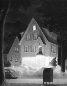
I had never heard of Chris Van Allsberg until last class but this image, The House on Maple Street was the one that appealed instantly. I personally don’t like pencil shading because I have a tough time doing it but this work was impressive to me. I really like the way he simply has less shading on the bottom of the house, which makes it look like there is some kind of bright like coming from there. Because of that bright light this picture reminded me of the move Home Alone, specifically the part where the kid puts on bright Christmas lights to scare off robbers. The shading makes this picture remind me of that scene, it looks like there is snow on the ground due to the light shading in the road. I think the house is supposed to be taking off due to the caption “It was a perfect lift off” but to me it looks like light.
Category Archives: Discussion
Week 4 Reading
For the longest time I was confused, wondering who the heck this Burdick guy was and why couldn’t I find his original works anywhere?? Took me a moment to realize he’s made up -__-
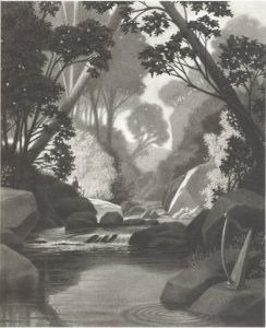
I’m a huge scaredy cat so the majority of Van Allsberg works looked like the beginning of horror movie premises to me and it bugged me out. Until I came upon The Harp. It made me feel tranquil and at ease looking at what I would imagine are lush greens and a soft steady stream flowing center stage. Then I read the caption, and it didn’t scare me! It actually added more to my own little head canon about what could be happening in this corner of an “enchanted forest.”
Week 4: Reading
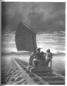
I chose this because it appealed to me. When I saw this picture I wondered what are these kids doing? and then I saw these kids are sailing but on a train tracks. I found that weird but surprisingly it was also interesting It made me think how did these kids come up with such an idea? It also shows that these kids have imagination they are imaging that they are on a boat sailing on the open ocean. This picture also gave me a calming effect when I saw the horizon. It gave the effect of a sunset you see at the end of movies.
Reading: Week 4
There is an enigmatic force throughout the illustration. This is the technique that is used to make your eyes wander around looking for clues and hints as to what is going on. Sometimes an illustration tells a message that is much deeper than what we can assume and most of the time that is what we are doing when observing. What could this character be thinking of? Who/what is that? Where are they? Where are they looking? Put yourself in the shoes of that body and see what they’re seeing. Keep looking.
Reading
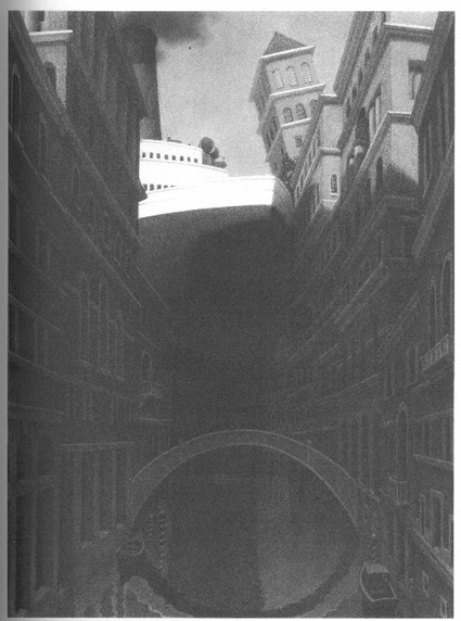
I wasn’t actually drawn to this picture at first it was so dark I kept bypassing it when I was looking at the google image page, it wasn’t until I came across the image close-up that I could make out what it was. The light value draws your eye in, but the shape is not one that is easily distinguishable from far away and once you learn that it’s a ship it is in your face and right in front of you, the perspective and darkness really gives you the feeling like you are trapped in the canal about to cross paths with an ocean liner.
Response to Reading
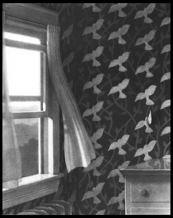
This appeals to me because of how subtle the drawing as a whole. When I first looked at the image I couldn’t understand how is was known as a piece by Harris Burdick because it looked like a regular picture of a room. It wasn’t until I noticed that the piece, like every other Burdick piece has a “supernatural” quality. The quality I’m referencing is the wing of one of the birds is flying off the wall. This piece stuck out to me because it made me think of how one little aspect of a picture can change a view about what the picture is suppose to make the viewer interpret.
Pen and Ink Tools – Part 2
Pen-and-ink Drawing Surfaces
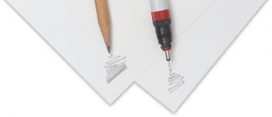
Pen-and-ink drawings are usually created on different types of paper. The tooth or grain of the paper can affect the marks made by the pen. Because of this, most illustrators prefer to work on smoother surfaces that are still absorbent to the ink, creating detailed ink drawings in this way.
You can use ink to draw on your sketchbook paper, but over time this paper will warp or fray with the wetness of the ink. The paper in this sketchbook simply isn’t heavy or absorbent enough. For final work, illustrators usually choose something with a little more heft.
Paper
Bristol Board is a smooth-surfaced paper that’s heavier than regular drawing paper. It’s a popular choice for pen-and-ink drawings.
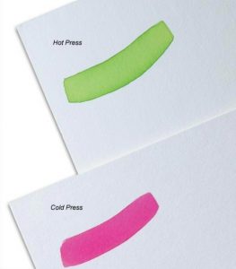
Another popular choice for ink drawings, and the paper used for this class, is hot-press watercolor paper. Hot press refers to the method used to make this special kind of paper. This paper’s surface has been ironed smooth, and is very versatile, allowing artists to make fine details in ink as well as combine other media such as watercolors or colored pencils.
Pen and Ink Tools – Part 1
However, an almost endless number of pen and ink tools and techniques exist, and it’s highly recommended that you experiment with as many opportunities as possible within this amazing medium. Some substantial differences exist between tools; it’s likely you will prefer some over others. Take the time to experiment and discover your own interests and comforts
In this and subsequent posts, we’ll cover the most commonly used pen-and-ink drawing tools and materials. In addition to the obvious ink-specific tools such as pens, brushes, and paper, you may also need to acquire paper towels, white-out pens (useful for reproduction work), an old toothbrush, and a water jar.
Quills
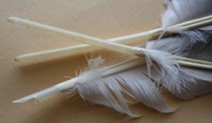
The first pens were made from feathers (quills), bamboo, or reeds. Usually, quills are created from the wing feathers of geese. Other common feathers used for quills come from the crow, eagle, owl, hawk, swan, and turkey. These feathers are carefully treated in order to retain their shape despite frequent wetting and drying. The hollow shaft of the feather acts as an ink reservoir, and ink flows to the tip by capillary action.
Crow Quill
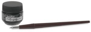
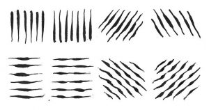
The modern version of the traditional quill—the steel dipping pen, or crow quill—remains widely used by illustrators today. This pen is included in your supply list and is the one recommended for use in this course. A quill pen can produce either very delicate lines or thicker, more dramatic ones. It can also produce lines of varying width. Check out all the varied lines produced by a crow quill in the next image. When you press down on the crow quill, more ink is released, making the line thicker. Apply less pressure, and the line becomes thinner. This allows your line to vary from thick to thin and visa versa without having to change the position of the pen.
Aside from the traditional look it gives an image, a crow quill helps to develop hand techniques that are needed for all drawing media. When working with a quill, you must learn to control the pressure that you apply to the nib in order to vary the weight of your lines.
Crow quills are made of both a holder and a nib. The nib is the metal point that you dip into the ink. They come in a variety of sizes and with a variety of point shapes (pointed, angled, or rounded), but all are flexible, have a small hole or reservoir, and are split at the tip, thereby allowing the ink to flow onto the work surface. They also work on the same principle as the feather, sucking up the ink through capillary action. You’re encouraged to experiment with several different types and sizes of nibs in order to see how they all perform differently.
Caring For Your Crow Quill
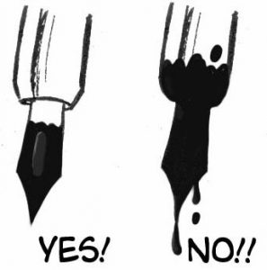
When using your crow quill, don’t dip it into the ink past the nib. Doing so will cause messy, uncontrollable drips on your artwork and will also damage the pen, shortening its life. Dipping in just past the reservoir is ideal.
Drawing Pens
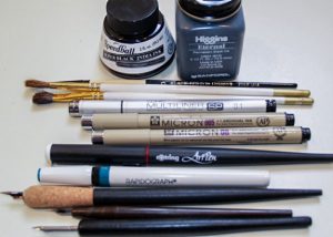
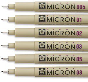
These drawing pens are similar to a felt tip pen, but they use archival ink. Several different brands exist but the most commonly used are the Microns pictured here. Various point sizes make it easy to control line weights. These pens are often used for sketching, particularly for comic book art and illustration. Again, note the consistent line weight and various sizes, each of which is ideal for different purposes. You’re highly encouraged to try using these pens if you haven’t already done so.
Brushes As Drawing Tools
Watercolor brushes and brushes for working in ink are generally the same: they both use water as the dilution and clean-up medium. However, keep in mind that once a brush has been used for inking, it’s difficult to get perfectly clean again, so be careful that leftover ink doesn’t stain your artwork when subsequently using other media. Keep in mind we are specifically discussing drawing here; painterly brush techniques will be covered in later modules.
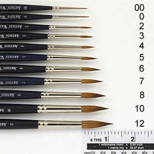
Brushes used for drawing purposes are generally of a smaller gauge. Though the sizes of brushes you’ll use will vary given the size of your picture (the larger the picture, the larger the brush, in general), good sizes for general inking—such as comic book style illustration—are the number 0 to number 3. These allow for both thicker and thinner lines, but will also give a “drawn,” as opposed to “painterly,” feel.
Also similar to the style produced via crow quill, a brush allows for line width variation based on pressure. For this course, drawing with a brush in addition to the crow quill is recommended. Take the time to practice with both.
Caring For Your Brushes
Don’t dip your brush into the ink all the way to the metal. This will make for a messy drawing tool and will shorten the life of your brush. Clean your brush every time you’re finished using it. If you plan to use it again in a short time, rinse it in water that’s completely clean. Don’t leave your brushes sitting in water for long periods of time, as this will damage your brushes’ tips. In general, it’s better to periodically wash brushes with soap and water, which will not only keep your brushes in good shape but will also ensure their ability to manipulate ink effectively. Don’t use turpentine or other hard solvents to clean, as they’re unnecessary with ink and will deteriorate the hairs on your brush.
Response for Reading
Yuko Shimizu uses Google Map to “Located” the locations in her work. By using the Google Map, she can get the locations and draw as references. This helps the view of the illustration more realistic with full details and texture. She uses these reference drawing as the locations background in her work, that makes her work more to the live and unforgettable.
Week three reading: Role of reference
Illustrator Yuko Shimizu uses google map to help him with his drawing during horrible weather, which he couldn’t attend. By using references from Google for certain place or building he was going to draw for concept. The thing that interested me when “A girl with the dog is based on one of my students who had to give away her dog to the neighbor and feeling sad, so I decided to draw her with a dog happily taking a walk”. Which in my opinion that was interesting to do.

