Deepti Sunder
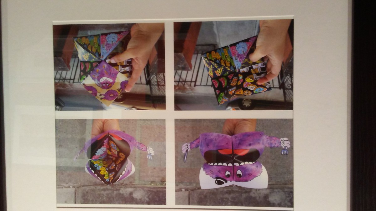
Herbert the Hungry Monster Fortune Teller
This piece was on the second floor of the Society of Illustrators. The second floor held an exhibition titled MoCCA Arts Festival Awards of Excellence. Sunder is a modern illustrator who came to America from India to pursue art. Right now she’s studying at FIT for an MFA in Illustration. Her style is very bright, colorful, and cartoony. However, if you stumble on her Behance there are some really well done illustrations that were even made for children’s books. In an interview about the book: Bonkers the interviewer asked Sunder about how her process works. She says that she tends to (like Professor Woolley has been saying all along) that she starts off not too rigid. Depending on the client, she creates rough sketches then sends them to her editors, sees what she needs to tweak up, then sends the complete sketches and SHAZAM! Bam, bam, thank you ma’am there goes her completed projects.
What drew me to this piece, Herbert the Hungry Monster Fortune Teller is how its an actual fortune teller. I also like the illustration and how it really captures Herbert. Based on the illustration you can tell that Herbert is a Hungry Monster Fortune Teller. I just thought it was very creative and I love how she took this concept to more than just drawing a hungry monster on a flat sheet of paper. She mentioned in the interview that she does most of her work traditionally and with dry media but she said she would love to tamper with digital work and she has gotten interested in watercolor, so I would love to see how her process was when she created this piece. Granted, this interview was in 2014 so she probably already tampered with it. Then again she might have already graduated. She could have been able to do this digitally. Though the textures in the image feel more traditional. Unless the robots known as Photoshop made a really cool texture brush or something. Anyways, Herbert the Hungry Monster Fortune Teller is sitting pretty on the second floor in the Society of Illustrators so if you didn’t already check it out there or on her Behance. It’s really cool!

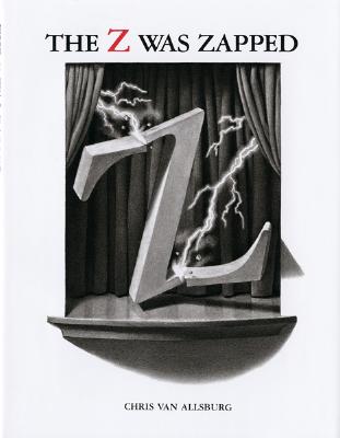
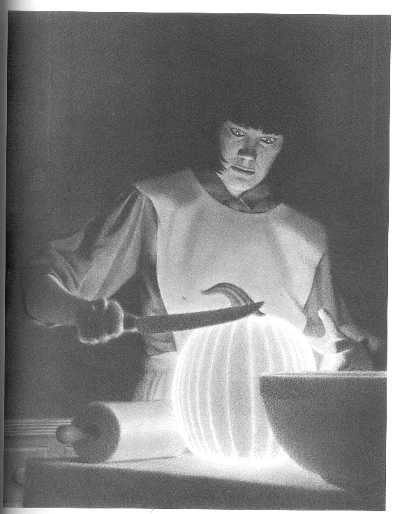
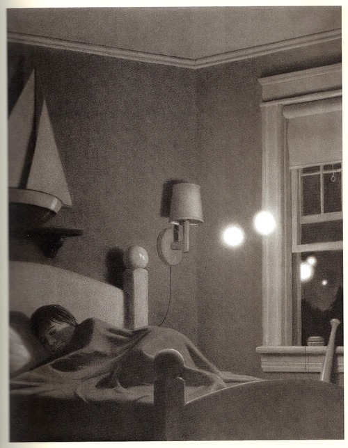
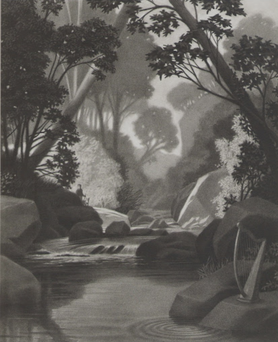
 Society of Illustrators