Expressive Line : Master’s Study Egon Sheile & David Mack

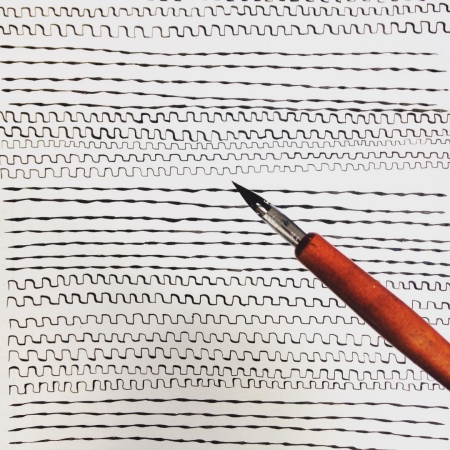
Lines are where most people begin when first starting to draw. By themselves, lines are powerful drawing tools! They have shape, texture, and weight, all of which can add up to a very expressive drawing if you’re thoughtful about their creation.

1468363023016

When beginning a drawing, people often carefully inspect an object’s outside edge, or silhouette, as a starting point. They render each line representing an edge or contour. Next, people usually fill in those contours with value.

However, so much can happen using just line alone! A line by itself is capable of conveying all sorts of emotions. In your drawings, lines can and should have life.


Try this

ill_232_v9_m5_p6-lines

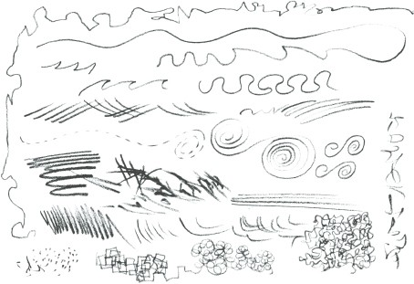
In ink take five minutes to draw as many different kinds of lines as you can imagine. Try different movements with your hand, drawing lines from your wrist, your elbow, and then your whole arm. Try different amounts of hand pressure, creating straight lines, parallel lines, curves, and spirals. There’s no wrong or right answer here! This freeing exercise will help open up your expressive drawing skills, warming you up to this medium.
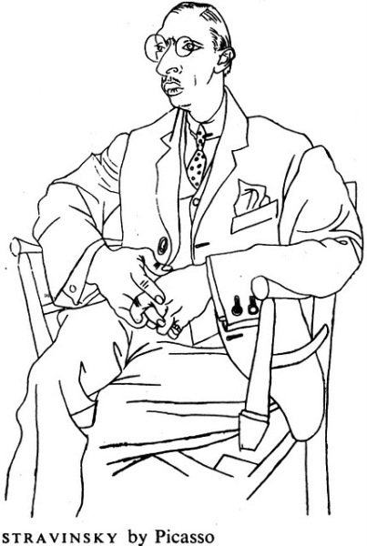
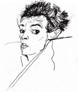
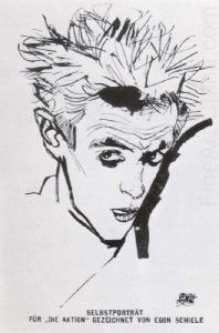
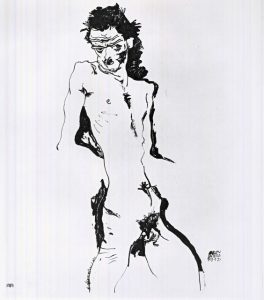
Egon Schiele

German expressionist Egon Schiele is a master of the living line. In these images note how he uses nothing but varying kinds of line in order to imbue these portraits with interest and emotion.

Line Weight

Part of what we see creating the sense of liveliness and emotion in Schiele’s lines is an incredible understanding of line weight.

Line weight is an important drawing concept. Different tools create different kinds of lines, and allow us different methods of varying line weight. A line’s weight, meaning how dark or thick it is, will make that line either move forward in an image (if it’s a strong, dark line) or sink farther back (if it’s light or thin). This is useful when trying to give the impression of something being closer or further away. A heavier line weight will also create emphasis on a particular area of a drawing, which is of course useful in creating our focal points.

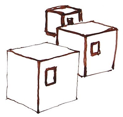
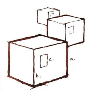
In the two images shown here, note how the image on the left is logical. The closest block is also the one with the thickest contour line, which makes visual sense. However, in the image on the right, the line weights of the blocks don’t follow the correct hierarchy, as they don’t recede in space logically.
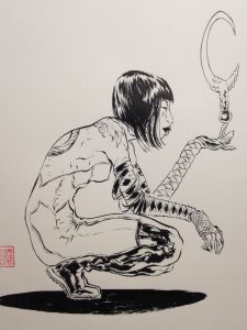
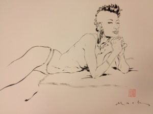
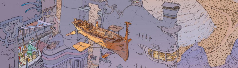
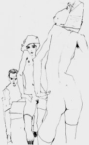
David Mack

David Mack, contemporary comic book illustrator and creator, is known for his linear figure drawing style. In the next series of drawings, notice how Mack uses only contour lines in order to describe the body. It’s useful to note that he cites Schiele as an influence to his work. His expert use of line weight is especially obvious in the implied shadows that convey a feeling of gravity entirely though varying thickness of line.

Color Theory Review: Concepts and Terminology

The Three Attributes of a Color

To accurately describe a color and differentiate it from another there are 3 attributes to measure.

1466095636630

 HUE

When the average person says “color” they are actually mean hue. The hue of a color is its particular light wave energy frequency. Remember, light is waves of energy, and white light is contains all possible colors! Violet is the highest visible light frequency and red is the lowest, which we humans have receptors to see.

In this diagram, note how the blue becomes pink, but all of the colors in between are of equal intensity, as it as it moves from right to left.

SATURATION

Saturation (or chroma as it is sometimes called) means a color’s purity. When people are talking about a color’s intensity they mean its saturation or chroma.

In the diagram, note how the blue becomes less saturated as it as it moves from right to left.

VALUE

As we discussed earlier in the course, colors have values just as shades of gray do. A color’s brightness or darkness, and its nearness to white or black respectively, is the color’s value. Value is independent of hue or saturation and can be seen even in a black-and-white photo.


Tints, Shades, and Tones

 Value has is has its own color terminology.

Remember that the value of a color is how light or dark a color is, or how close it is to black.

Tints are when we add white to a pure hue:

1466095651592

Shades are when we add black to a pure hue:

1466095660440

Saturation also has its own color terminology.

We get different tones when we add gray to a pure hue:

1466095671579

Another way to envision this is as the hue itself becomes less saturated, it appears more and more gray.


Munsell’s Color Tree

Talking about color can be very misleading! For example, when you go to a paint store, you can buy a can of Honorable Blue, Flyway, or Wondrous Blue! When we say Flesh Tone, what exactly does that mean? Whose Flesh Tone are we talking about?  It can be very confusing!

1409346652367

Albert Munsell, an artist and professor the Massachusetts College of Art and Design, felt the same way. In 1905 he developed a “rational way to describe color” using numeric notation instead of names to describe color. To assign these numbers he used the three attributes we discussed above: huevalue, and chroma (saturation).

1409346684313

In the diagram above, you can see the traditional color wheel as the center ring, and Munsell’s Color Tree, as it came to be known, growing from the center. The trunk of the tree represents zero to ten in value. The farther we move from its “trunk” represents an increase in chroma, until the hue—represented by the separate “branches”—is at full saturation, farthest away from the center.

 1409346719572

Munsell’s Color Tree


Now Lets Learn to work in a LIMITED PALATE.

And a MONO CHROMATIC PALATE


Working in Color: The Basics

Featured

Color is one of the most powerful aspects of making art. Almost everyone who loves to create can remember the childhood excitement generated by a brand new box of crayons!

1466032830041

Everyone has a favorite color, artists and non-artists alike.  Our relationship to color is one of the most powerful relationships we have as a species. It is intrinsically connected to how we relate to our world. And so of course it is one of the most powerful aspects to consider when making art.


Color Temperature

 Much of our relationship to color is based on instinct. For example, we see colors as warm or cool based on our physical response to them.

1466033269032

Warm things are warm colors (such as fire, the sun, hot coals, and in this case hot food.)


1466033283844


and cool things are cool colors (such as water and ice, which as blue or bluish).


1466033301650


Interestingly warm and cool colors also create a sense of perspective and depth when we look at an image. Warm colors tend to advance towards us, whereas cool colors tend to recede away from us.


In these two images note how early 20th-century illustrator Edmund DuLac uses this trick. In the first image of The Princess and the Pea he creates a sense of incredible height, as the cold blue-purple recedes from the viewer, effectively raising the height of the bed canopy. And in the second one, A Palace of Wonder, a sense of depth is created between the warmth of the interior space and the cold dark outside.

1466033989719 1466034009733


COLOR AND CULTURE

However, a great deal of our reactions to color are not innate, they are in fact cultural. For example Black and Death are associated in many Western cultures, in many Eastern cultures it is associated with white—its direct opposite.

Take a look at this info-graphic. Note how many color associations change, depending on where you are in the world. However also note how HOT and COLD or Color’s Relationship to Temperature do not.

It is however important to understand your target market and the culture that they come from, because culture has a strong influence on the development of cultural-color associations in childhood building the adults eventual perceptions of color.

It is however important to understand your target market and the culture that they come from, because culture has a strong influence on the development of cultural-color associations in childhood building the adults eventual perceptions of color.


Throughout this module and the next we will look at these basic reactions we all have to color and learn to compose in color effectively. We will build on what we have learned regarding composition, concept, point of view, and value and we will see how we can use these reactions to color to aid us in our ultimate goal, telling a great story through narrative illustration.


However, before we can do that lets be sure we have down the basics.

NEXT STOP: The Color Wheel

THE COLOR WHEEL

1466034999442

YES, you painted one of these in Kindergarden. I know. However the usefulness and knowledge that can come from this tool is limitless. So please let go your preconceptions toward color, and using a color wheel and come into this with an open mind.

The color wheel is one of the most powerful tools artists and designers have to help us understand and use color effectively.  It is strongly recommended that as you examine the different color schemes thought this post and the following, you look at a color wheel and plot them out.

1466035082557


FUN FACT! The first circular color wheel was created by Sir Isaac Newton in 1666. As if the laws of planetary motion and gravity weren’t enough!

1466094968998

Foto: picture-alliance


1466095035989

We begin with a three-part color wheel that shows only pure colors, meaning colors which no amount of mixing will result in. These three colors are of course our primary colors: red, yellow, and blue. All other colors are derived from these three hues.


1466095027770

Next we move on to our secondary colors. These are the colors formed by mixing the primary colors with each other: green, orange, and purple.


1466095133395

You can further break down the color wheel into tertiary colors. These are the colors formed by mixing a primary and secondary color: yellow-orange, red-orange, red-purple, blue-purple, blue-green, and yellow-green.


1466095577744

And of course we divide that wheel based on Color Temperature, with warm color opposite cold.


To create a successful illustration, your color palette or scheme needs to support your big idea. It must work to further your narrative and or concept.  If you have already taken Color and Design, you will have worked with various color schemes.   In the next few posts, and in the remaining weeks of class, you’ll look review color theory in detail, and see how those color schemes can influence narrative. We will also look at how they are applied in both fine art and in contemporary illustration
1466095598653

Drawing by Philippe Buchet, Color by Matt Hollingsworth


NOW lets get deeper into some real COLOR THEORY!

ALL GOOD ART IS POLITICAL exhibition

Hey Class!  You have the opportunity to see some pretty incredible art- go check it out! …

ALL GOOD ART IS POLITICAL
Käthe Kollwitz and Sue Coe
October 26, 2017, through February 10, 2018

GALERIE ST. ETIENNE
24 West 57th Street, New York

Join artist Sue Coe in celebrating the
150th anniversary of the birth of Käthe Kollwitz
Exhibition preview October 26, 6 to 8 PM

http://gseart.com/gse-pages/Current_Exhibition.php

Inking Tips and Tricks (This and TONS more INFO in RESOURCES!)

Ink can be a messy medium!

Before you begin your work in this medium, here are some helpful tips and tricks.

1472596863412

  • Always warm up.

Just as you would warm up before exercise, warm up before using ink. Take the time to work on your lines and strokes on a separate sheet of paper before you begin working on your actual illustration. This will ensure that you have proper command of your hands.

This image is of comic book artist Jacob Halton’s inking warm-up, which he does in the morning to “get command of his hands”.

1472596872881

  • Don’t tape down your page.

Marks are easier to make when moving your hand in certain directions, so move your page around in order to make this possible. Work your hands in the way that they move naturally.

  • Begin with thicker lines.

This is a way to keep warming up your hands. Thicker lines are safer to work with until you feel confident enough to move onto the drawing’s fine detail portions.

  • Work in a way that minimizes smearing.

Don’t try to work on the illustration in a left-to-right method, or in any order like that. Instead, think about where your hand may smear the ink, and work in a way that minimizes that smearing. Some artists place a piece of paper or paper towel under their inking hands in order to help with this process.

  • Address large areas of ink last.

All paper, including watercolor paper or Bristol board, will warp when wet. It’s much easier to draw controlled lines on completely flat paper. Therefore, draw your lines before soaking any large areas with ink, otherwise known as executing an ink wash. Another method is to fill in large areas of ink, and then either allow for drying time or use a hair dryer before moving on to finer details.