Field Trip to The Society of Illustrators

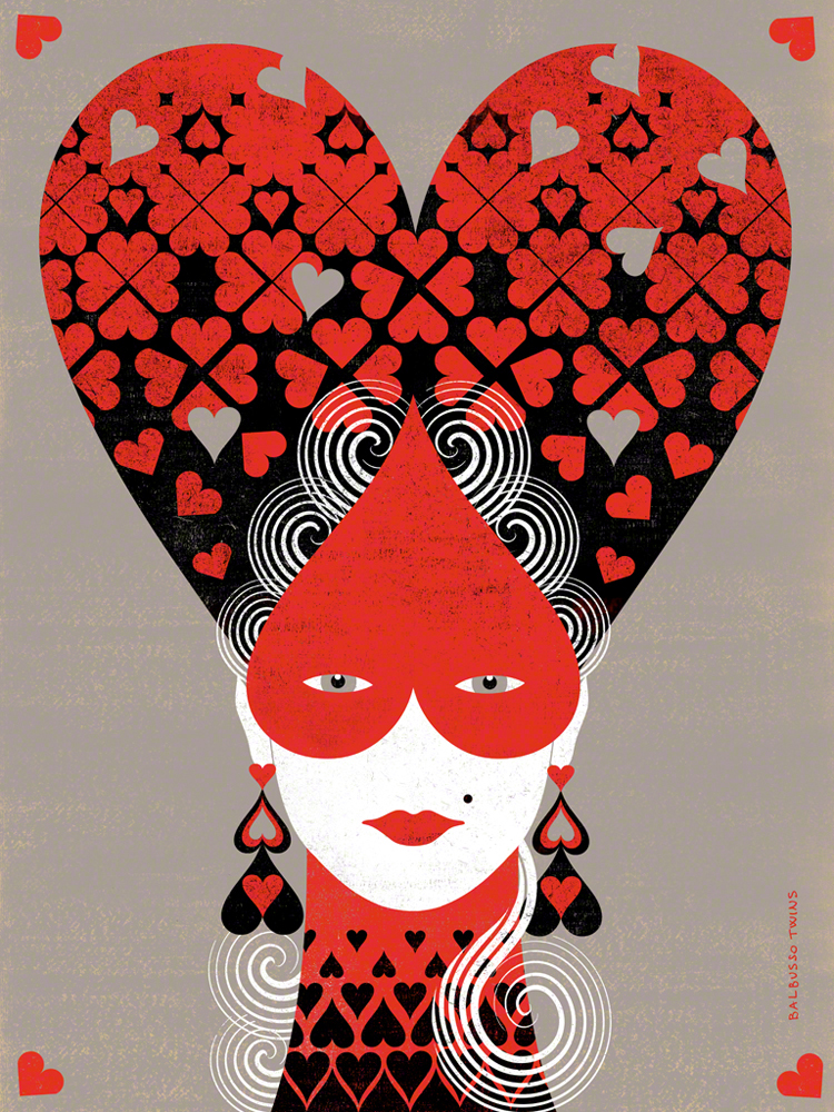
This piece interested me cause it reminded me of Alice in Wonderland, but with less wonder and more elegance. I think that the use of black, red, white and the shade of grey brings out the silhouette of the woman.Ā The illustrators used Gouache, and some digital media. This is one installment in a four part series in which the illustrators created four high hairstyles with Queen cards symbols: hearts, diamonds, clubs, spades. The illustratorsĀ were inspired by Women’s Hairstyles of the 18th Century. This was considered as a Personal project for them.

Iā€™ve learned that the illustrators are known asĀ Balbusso Twins are internationally recognized award winning italian illustrators team. They haveĀ a unique signature ANNA+ELENA=BALBUSSO TWINS. Their workĀ has been published by major international publishers and companies through out the world on various media types such as book jackets, magazines, newspapers. They have illustrated over 40 books and have received more than 60 international Awards. I saw this piece at the Society of Illustrators in New York where they have been membersĀ since 2009. they have also been recognized by Society of Illustrators of Los Angeles and have been members since 2015.

I have also learned they have a three step process when making illustrations after they gather information. theses steps differ on what medium they are doing the art for conceptual illustration or book projects. My opinion on this piece is that when I looked at it my eye wasn’t captivated in one spot but it was a whole piece. I thought the art flowed instead of having one singular object stand out.


Society of Illustrators Blog Post

Deepti Sunder
Herbert the Hungry Monster Fortune Teller

This piece was on the second floor of the Society of Illustrators. The second floor held an exhibition titledĀ MoCCA Arts Festival Awards of Excellence.Ā Sunder is a modern illustrator who came to America from India to pursue art. Right now she’s studying at FIT for an MFA in Illustration. Her style is very bright, colorful, and cartoony. However, if you stumble on her Behance there are some really well done illustrations that were even made for children’s books. In an interview about the book: Bonkers the interviewer asked Sunder about how her process works. She says that she tends to (like Professor Woolley has been saying all along) that she starts off not too rigid. Depending on the client, she creates rough sketches then sends them to her editors, sees what she needs to tweak up, then sends the complete sketches and SHAZAM! Bam, bam, thank you ma’am there goes her completed projects.

What drew me to this piece, Herbert the Hungry Monster Fortune Teller is how its an actual fortune teller. I also like the illustration and how it really captures Herbert. Based on the illustration you can tell that Herbert is a Hungry Monster Fortune Teller. I just thought it was very creative and I love how she took this concept to more than just drawing a hungry monster on a flat sheet of paper. She mentioned in the interview that she does most of her work traditionally and with dry media but she said she would love to tamper with digital work and she has gotten interested in watercolor, so I would love to see how her process was when she created this piece. Granted, this interview was in 2014 so she probably already tampered with it. Then again she might have already graduated. She could have been able to do this digitally. Though the textures in the image feel more traditional. Unless the robots known as Photoshop made a really cool texture brush or something. Anyways, Herbert the Hungry Monster Fortune Teller is sitting pretty on the second floor in the Society of Illustrators so if you didn’t already check it out there or on her Behance. It’s really cool!

Week 4 Reading

I had never heard of Chris Van Allsberg until last class but this image, The House on Maple Street was the one that appealed instantly. I personally don’t like pencil shading because I have a tough time doing it but this work was impressive to me. I really like the way he simply has less shading on the bottom of the house, which makes it look like there is some kind of bright like coming from there. Because of that bright light this picture reminded me of the move Home Alone, specifically the part where the kid puts on bright Christmas lights to scare off robbers. The shading makes this picture remind me of that scene, it looks like there is snow on the ground due to the light shading in the road. I think the house is supposed to be taking off due to the caption “It was a perfect lift off” but to me it looks like light.

The Role of Reference response

In Eric Fortune’s case he used an actual picture of a person as reference. He took a picture of this person in the pose he wanted where he wanted and drew his piece from this photo reference. He transfers the sketch to watercolor paper, finding it helpful to correct anatomy on better paper. Another way Eric uses reference to is leave the drawing in a sort of rough state so as not to disturb the paper with erasing. He tries to get enough information from the referenced pencil drawing portion of the work, letting the paint do some of the detail work later on.

Week 3 Reading: The Importance of Reference

In Yuko Shimizu’s piece for Mother Jone’s magazine she used Google Maps as her reference. She mentions that with Google Maps she was able to digitally walk around and get reference of the buildings. This made it easier for her because she said that she wouldn’t have to sit somewhere for hours at a time and let other people see her rough sketches. With Google Maps Yuko was also able to get references of buildings that photographs or other images couldn’t get. This allowed her more freedom to move around and work on her project. Yuko used Google Maps to guide her during her drawing phase. She says that she was literately drawing while walking around in Google Maps. Lastly, she also used characters in her illustrations. Yuko mentioned one for her students and was inspired to draw a character like her. I don’t know if this would count as reference or inspiration but either way the illustration came out really well.

Jillian Tamakiā€™s Idea Generation response

I normally collect media that I am interested in, I have folders on my hard drive and use websites such as Pinterest to collect images of things I like. I also like to take source material seriously. I try to read the original book or view the original work to see what the creator had in mind. While reading a book I tend to become focused on certain concepts and then collect images on it. I like the idea of staying true to source content, even if some changes are made.