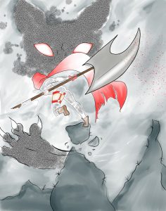
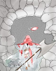
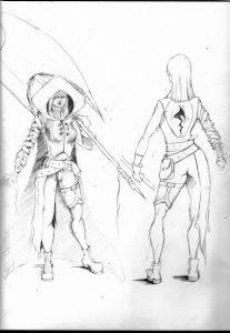
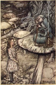
The Final 1+2 is on top while character design is at the bottom
Category Archives: Uncategorized
Project 2 REDO
Featured
Hey Class-
You all asked so here we go…
If you want another crack at Project 2 Editorial Illustration, you may resubmit to DROPBOX until 12/20/2016. DO NOT resubmit if your final is not complete and REALLY WELL DONE… its more important that you do a great job on the final.
Also PLEASE DO NOT resubmit if it is not BETTER than the first attempt. You will get a lower grade than you started with.
Color Relationships and Limited Palate
MODEL SHEETS
Character Design Form, Personality & Expressions
As Promised … Today’s Lecture.
Power Point: character-design-intro
PDF: expressionguide
PDF: character_heads_and_features
Focal Point Through Color: Direct Your Viewer with Contrast
We already know that great composition will guide our viewer, allowing us the illustrator to direct the overall read of the image. We’ve also looked at how strong value contrast establishes clear focal points. Contrast and intensity in color works exactly the same way.
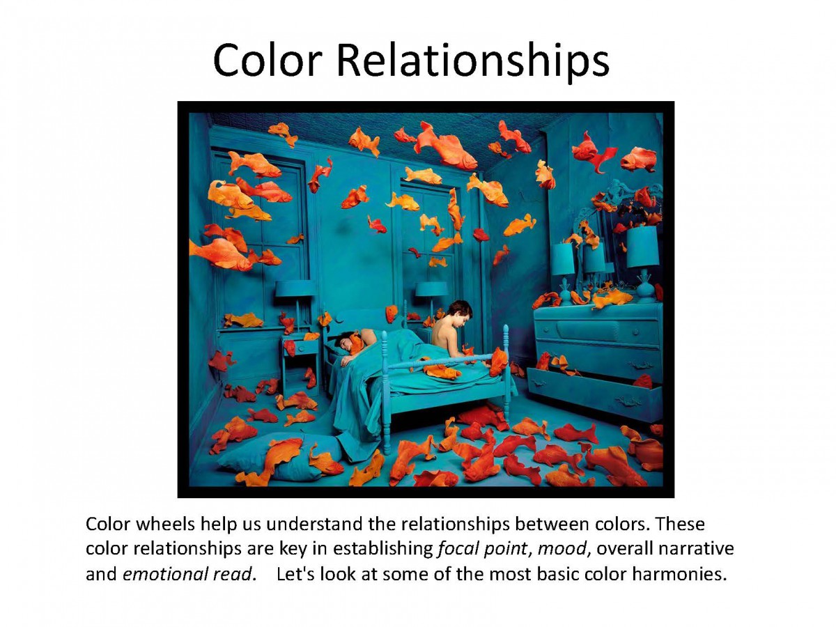
Strong differences in color and highly saturated color will pull your viewers eye, every time. Remember you are making deliberate choices to tell the best story you can. Using color to both tell the story by establishing mood and setting, and creating places of emphasis to guide your viewer is critical.
Color used for emphasis can be very dramatic.
- Tomer Hanuka, Overkill Using contrast to create emphasis can be very dramatic.
- Frank Miller, The 300 – It can guide your viewer, even through multiple scenes.
- David Shannon No, David! – It can imply tension and danger.
But contrast can be used to guide the viewer subtly too.
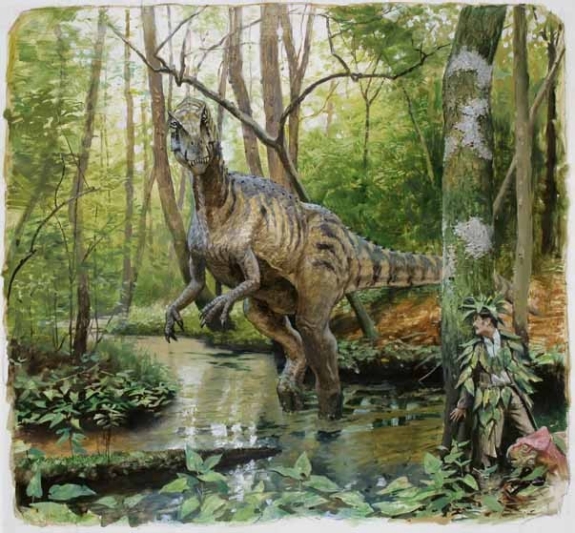
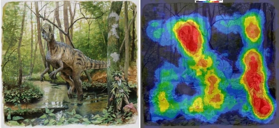
Consider this image called Camouflage by James Gurney, creator of Dinotopia. Take a good look and be aware of where your eyes travel.
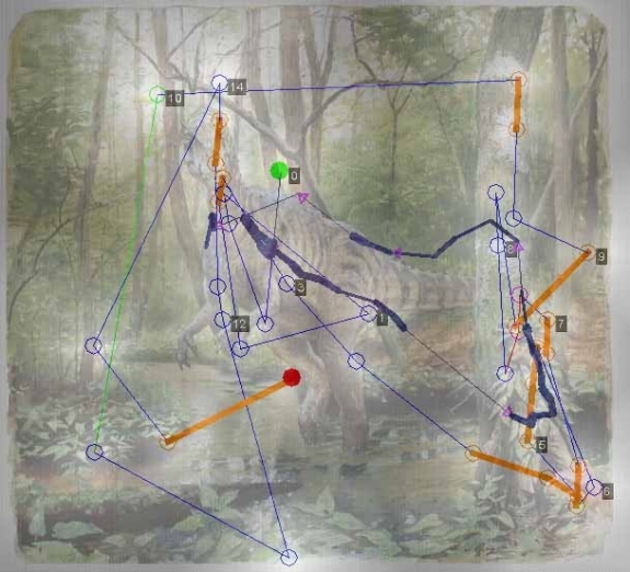
Gurney conducted an experiment concerning focal points and how different people look at the same image. By adding together the eye movement data from a group of test subjects, he was able to observe where people look in a given picture.
To create the image below, eye-tracking technology recorded the data of sixteen different subjects and compiled the information into a composite image, called a heatmap. The red and orange colors show where 80-100% of the subjects halted their gaze. The bluer or darker areas show where hardly anyone looked.
The heatmap for Camouflage shows that everyone noticed the dinosaur’s face. They also quickly spotted the hidden man and the small pink dinosaur. According to data connected to timing, these three faces drew almost everyone’s attention within the first five seconds. The dinosaur’s face was statistically the first thing most people looked at, followed quickly by the hiding man.
Why do we look the same way at this image? As humans we are drawn to faces. This is a given. However, though the contrast is subtle, the only pink things in all that foliage, (remember green’s complement is red) are the hidden man’s skin and the small pink dinosaur.
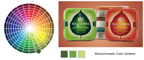
Monochromatic Color Scheme
It isn’t always necessary to use many colors in order to achieve a colorful image — the monochromatic color scheme consists of one color plus black and can be very powerful. A monochromatic color scheme has one principle color and in all it’s various tints, shades, and tones.
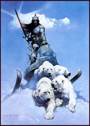
1980s fantasy illustrator Frank Frazetta whose work we’ve looked at in previously, makes great uses of a monochromatic color scheme in this illustration, Silver Warrior.
Note the tiny dabs of warm color he uses to create high contrast focal points within this otherwise completely monochromatic composition. Those warm spots stand out due to color temperature.
Tony DiTerlizzi’s Monochromatic Palate
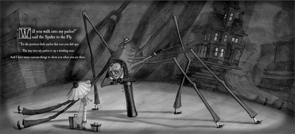
Illustrator Tony DiTerlizzi often works in a monochromatic palate. For his book The Spider and the Fly he chose a metallic silver and. The beautifully rendered drawings are printed in black against a silver printed page. Silver is a gray and not, therefore, really a color. But because it’s metallic, it contributes more than a standard gray. Though DiTerlizzi’s color solution may seem basic, it is unique in children’s picture books and greatly enhances the mood of his illustrations.
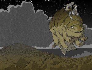
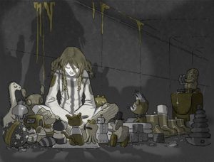
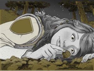
For his more recent series of chapter books, The Search for Wondla, DiTerlizzi chooses a different approach. Here, there are no contrasting dabs of warm color like there were in the Frazetta piece.
DiTerlizzi again works monochromatically, but in this case he chooses a two color printing process, meaning he chooses a principle color and the illustrations are all formed by the various combinations of this ink and black 2 along with the white of the paper.
Color Theory Review: Concepts and Terminology
The Three Attributes of a Color
To accurately describe a color and differentiate it from another there are 3 attributes to measure.
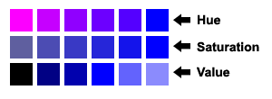
HUE
When the average person says “color” they are actually mean hue. The hue of a color is its particular light wave energy frequency. Remember, light is waves of energy, and white light is contains all possible colors! Violet is the highest visible light frequency and red is the lowest, which we humans have receptors to see.
In this diagram, note how the blue becomes pink, but all of the colors in between are of equal intensity, as it as it moves from right to left.
SATURATION
Saturation (or chroma as it is sometimes called) means a color’s purity. When people are talking about a color’s intensity they mean its saturation or chroma.
In the diagram, note how the blue becomes less saturated as it as it moves from right to left.
VALUE
As we discussed earlier in the course, colors have values just as shades of gray do. A color’s brightness or darkness, and its nearness to white or black respectively, is the color’s value. Value is independent of hue or saturation and can be seen even in a black-and-white photo.
Tints, Shades, and Tones
Value has is has its own color terminology.
Remember that the value of a color is how light or dark a color is, or how close it is to black.
Tints are when we add white to a pure hue:
Shades are when we add black to a pure hue:
Saturation also has its own color terminology.
We get different tones when we add gray to a pure hue:
Another way to envision this is as the hue itself becomes less saturated, it appears more and more gray.
Munsell’s Color Tree
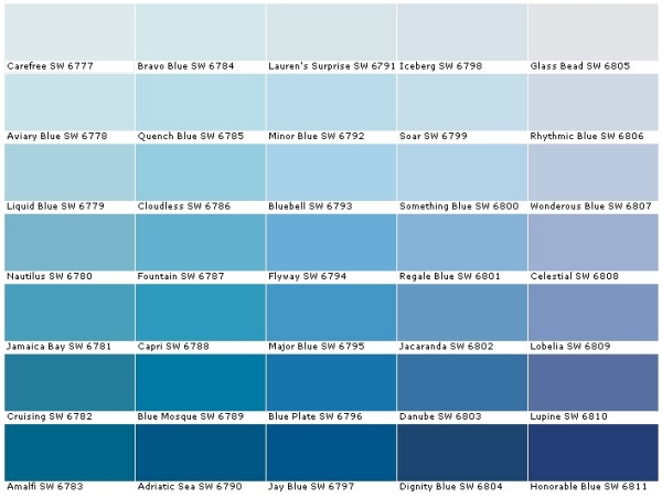
Talking about color can be very misleading! For example, when you go to a paint store, you can buy a can of Honorable Blue, Flyway, or Wondrous Blue! When we say Flesh Tone, what exactly does that mean? Whose Flesh Tone are we talking about? It can be very confusing!
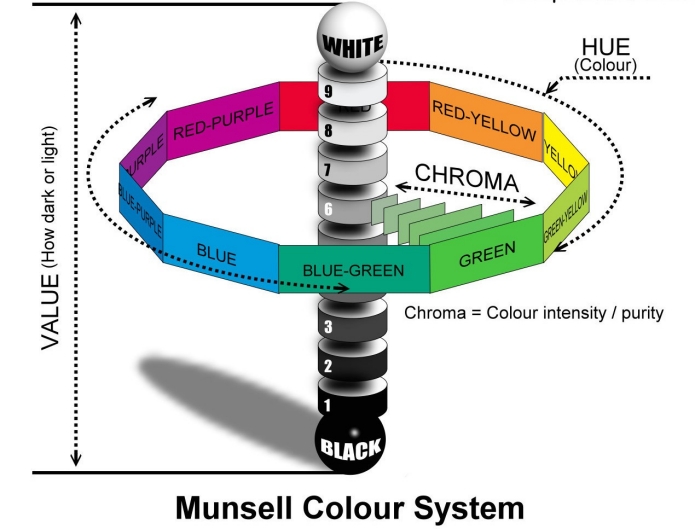
Albert Munsell, an artist and professor the Massachusetts College of Art and Design, felt the same way. In 1905 he developed a “rational way to describe color” using numeric notation instead of names to describe color. To assign these numbers he used the three attributes we discussed above: hue, value, and chroma (saturation).
In the diagram above, you can see the traditional color wheel as the center ring, and Munsell’s Color Tree, as it came to be known, growing from the center. The trunk of the tree represents zero to ten in value. The farther we move from its “trunk” represents an increase in chroma, until the hue—represented by the separate “branches”—is at full saturation, farthest away from the center.
Munsell’s Color Tree
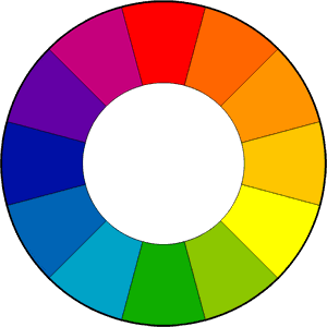
THE COLOR WHEEL
YES, you painted one of these in Kindergarden. I know. However the usefulness and knowledge that can come from this tool is limitless. So please let go your preconceptions toward color, and using a color wheel and come into this with an open mind.
The color wheel is one of the most powerful tools artists and designers have to help us understand and use color effectively. It is strongly recommended that as you examine the different color schemes thought this post and the following, you look at a color wheel and plot them out.
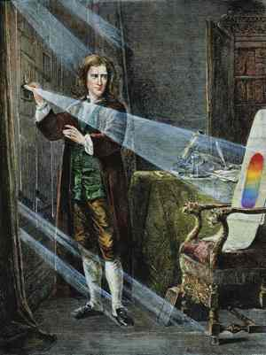
FUN FACT! The first circular color wheel was created by Sir Isaac Newton in 1666. As if the laws of planetary motion and gravity weren’t enough!
Foto: picture-alliance
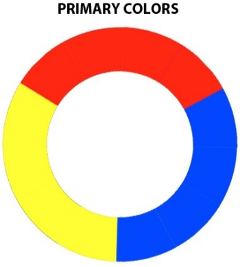
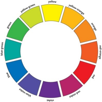
We begin with a three-part color wheel that shows only pure colors, meaning colors which no amount of mixing will result in. These three colors are of course our primary colors: red, yellow, and blue. All other colors are derived from these three hues.
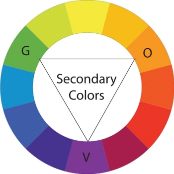
Next we move on to our secondary colors. These are the colors formed by mixing the primary colors with each other: green, orange, and purple.
You can further break down the color wheel into tertiary colors. These are the colors formed by mixing a primary and secondary color: yellow-orange, red-orange, red-purple, blue-purple, blue-green, and yellow-green.
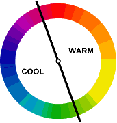
And of course we divide that wheel based on Color Temperature, with warm color opposite cold.
To create a successful illustration, your color palette or scheme needs to support your big idea. It must work to further your narrative and or concept. If you have already taken Color and Design, you will have worked with various color schemes. In the next few posts, and in the remaining weeks of class, you’ll look review color theory in detail, and see how those color schemes can influence narrative. We will also look at how they are applied in both fine art and in contemporary illustration

Drawing by Philippe Buchet, Color by Matt Hollingsworth
Working in Color: The Basics
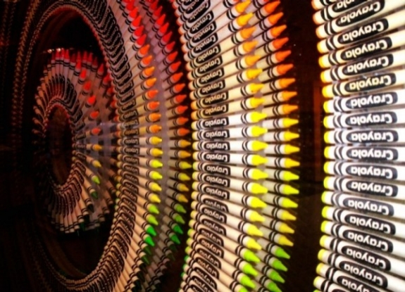
Color is one of the most powerful aspects of making art. Almost everyone who loves to create can remember the childhood excitement generated by a brand new box of crayons!
Everyone has a favorite color, artists and non-artists alike. Our relationship to color is one of the most powerful relationships we have as a species. It is intrinsically connected to how we relate to our world. And so of course it is one of the most powerful aspects to consider when making art.
Color Temperature
Much of our relationship to color is based on instinct. For example, we see colors as warm or cool based on our physical response to them.
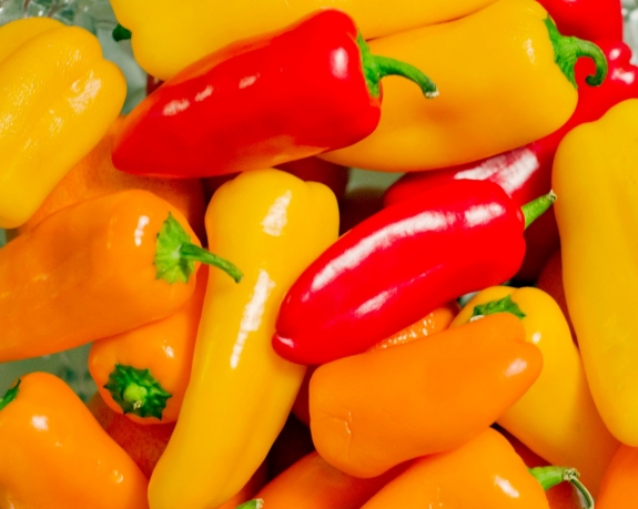
Warm things are warm colors (such as fire, the sun, hot coals, and in this case hot food.)
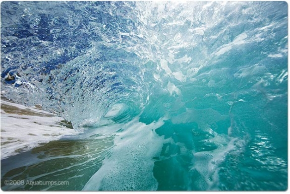
and cool things are cool colors (such as water and ice, which as blue or bluish).
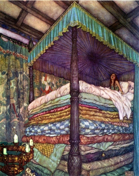
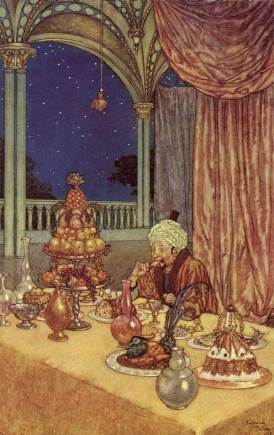
Interestingly warm and cool colors also create a sense of perspective and depth when we look at an image. Warm colors tend to advance towards us, whereas cool colors tend to recede away from us.
In these two images note how early 20th-century illustrator Edmund DuLac uses this trick. In the first image of The Princess and the Pea he creates a sense of incredible height, as the cold blue-purple recedes from the viewer, effectively raising the height of the bed canopy. And in the second one, A Palace of Wonder, a sense of depth is created between the warmth of the interior space and the cold dark outside.
COLOR AND CULTURE
However, a great deal of our reactions to color are not innate, they are in fact cultural. For example Black and Death are associated in many Western cultures, in many Eastern cultures it is associated with white—its direct opposite.
Take a look at this info-graphic. Note how many color associations change, depending on where you are in the world. However also note how HOT and COLD or Color’s Relationship to Temperature do not.
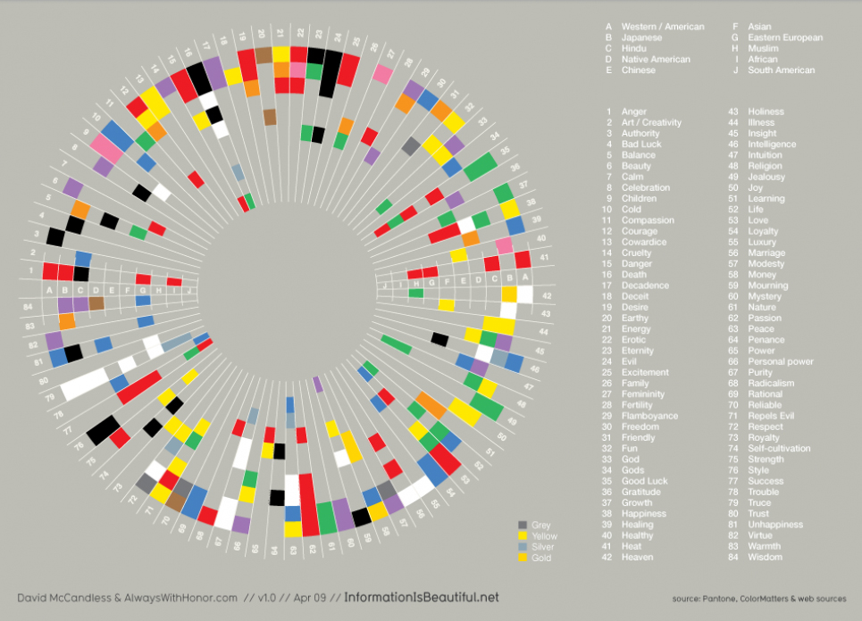
It is however important to understand your target market and the culture that they come from, because culture has a strong influence on the development of cultural-color associations in childhood building the adults eventual perceptions of color.
Throughout this module and the next we will look at these basic reactions we all have to color and learn to compose in color effectively. We will build on what we have learned regarding composition, concept, point of view, and value and we will see how we can use these reactions to color to aid us in our ultimate goal, telling a great story through narrative illustration.
However, before we can do that lets be sure we have down the basics.

