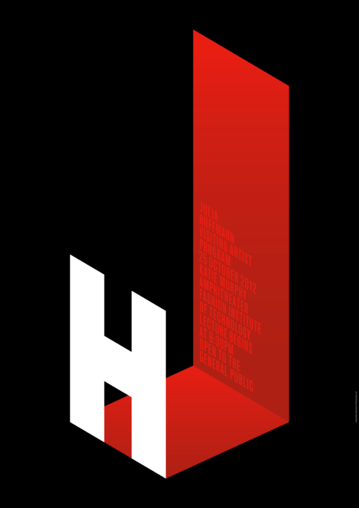
I chose this poster by Julia Hoffmann who was the creative director for graphics at the Museum of Modern Art in 2012, mainly due to how distinct it had come off compared to the other posters to me its text … Read More
Beth Tondreau | COMD1127—D035 | Fall 2022

I chose this poster by Julia Hoffmann who was the creative director for graphics at the Museum of Modern Art in 2012, mainly due to how distinct it had come off compared to the other posters to me its text … Read More
The font doesnt suit the store itself, it feels as if it is not taking itself professionally, the font underneath it, I would recommend or a fancier font.… Read More
I don’t believe that the font used for his store is a good representation of his business. I believe a fancier font should be used for a business called “Fine Jewelry”. The current font used is too simple and may … Read More
The typeface of Larry’s jewelry sign is eye catching by making the name “Larry” bold but it does not give me the idea of fine jewelry. I believe the typeface choose for his sign speak more of welcoming front than … Read More
I did not know that illiterate monks were the ones who produced manuscripts by copying text. It must have been really strange, knowing how to copy word for word, but not being able to read and understand what they were … Read More
© 2025 COMD1127 Type and Media
Theme by Anders Noren — Up ↑