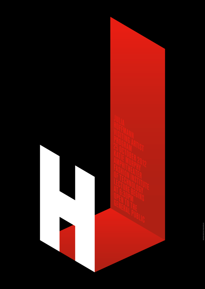
I chose this poster by Julia Hoffmann who was the creative director for graphics at the Museum of Modern Art in 2012, mainly due to how distinct it had come off compared to the other posters to me its text is also noticeable even being the next thing I pay attention to after the H, it’s creative with the type itself being that it uses a contrast of white and red to form a J with them.


Leave a Reply