- What in Sahre’s project seems similar to what we’ve done in class that reminds me of the general study of the principles of design with type we’ve done in class and it would mainly be similar to the work we
Author: danny (Page 1 of 2)
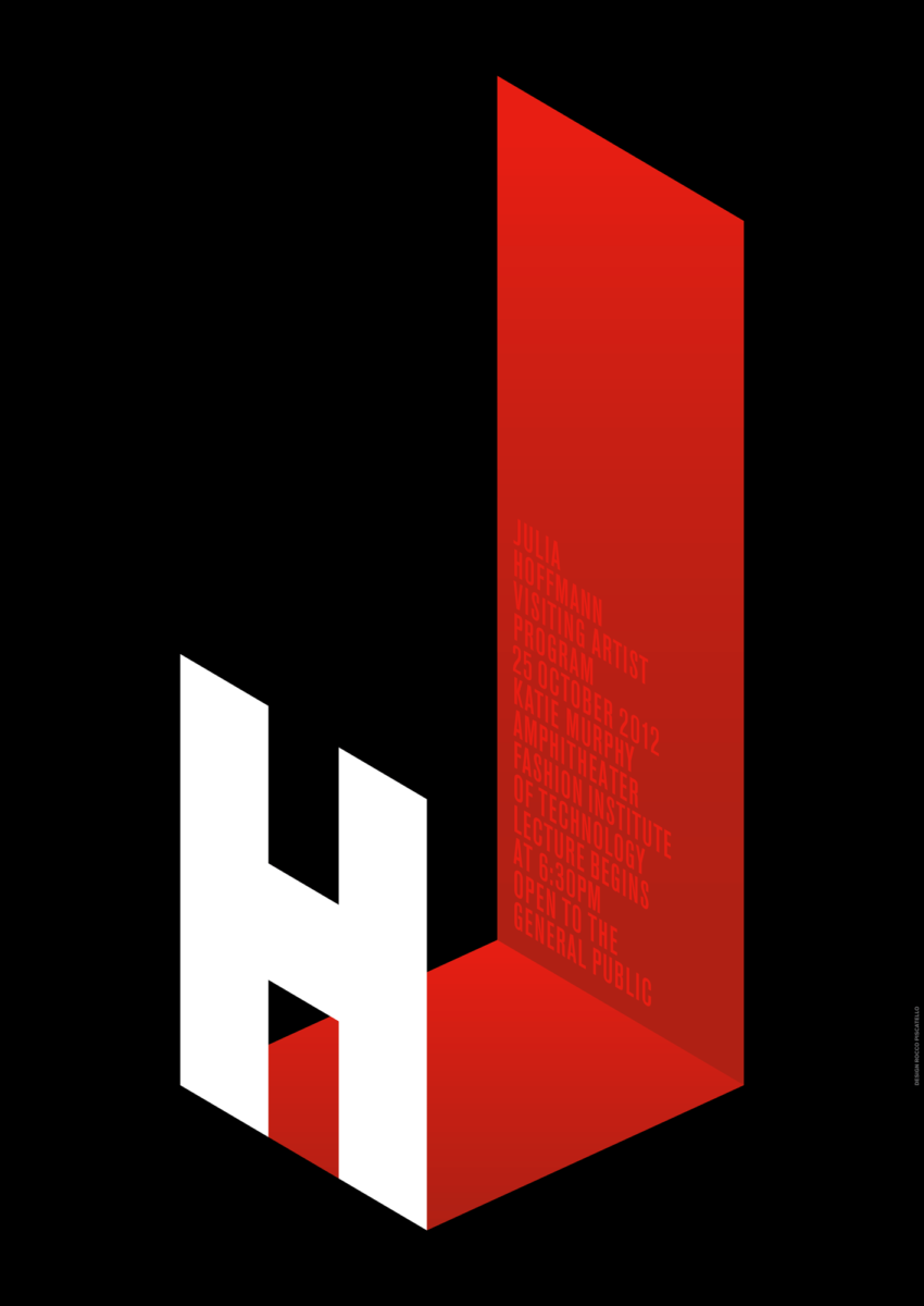
I chose this poster by Julia Hoffmann who was the creative director for graphics at the Museum of Modern Art in 2012, mainly due to how distinct it had come off compared to the other posters to me its text … Read More


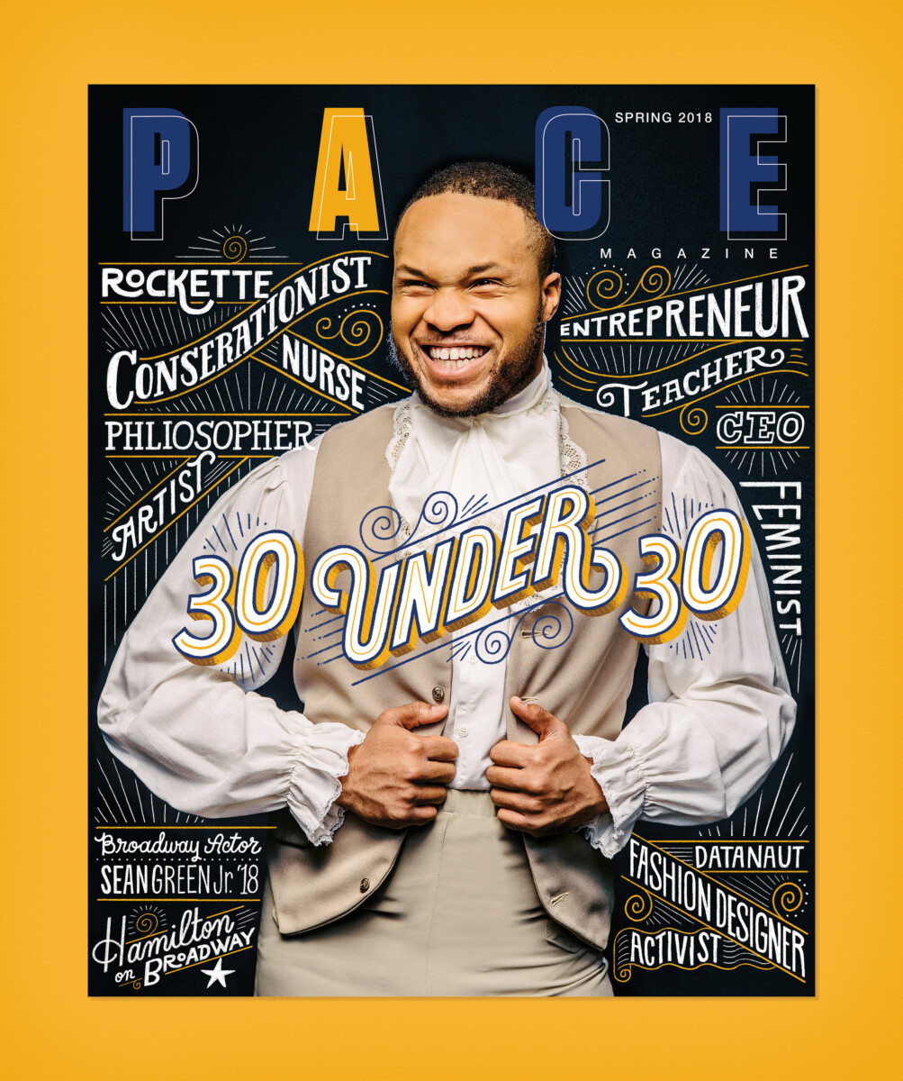
- I choose Mary Kate McDevitt
- Why I had chose main Mary Kate McDevitt due to how the use of colors mix well with the type without having the type go be unnoticeable
- I’d say if anything the color blend really
What had come to be more eye-catching to me would its use of serif it seem as if it’s making a statement of sorts and the book cover that displayed this the best would be the fifth book cover in … Read More


