What had come to be more eye-catching to me would its use of serif it seem as if it’s making a statement of sorts and the book cover that displayed this the best would be the fifth book cover in the first display of the Fenda books ,though it seems to be a bit clustered its red type contrast defiantly pops out from the over all color of the cover causing the possible viewer to have their attention draw-in to the end of the cover to and the fifth book cover in the last display of the Fenda books because does the same but with a different method to do such, of more of a spiral as the size of the font decreases.
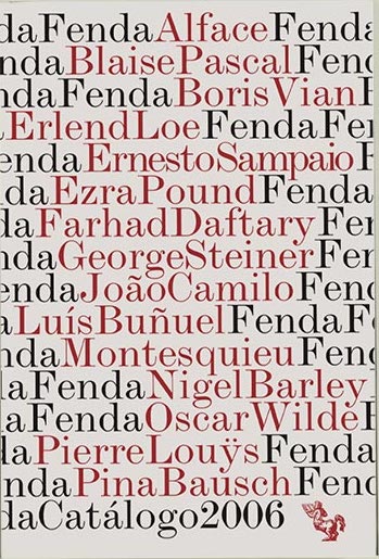
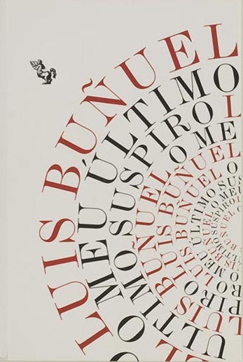


“Clustered” is a good way to describe the catalog that repeats the name “Fenda” in black and highlights the names of the authors in red. Your other choice, with the type in repeating arcs, definitely does draw attention.
It’s good to see your post, Danny!