De Stijl and the Constructivists brought us the grid, the use of geometry, sans serif typefaces, especially and notably Helvetica, which refers to Switzerlan, and worked towards a “Universal” visual vocabulary in their work.
They sought “honesty” in their designs, and functionalism comes from this. The forms and layouts should reflect their makings, but without the imposition of the designer. Authorship was given, but the subjectivity of the designer was not sought.
In the reading, Joaquin Torres-García agrees with many of the artists and designers coming out of the Bauhaus in Germany. He says design can be understood across cultures. Herbert Bayer’s “Universal Type” was an attempt at this.
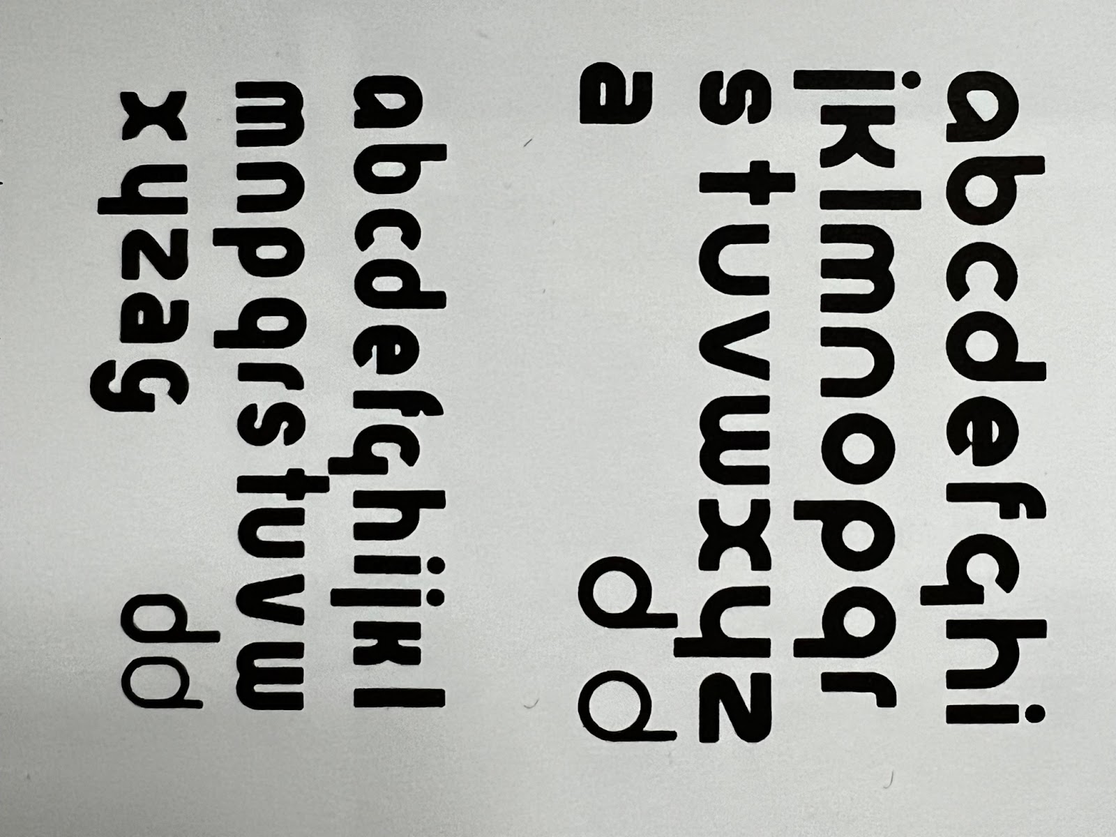
I’m not sure I agree it works. Functionalists were constantly finding the exercise unsatisfying. The Noun Project has attempted something more recently that is crowd sourced.
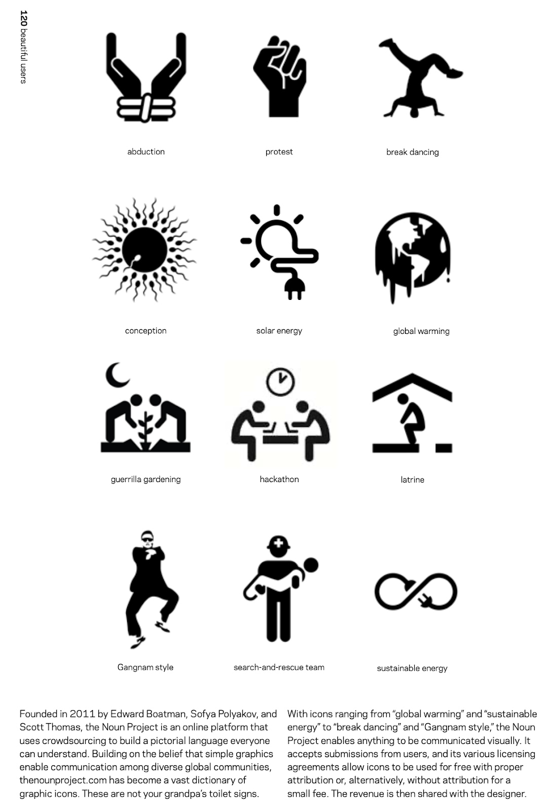
It’s possible it could be more successful to have more voices making “Universal” things, rather than one old European guy telling us what works best.
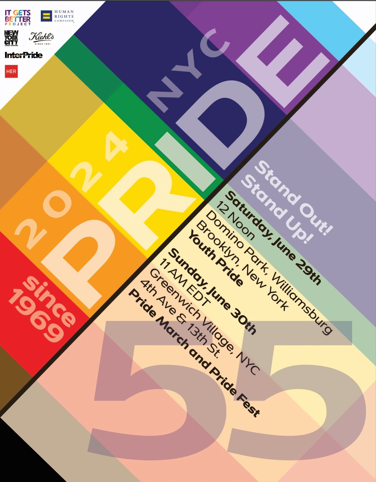
That said, I do Love a Swiss Grid! Here’s my (speculative) typography-based Pride Poster for 2024. It’s clearly inspired by Jan Tschichold’s Die Neue Typographie and the Swiss Grid that emerged slightly before his work via the Bauhaus. I noticed Pride turns 55 this year so I made a poster. The typeface is called Dienstag, perhaps not coincidentally a German name. It was made in Adobe Illustrator in 2023.


Leave a Reply