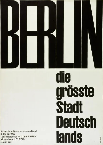
The International Typography Style (Swiss Style) is a minimalistic style that values objectivity and readability. One of the key elements in this style is the use of san-serif typefaces. Also, the grid that helps set the hierarchy to organize information within the design.
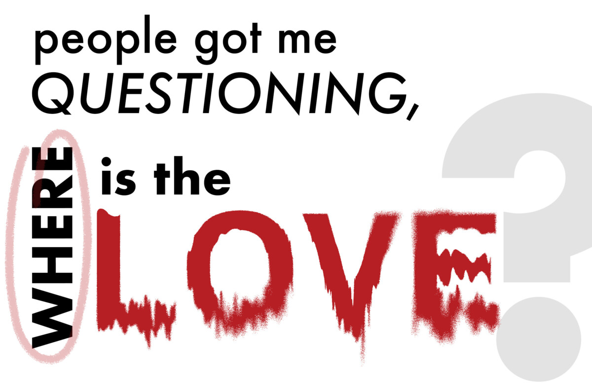
This is a movement that I find very attracted to. I had heard of it before but mostly seeing its influence in a lot of typographic posters when trying to find inspiration. To me the way in which typography can be set and structured within a certain space can change the whole message more than the look of the visual graph. At the time I created this poster I didn’t know about this movement, but had seen inspiration that seems it took influence in the Swiss style. But one of the earliest experience experimenting with type was in my first typography class in the earliest semesters. We were adding quotes in a booklet we were working on and the professor helped me out in arranging each word differently but still making the quote clear. So it wasn’t only more visually attractive, but it was a stronger and powerful quote.
This poster is one I did a couple or a semester later that typography class. We had to design a quote poster that used typography only and this is what I ended up creating. It is something that I enjoyed experimenting with. I can see to some extend the lineage/influence of the Swiss Style. I would like to push this influence and also incorporating images while keeping the design clean and legible.
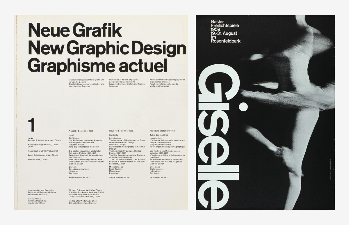
2. Armin Hofmann, Giselle – Basler Freilichtspiele poster, 1959, offset, photo: Paul Merkle, Museum für Gestaltung Zürich, poster collection.


Leave a Reply