Graphic Design has played a major role in people’s lives. Without it, who knows what life would be like right now. A definition that defines Graphic Design according to 99design, “Graphic Design uses visual compositions to solve ideas through typography, imagery, color, and form.” It’s ever changing and it’s something that designers need to be adaptable with. Moving forward, a Designer that became influential in the field of graphic design is Otl Aicher. I’ll be focusing on his notable designs and it’s influence. How he communicated his ideas to the movements that he was inspired by and the semiotics and signs to create his work.
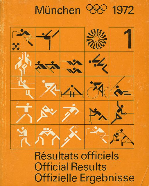
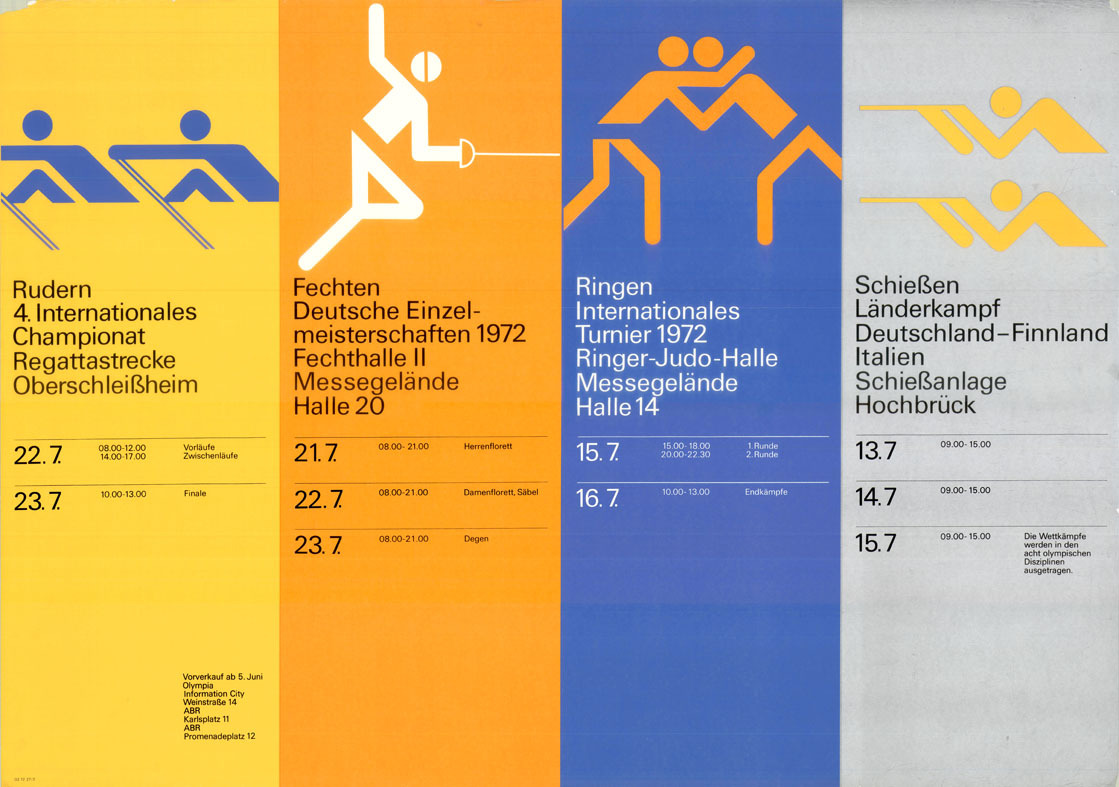
Otl Aicher’s design of the 1972 Summer Olympics in Munich, Germany sports pictograms and posters. This was a way for players who were participating in the event would be able to notice their spot. It was a simple and effective design that helped and influenced designers now with signage design. The movement that inspired his work is the Bauhausian style, but leans towards the DeStijl style for it’s tight nit strict grid system. The way I describe the designs would be that he uses a bright color scheme and stick figures and puts it in the pictograms. The use of functional shapes, the design is straightforward and simple, which makes it look modern. The stick figures show little to no emotion at all in the pictogram. For his posters, he used the asymmetrical arrangement instead of using the central-axis for text and he uses a sans-serif which creates a fresh new look and rhythm, there is no ornamentation, uses bright color scheme and photographs of people doing the sport. The reason why this design became so important is because “…he revolutionized the Olympic identity and iconology of the 1972 Olympics…” as reported by shillington.com. Just by looking at the designs from 1896-1960, they were still using illustrations and serifs. Aicher’s design really changed the approach and dynamic of the Olympics identity. And this design has continued to influence other designers to create a minimalist approach to how they design the logo and pictograms.
Another point would be how Aicher uses signs and semiotics in his design. In the pictorams, not only are the stick figures shown but they are illustrated to look like the sport they are playing in. According to the Olympic design.com, “Aicher’s sports symbols were to be designed from a characteristic pose for each type of sport.” To go more in depth with this, the signifier is the stick figure and the sports equipment is the signified because it shows or expresses the idea of someone playing this particular sport, so it gives the viewer or the player the assumption that this is where this sport group is.
All in all, Otl Aicher has made a successful design that has heavily influenced designers in signage design. Based on his works, you can see the influences that led Aicher to create the pictogram designs and the posters for the Olympics in Munich. To the signs and symbols he used and created. The designs have made an impact where the Olympic Games identity design from 1972 has become iconic and memorable. After that, more designers became inspired by his works, and started to make designs similar to it.
Images:

References:
Cann, Mila Jones. “The 8 Types of Graphic Design.” 99designs, 99designs, 2 Mar. 2020, https://99designs.com/blog/tips/types-of-graphic-design/.
Petzold, Dirk Petzold. “Design History of the Summer Olympic Games.” WE AND THE COLOR, 12 July 2016, https://weandthecolor.com/summer-olympic-games-design-history/74197.
“Quick Design History: Otl Aicher #Throwbackthursday.” Shillington Design Blog, 2 Apr. 2019, https://www.shillingtoneducation.com/blog/otl-aicher-tbt/.


Recent Comments