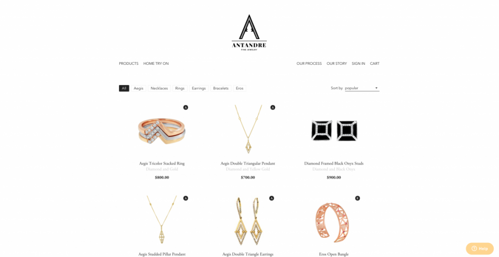
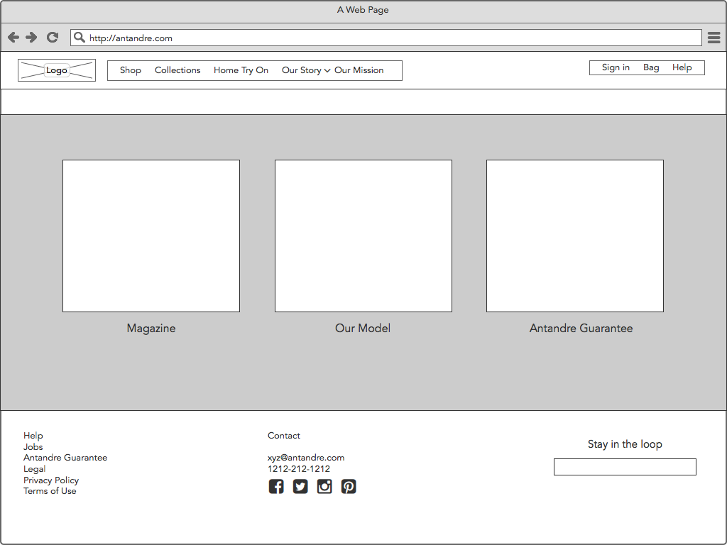
While we were working on the lifestyle and product shoots, we started brain storming for website layouts. This is what the homepage looks like currently:
This is more of a product page, than a home page. When Monil was initially working on this website there were a lot of limitations with what he could do with the design since our business model features home try on, it required a different type of ecommerce engine running in the background. When you shop on Amazon, Target or Best Buy online, they have an “add to cart” button, and you put in the payment information and you own what you just bought. However, with home try on, the customer can order up to 5 pieces of jewelry, try it on at home, keep what they like and return the rest. So that required a customized back-end development.
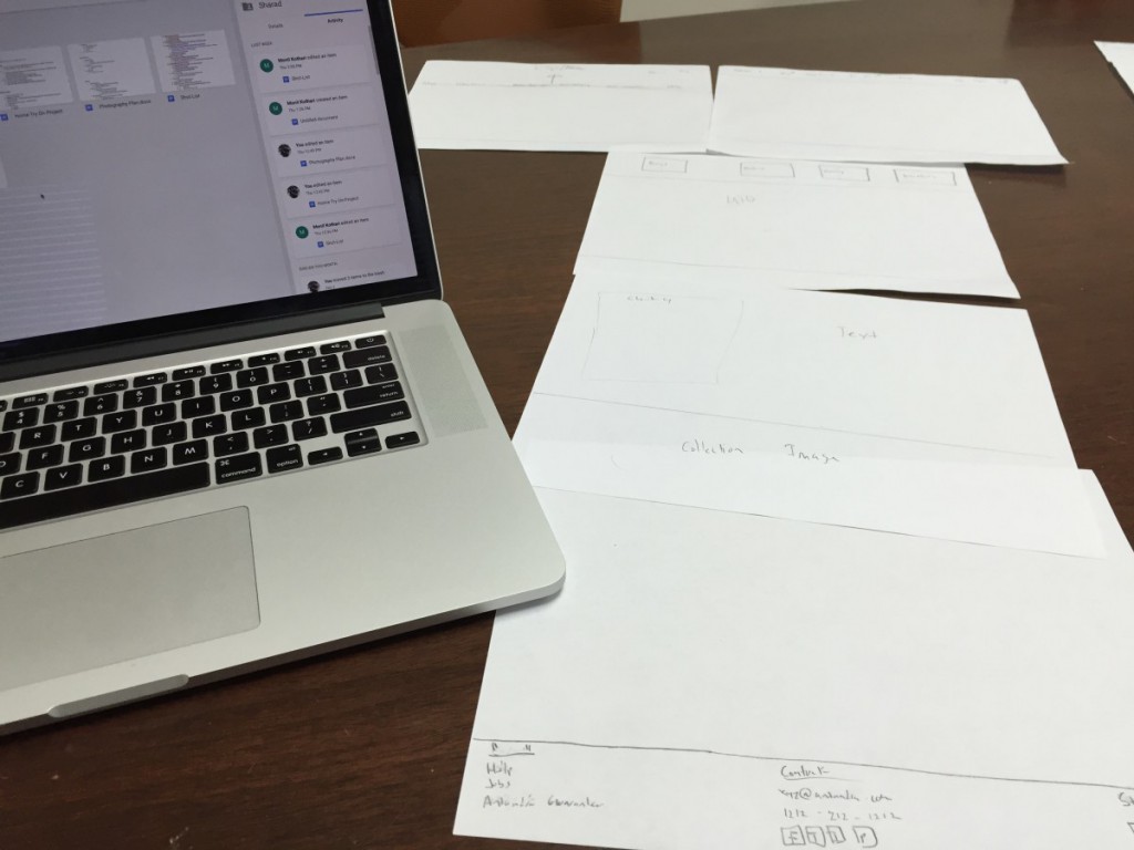
After doing research for finding alternative ecommerce engines we decided to redesign the website. Monil gave me a few sketches, and one day in the office, we discussed the layout of the website.
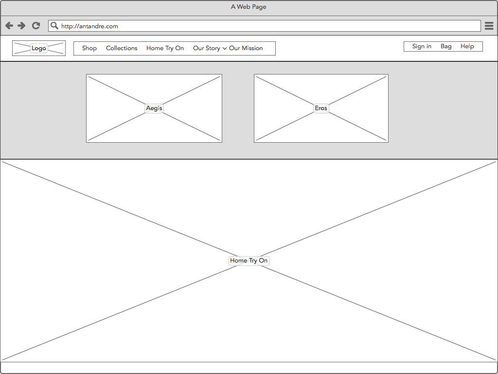
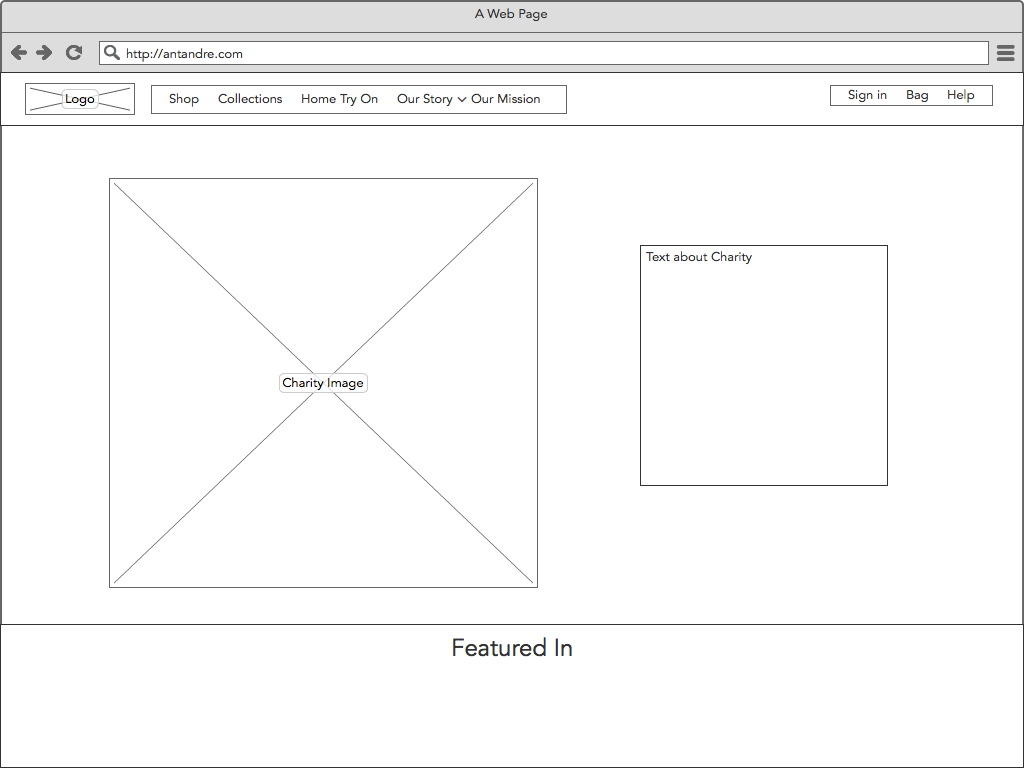
I made the first batch of wireframes and sent them for review. I received some feedback and started working on the second version. 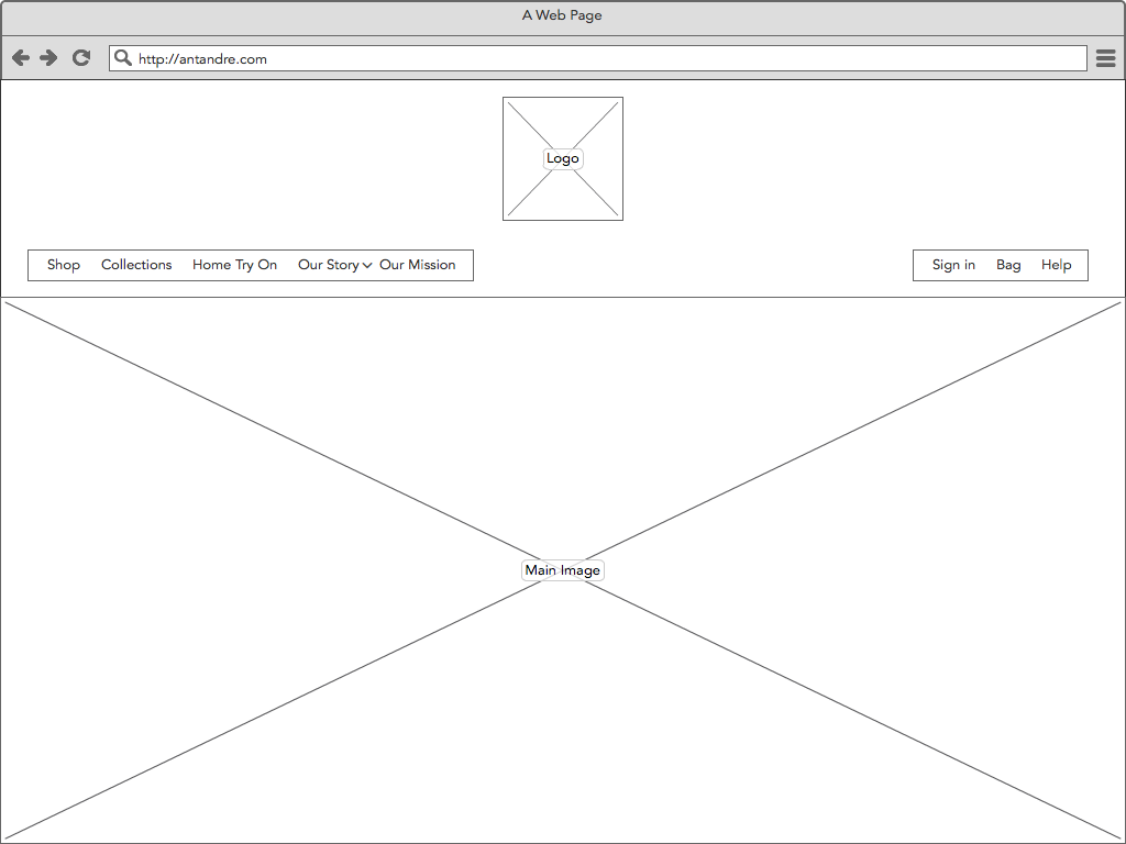
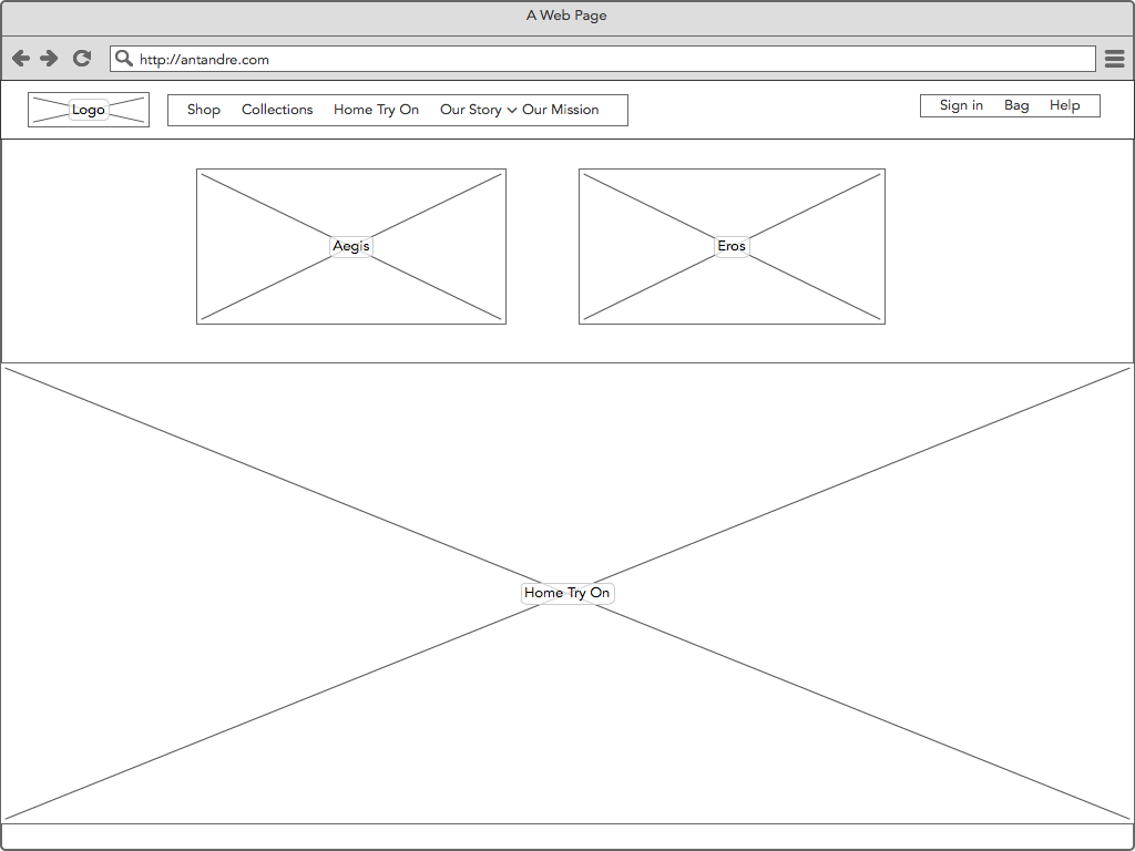
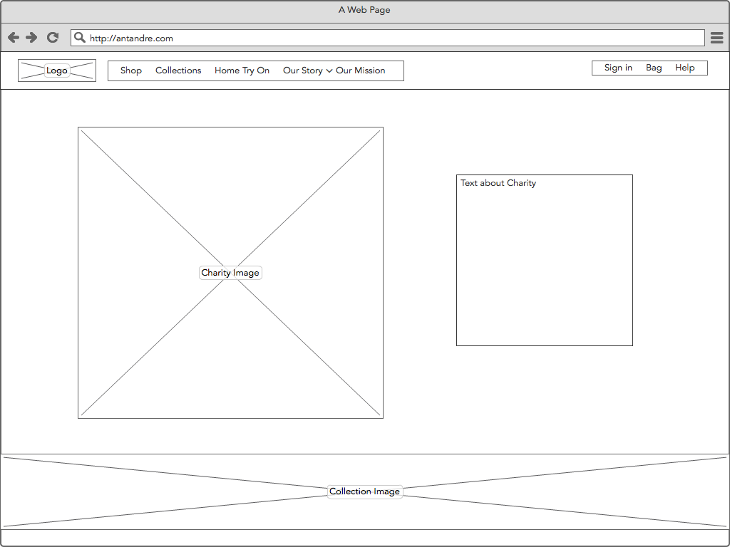
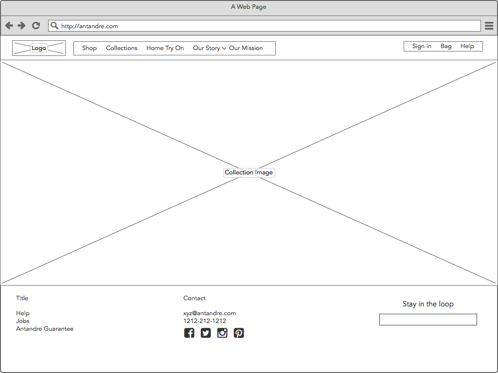
 Monil was out of country for an international show so we were communicating via email for about 10 days.
We kept going back and forth with the wireframes. After a few versions, we finalized these:
