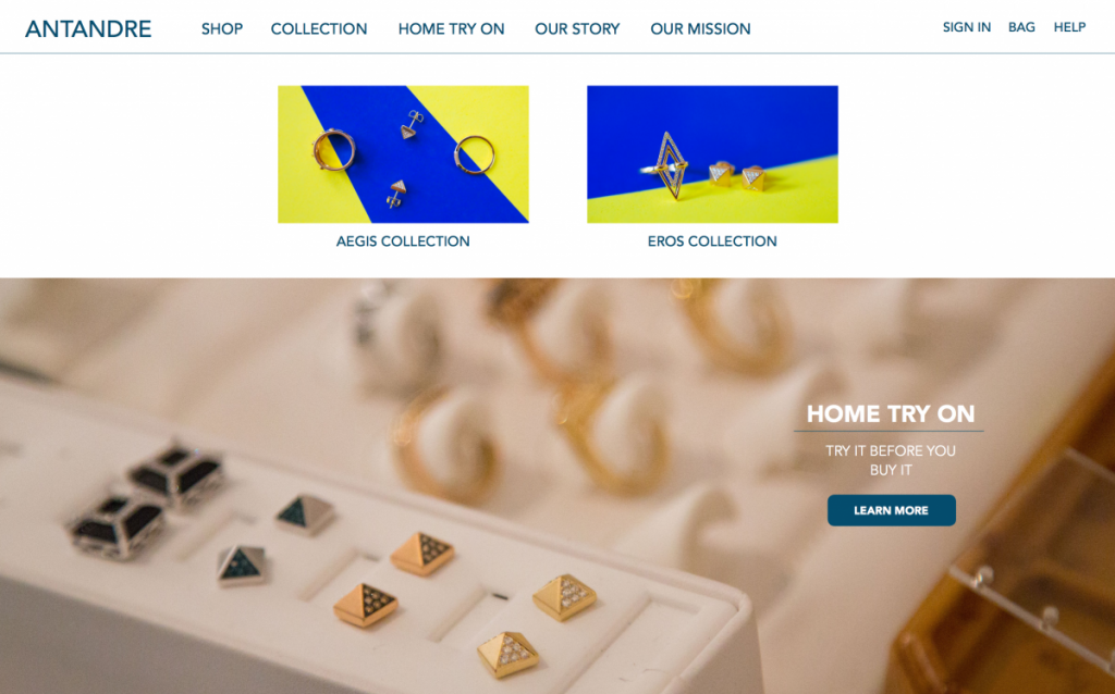
While we were in the mockup phase, we needed to get a lot of assets. It’s a very time consuming process. Initially we were going to use the blue/yellow images for the collection panel on the homepage. 
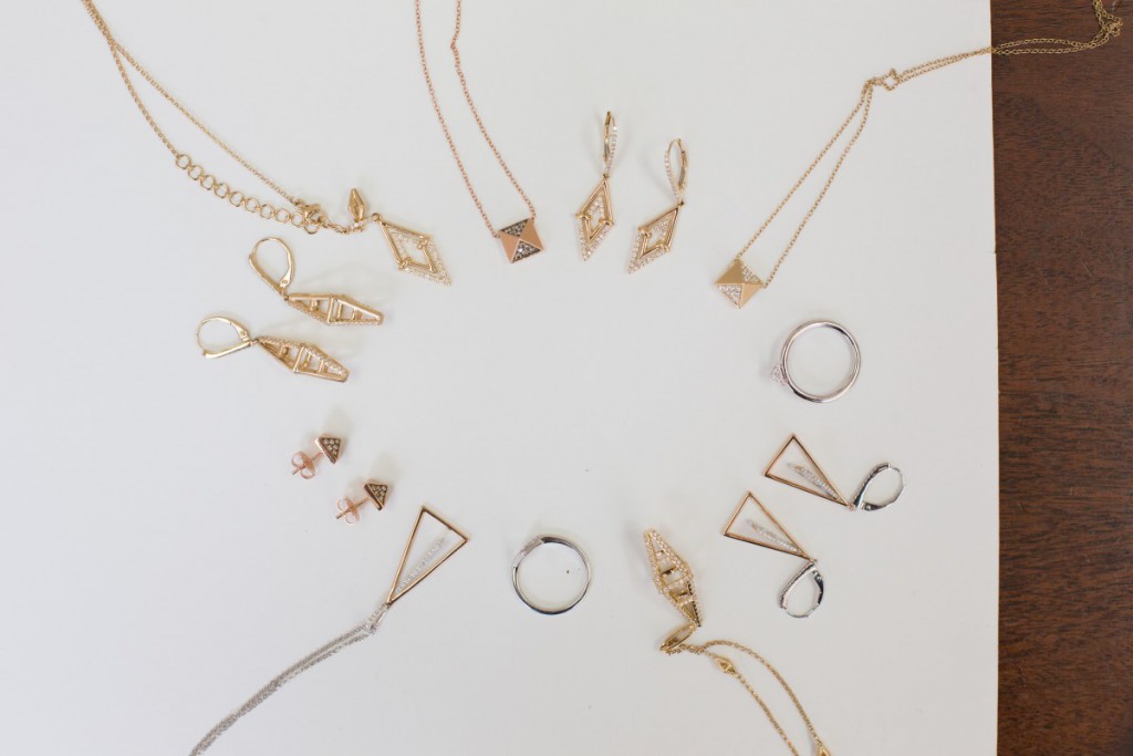
However, we decided that the blue/yellow is very distracting and doesn’t fit within the color scheme of the homepage. So we started brainstorming on new ideas. After some time, we thought of doing a “scattered” pieces shot.
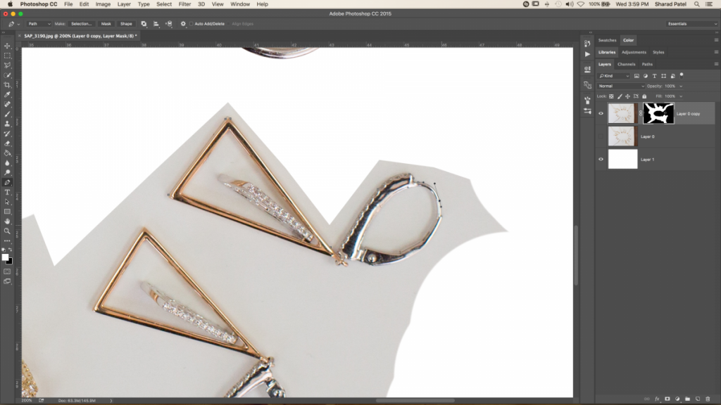
Now, it was the tedious task of cropping the background and keeping a plain white background.
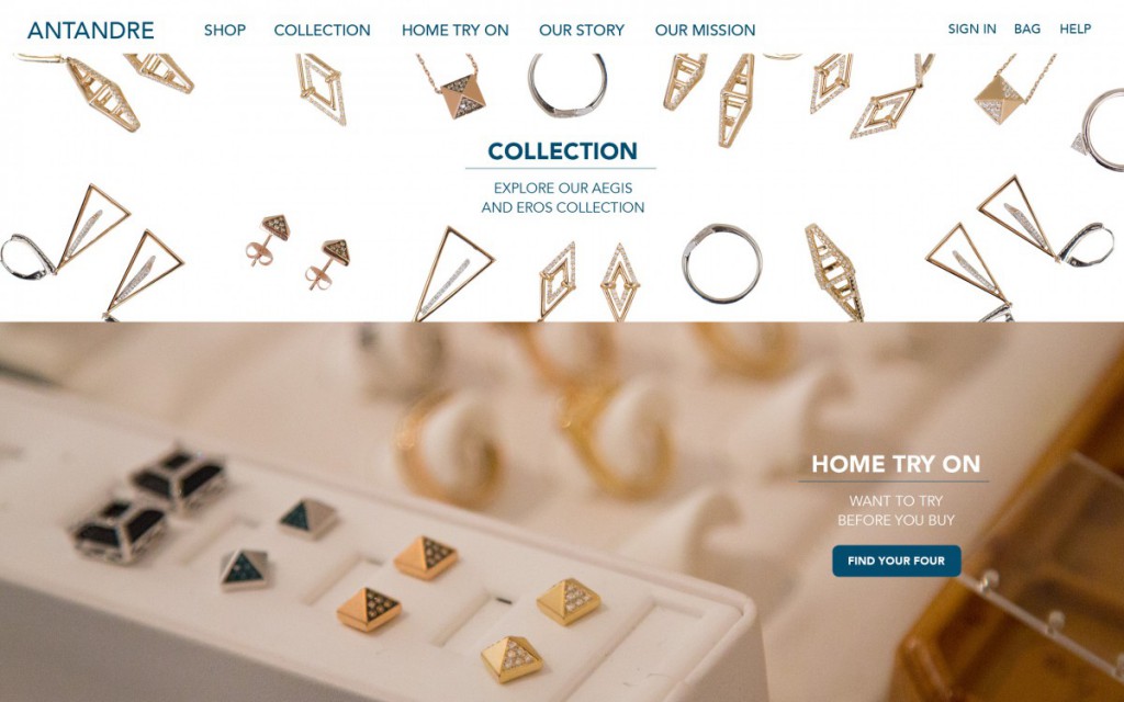
It took me around 4 hours to carefully crop the background out. This is what the end product looked liked.
And this is how we used it in the mockup:
So we can see how just one thing takes so long to create. That’s why it’s great to pre-plan everything before execution. It’ll save a lot of time!


