Tag: WEEK 4 (Page 1 of 5)
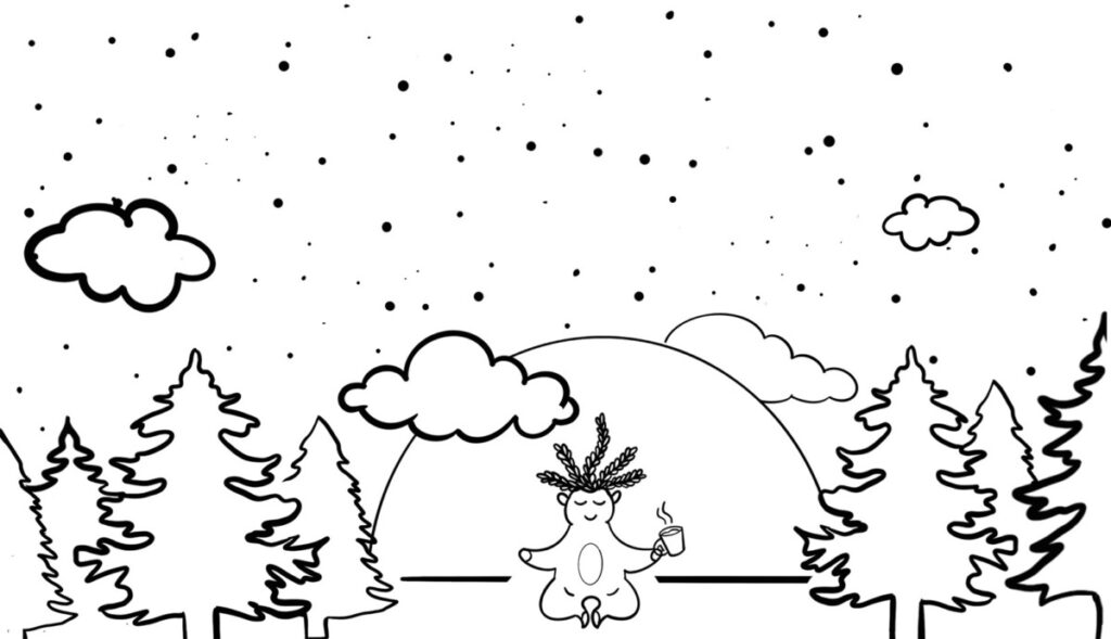
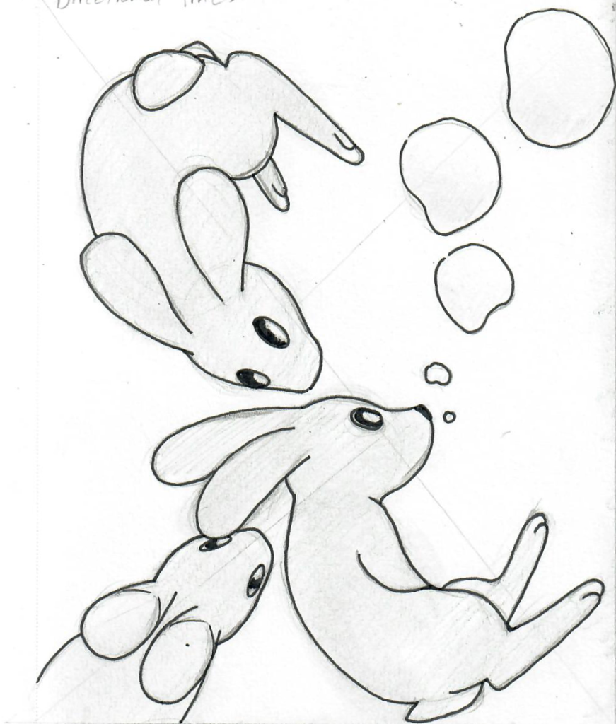
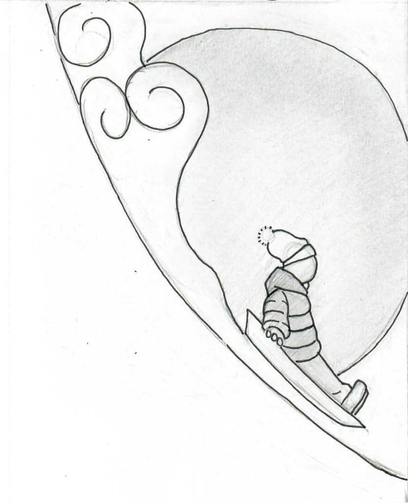
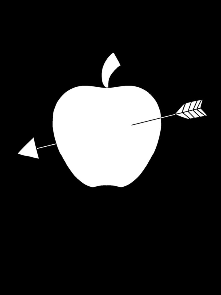
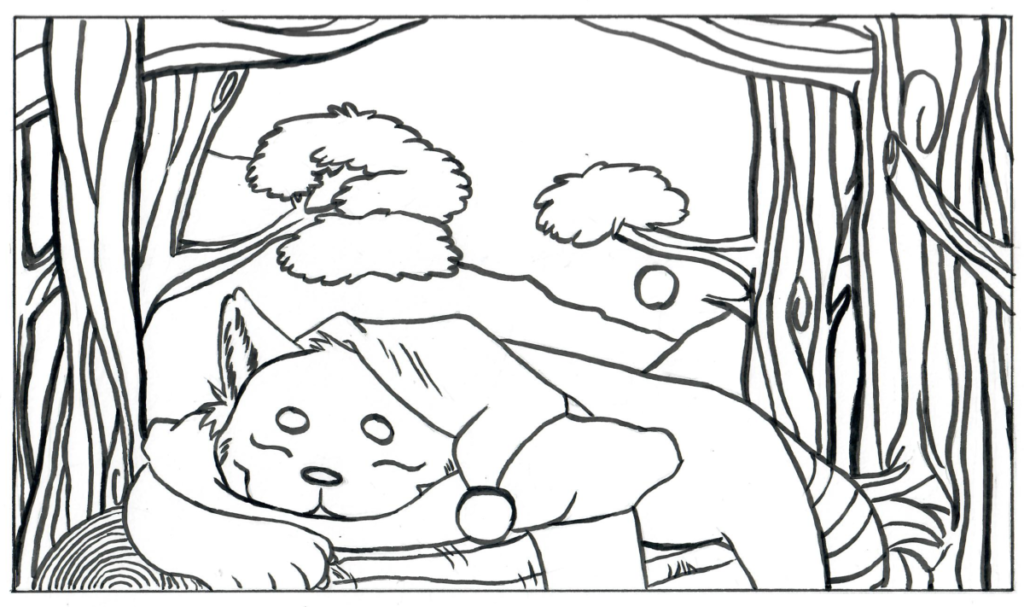
I never really experiment with different composition of the overall image before. So this is a good exercise to use the whole page. I’ve tried directional lines, negative space, balance, unity and movement. Out of all of them, I picked my directional, negative space and balance thumbnails. I also like the though.
I really like my directional concept. It turned out good to me. I wanted something to hit the points, but I didn’t want to distort the subject to do so. Suddenly I had floating rabbits come to mind. I’m glad it turned out good. The only thing I would change would be the bubbles. It might be too much. I’m not sure. I also like my balance concept. However, I think it’s a little too “asymmetrical.” I was inspired by the “Ukiyo-ye” example. Specifically having a small figure in the foreground and have a large object with mostly negative space in the background. So that explain the huge sun. The only thing I would change would be getting rid of the sun and make the cloud spread to the other side of the hill. Finally, the negative space concept is not my favorite, but it is successful. I did this one digitally because it’s easier getting a flat shade without using up my pen’s ink.



Recent Comments