
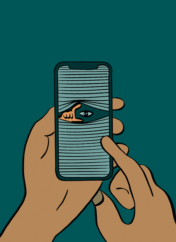
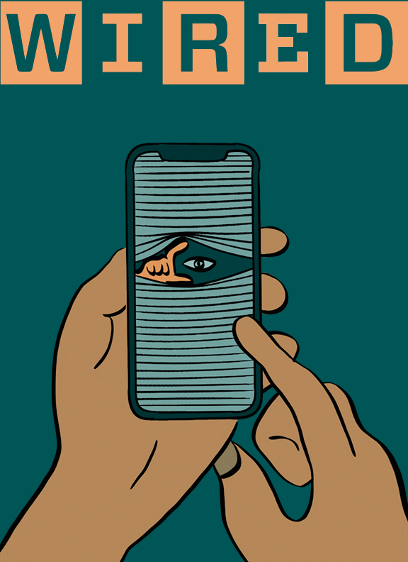
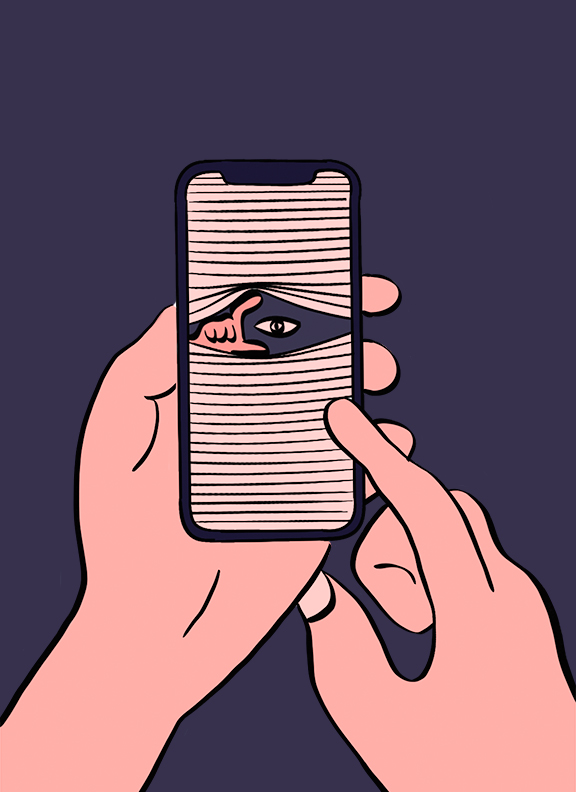
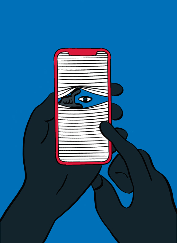
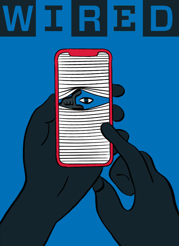
The article I chose, “There are spying eyes everywhere – and now they share a brain,” is from Wired magazine. I wanted my cover to have a clean, negative space composition. I achieved that by keeping the illustration minimal and the color palette of no more than three colors. The color variations I examined are colorful and vivid. The magazine’s logo helped tie the cover together. When researching, I noticed that the color changes with almost every issue published to match the colors of the cover illustration. Looking at my pieces with and without the logo, I think it ties the work together. The final product I decided on is the blue, gray, and red cover. It is my favorite because of its bright and eye-catching, especially with red as the accent color.












Recent Comments