Professor Schoenbrun | COMD3313 OL74| FA21

Category: Discussions (Page 8 of 18)

Discussion Week 6_Kiana

Utagawa Hiroshige, “Fuji Seen From The Sea At Honmaki Musashi” (Image from Google: Pinterest-Pedro Bonilla)

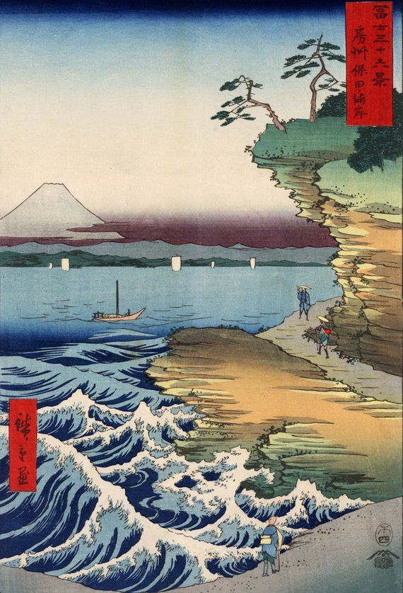
This art was created by Japanese Ukiyo-e artist Utagawa Hiroshige. I chose this artwork because I enjoy Ukiyo-e and arts from Japan. I think they are beautiful and I appreciate the process the artists use to make the prints. This art shows how well Hiroshige uses color theory to create his prints for viewers to admire and appreciate. You can view more of his work through this website, https://www.artic.edu/collection?artist_ids=Utagawa%20Hiroshige.

The process Hiroshige uses is traditional media, such as paint, woodblock, brushes and paper. He also uses the Color Technique called Color Harmony because of the way the colors balance each other out. The colors Hiroshige used helps guide the viewers into seeing the art in one direction to another, which is what Color Harmony is known for. When you look that the print, your eyes move from the wave, to the shore and finally to Mount Fuji. They also make the print stand out and not become dull.

I consider the Color Technique to be effective because it makes Hiroshige’s art look unique and magnificent. As mentioned before, the colors help balance out the art so people can view from one part of the print to the other. This way people can admire the different parts of the landscape and appreciate the dedication Utagawa Hiroshige put into it. I hope to learn more about Color Harmony in future, in order to become a better artist and improve my work.

Discussion 6

This artwork above is called Intriguing by the artist Tishk Barzanji. I chose this piece because as its name says, it is very intriguing. The composition is clean and simple, yet vibrant and it’s eyecatching. The color palette consists of three colors; red, orange, and green, and Barzanji built the image using their different values. The different values created perspective, shadows, and depth, as well as putting emphasis on the brighter subjects. I believe Barzanji created this artwork digitally, which is my favorite media.

Discussion Week 6

 “Starry Night”1888 Painting by Vincent Van Gogh

 I chose the “Starry Night” by Van Gogh because I think Van Gogh did a wonderful job of using a limited palate in many of his works. He also uses color to add value, depth and proper shadowing in his pieces. In this piece Van Gogh uses color theory by playing around with value and temperatue. He uses different hues of blue to emphasis, for example a light blue line work is painted in the foreground to separate where the couple is walking and make it stand out against the dark blue hues of the water. This same light blue though, is carried out sparingly into the shadowing of the water to create the sense of reflection. He also plays with different temperatures of blue in the sky to add the feeling of light from the stars. A very dark navy blue is set around the bridge to show reflection of hard to make out buildings, as if from the point of view of someone looking out across the water. He uses a contrasting color to blue, yellow, to give the eye a place to rest in the bright stars and to play with reflection again as the light from the moon and stars casts refractions of light in yellow line work across the water. Van Gogh seems to be using oil paint and mixing white in with the blue to lighten it and create new hues of blue. He also seems to modulate colors using warm and cool hues to create depth in the painting. I think Van Gogh’s work is effective because he is able to create a vivid scene with movement, rhythm and beautiful line work to pull the viewer into the painting and make it come alive. An awesome website to check out with more of his work is: https://vangoghworldwide.org/search?current=n_4_n&size=n_12_n

« Older posts Newer posts »