Professor Schoenbrun | COMD3313 OL74| FA21

Category: Discussions (Page 7 of 18)

Discussion Week6

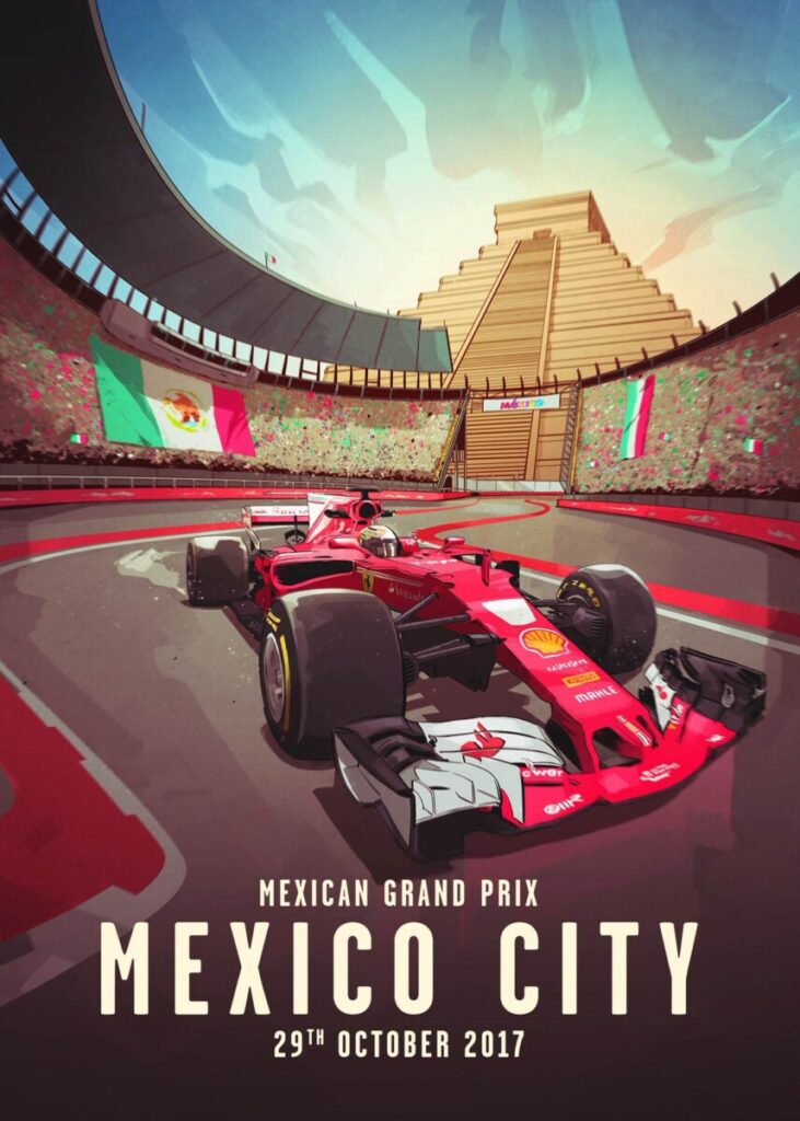
This artwork done by French Carlomagno who is a freelance illustrator. According to his work, he used Adobe illustrator to work on this artwork. This is a Formula 1 poster based on the Grand Prix taken place in Mexico City. The main focus is the setting and the Ferrari Formula 1 car that’s in the center of the artwork. This illustrator decided to use a warm color palette; this artwork has great contrast and movement which brings the artwork come to life. His color technique is effective because it gives that feel of how warm it is in Mexico City. Apart from that, the amount of red and yellow used in this image helps balance out the art. 
Discussion week 6

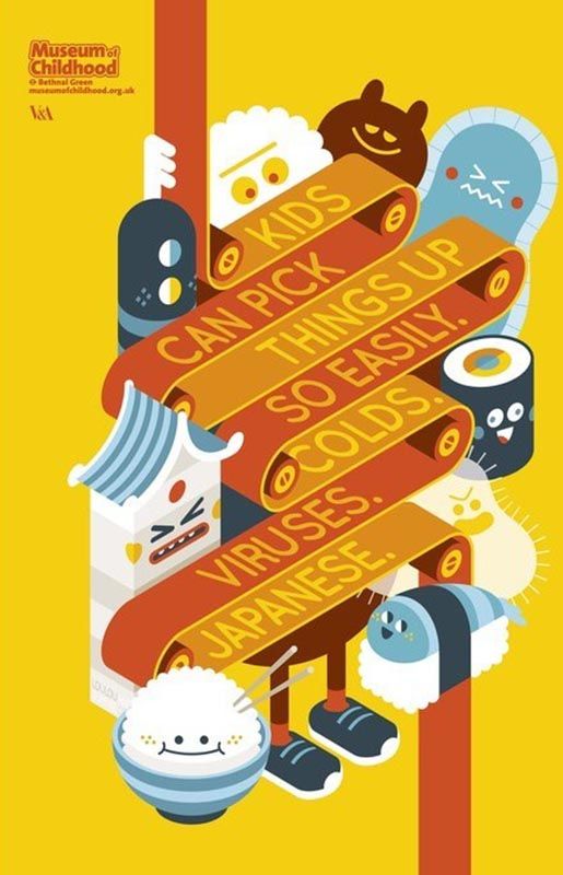
The art work create by ad agency AMV. The reason for me to choose this artwork is I like the character and the color. The character give some happy face. It covey the mood is fun. The artist use one color bur for different value in the background and the main object.  Also, the artists use warm color and color to make a contrast. The blue color use in the small object which around the main object.

Discussion Week 6_Joshua Smith

This illustration was created by Birgitte Johnsen who is a freelance illustrator and digital artist. The media they use to create their art are Adobe Photoshop, Adobe Illustrator, Indesign, and Procreate. You can view more of their work through this website https://www.artstation.com/iambirgitte

Birgitte used a limited color palette of blues and oranges. I believe that this is very effective because the colors contrast with each other very well. The use of the variations of blues and oranges worked very well because they used those colors to create shadows and highlights.

« Older posts Newer posts »