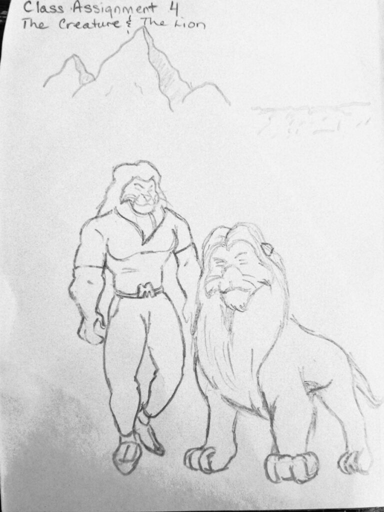
Author: Nyle (Page 7 of 10)
The design packaging that I can connect the most to would probably be Kellogg’s Tony the Tiger on the Frosted Flakes cereal box. Aside from the fact that I still love Frosted Flakes to this day, and along with having a catch phrase, there was also something about the simplicity of the art of Tony the Tiger that I was drawn to. Also the difference between his and most of the other cereal boxes was the contrast in colors(example, brown characters like Count Cholocula and Sonny the Coco bird, etc. were on brown boxes, Buzzy Bee was a golden bee on a golden Honey Nut Cherrios box, etc…Tony was a bright orange on a deep blue box)


Recent Comments