
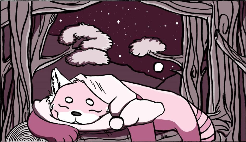
Custom comp 
Custom comp with template
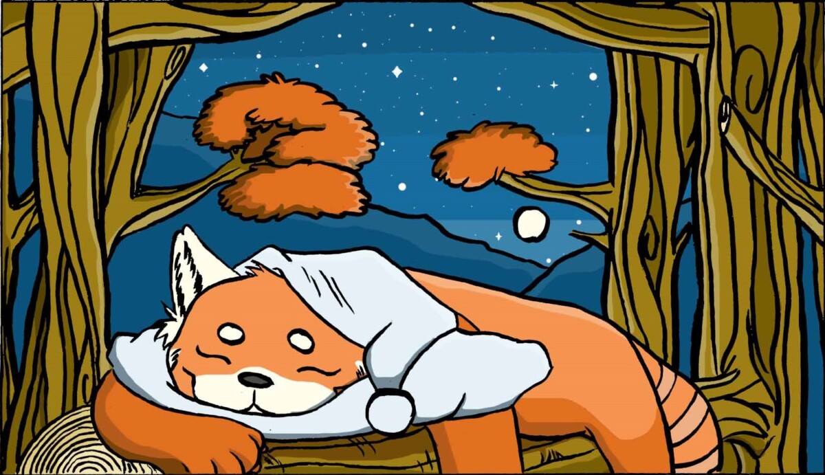
Mono comp 
Mono comp with template
Professor Schoenbrun | COMD3313 OL74| FA21
My name is Brianna Edwards. I'm in my first sophomore year in City Tech. I'm not sure on what I want to do yet but I'm thinking of being an illustrator. I've drawn on paper and digital media. I also want to tell my own story through drawings. I still feel like I have many things to learn so I'm looking forward to see how far I can go.
I'm also interested in animation. I have never properly animated before but I've grown up on them and I can't just let them go. So I still watch them now.


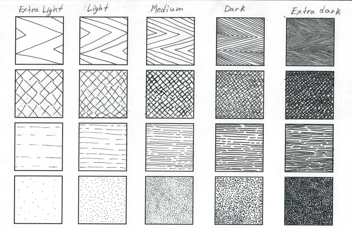
I started trying out different shades on a separate sheet. I specifically like linking the dots however it can take longer the execute. For inking between light and dark I’ve either drew the patterns closer together or use a different pen size.
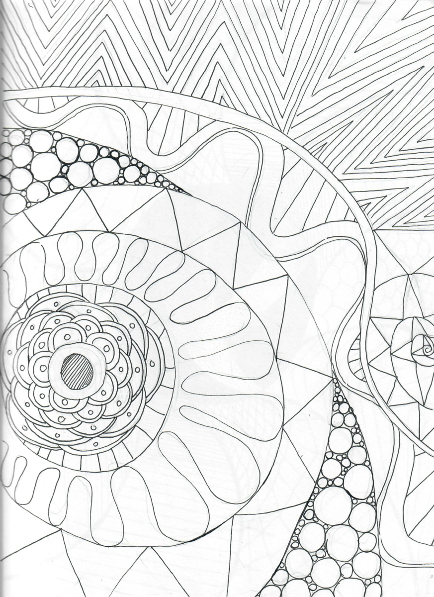
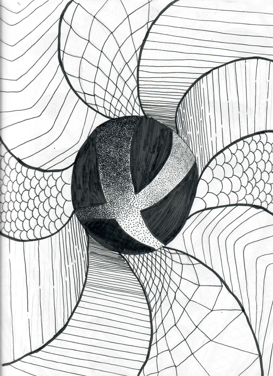
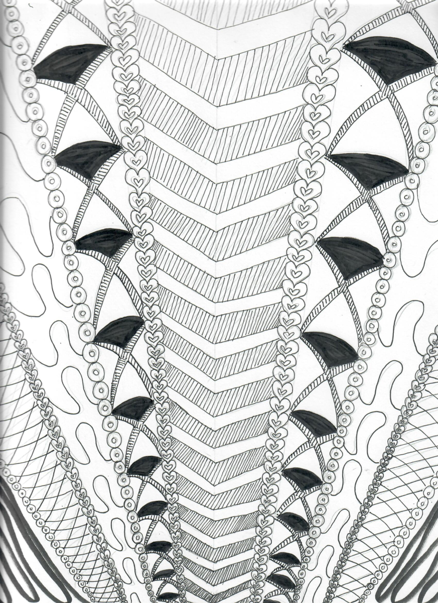
My first value sketch was more “random.” I tried to fit as many patterns on one page as much as I can. When I finished it, I was satisfied how it turned out. For my next two, I wanted to experiment more with perspective. For the second value sketch, I used a combination of the 1, 08, 01 and the brush pen. I started with the circle in the center, then I drew outward with swerve lines then I filled them in with patterns that gradually changes sizes. This helped with the prospective effect. For the third I decided to play with diagonal lines instead of circles/curves. Curves are still present, but they also flow upward. I think I like this one more visually because of consistency. I mostly used the 01 for the hearts and inner value in 5the center. and I also used the 05 for the second to fifth section. The last pattern on the end is a pen brush.
I never really experiment with different composition of the overall image before. So this is a good exercise to use the whole page. I’ve tried directional lines, negative space, balance, unity and movement. Out of all of them, I picked my directional, negative space and balance thumbnails. I also like the though.
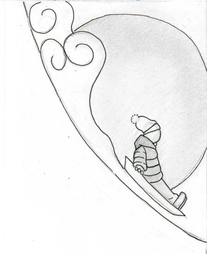
I really like my directional concept. It turned out good to me. I wanted something to hit the points, but I didn’t want to distort the subject to do so. Suddenly I had floating rabbits come to mind. I’m glad it turned out good. The only thing I would change would be the bubbles. It might be too much. I’m not sure. I also like my balance concept. However, I think it’s a little too “asymmetrical.” I was inspired by the “Ukiyo-ye” example. Specifically having a small figure in the foreground and have a large object with mostly negative space in the background. So that explain the huge sun. The only thing I would change would be getting rid of the sun and make the cloud spread to the other side of the hill. Finally, the negative space concept is not my favorite, but it is successful. I did this one digitally because it’s easier getting a flat shade without using up my pen’s ink.

© 2024 COMD3313, Illustration 1, OL74, FA21
Theme by Anders Noren — Up ↑
The OpenLab is an open-source, digital platform designed to support teaching and learning at City Tech (New York City College of Technology), and to promote student and faculty engagement in the intellectual and social life of the college community.


Recent Comments