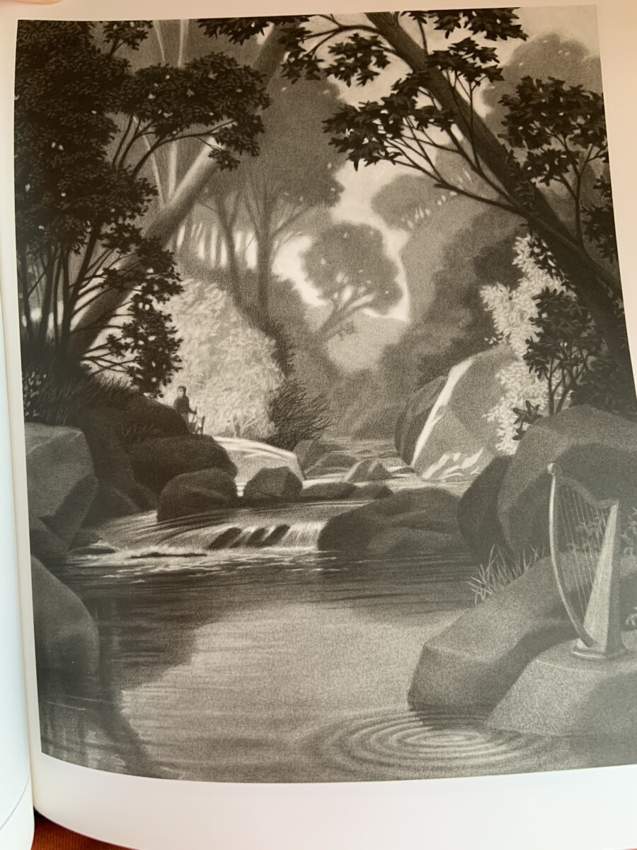
This illustration that I chose is by Chris Van Allsburg. I chose this illustration because I have owned an amazing book full of his illustrations since 2002, entitled “The Mysteries of Harris Burdick.” The entire picture book features drawings that all use greyscale and value. Allsburg does a wonderful job of incorporating different layers of value, using dark and light to form texture, shadowing and portray deeply vibrant works of art. His techniques seem very hard to learn, as they are very realistic but yet still hold playful elements within the characters he draws. I believe Allsburg used graphite pencil work to create his art. Some varying compositional techniques that Allsburg seems to use are contrasting foreground, middle ground and background. In the piece I featured above, Allsburg kept the background pretty light, keeping the sky white, helped with the reflections in the water in the foreground. He also made the middle ground dark, with the leaves on the trees to catch the viewers eye. However, because there is a lot of shadowing/ grey in his work, he uses light to reflect real world natural light and how it may bounce off of water, rocks and bushes to make the piece feel realistic. His techniques are effective because the dark and light contrast allows the eye to move around the page smoothly. It also creates a sense of unity on the page, that pulls the viewer into the world of the illustration.


Leave a Reply