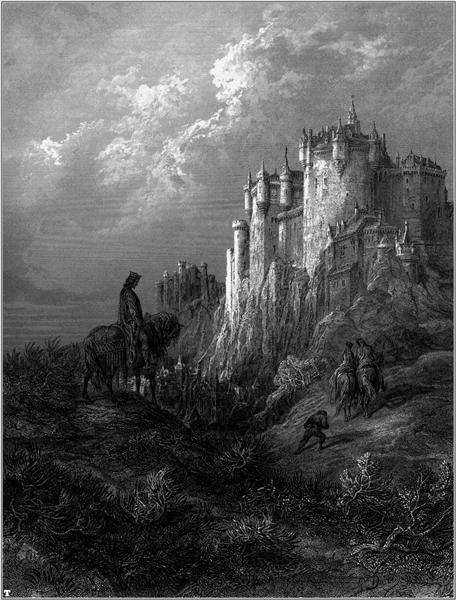
The name of the art work is Idylls of the King, created by Gustave Dore. I think the artists use Directional lines as the composition. The is guild audience’s attention from front to the back. The article use black, grey, and white color to created tone. Audience can easy to figure out which section is dark and which is light. I think it is easy to see 3 part of toned, black, white, grey.
About This Course
This course is a practical introduction to the field of illustration. Focus will be placed on process work and professional practices, presented within contemporary and historical context. Course includes projects and lectures in a variety of illustration genres.
Professor Schoenbrun
Office Hours: Tuesday 10am – 11 am
email for appointment
dschoenbrun@citytech.cuny.edu
Recent Comments
- Yanxuan Lin on Discussion Week 12: The Mysteries of Harris Burdick
- Yanxuan Lin on Discussion Week 8: Digital Inking
- Kiana on Discussion Week 12: The Mysteries of Harris Burdick
- Final Project – COMD3313, Illustration 1, OL74, FA21 on Final Project, Part 1
- Week 11 – COMD3313, Illustration 1, OL74, FA21 on Assignment 2, Part 3
OpenLab Help
Sharing
Logged-in faculty members can clone this course. Learn More!


I really love how value creates mood, which is very apparent in this piece that you chose. The castle and the clouds being this background light focal point and the dark hooded character sort of like a figment of our imagination coming out of the foregrounds dark dead grass land. Nice choice!