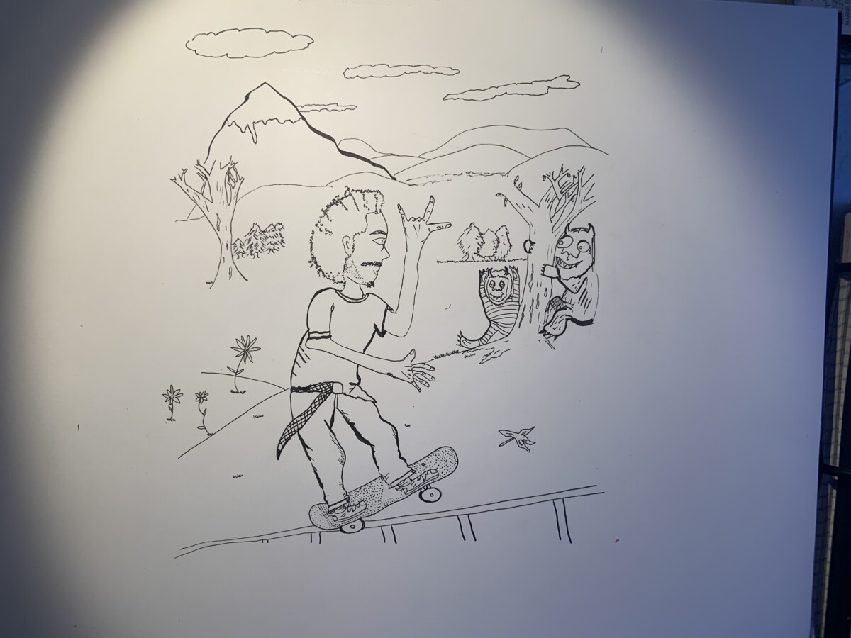


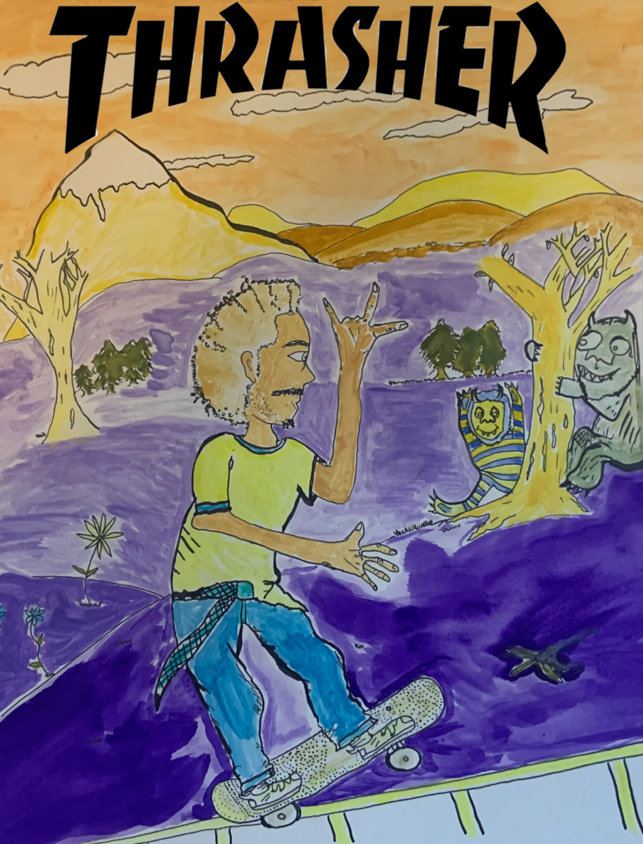
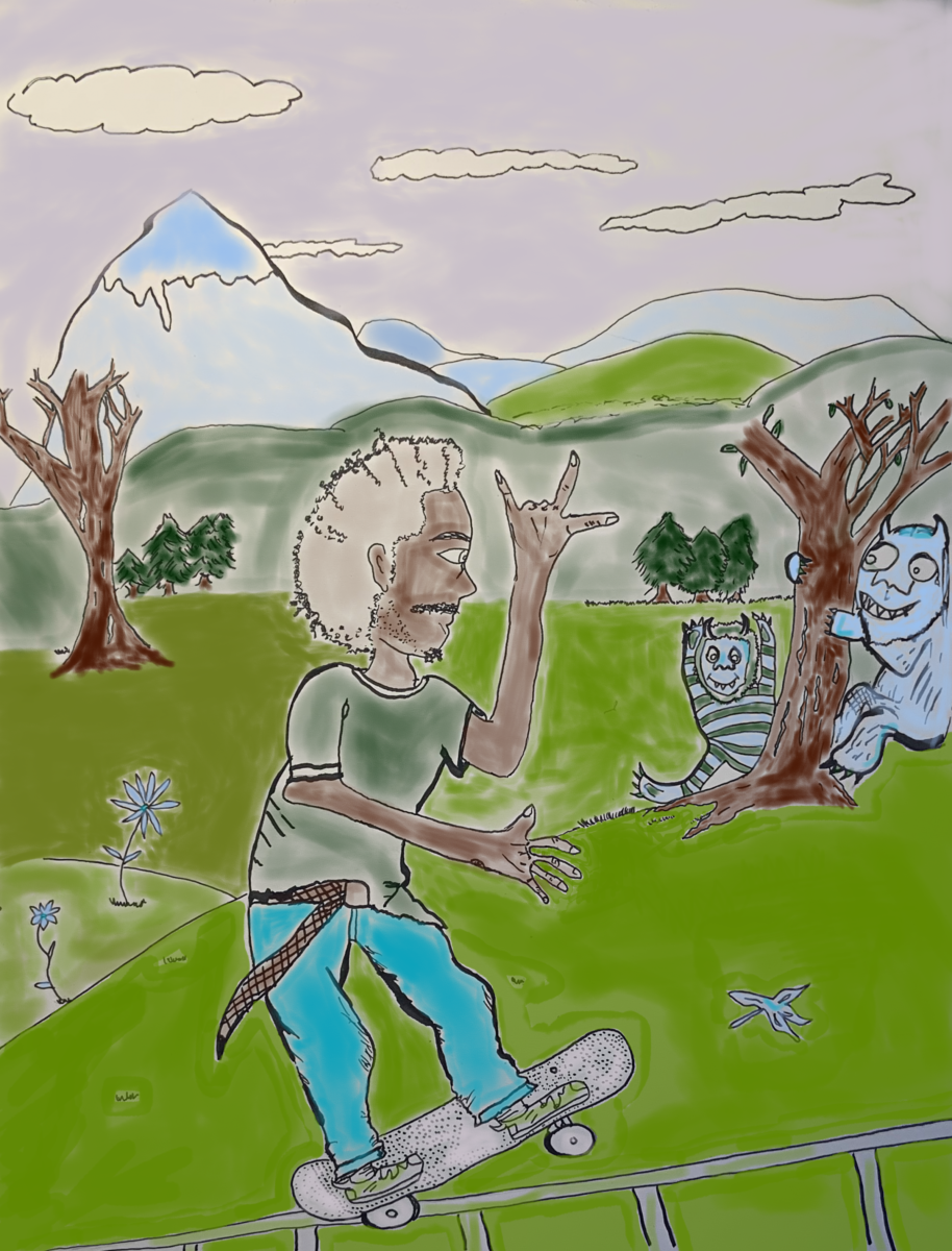
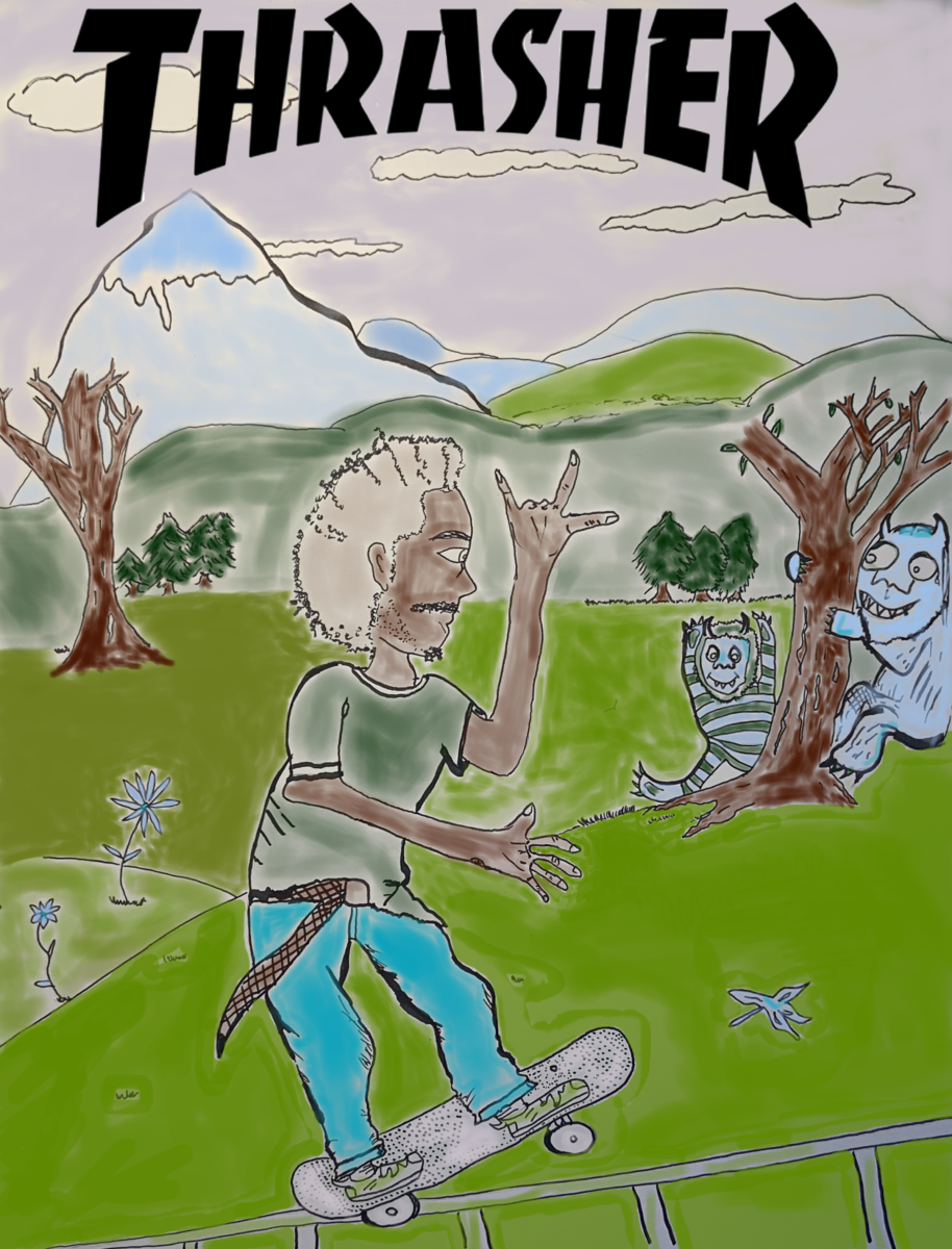
For this project I created a tight concept sketch for Thrasher magazine for the article “Wild Things” in issue 40. I then retraced my sketch using the window and sunlight onto Bristol board. I inked my piece using micron black ink pens sizes 005, 01,1, 2,3. I then created 3 color versions. Two versions were created via photoshop brush and one was created using watercolor. I wanted to play with different color palettes. For my final piece I chose a pastel color palette. I wanted to express a sunset in the sky without showing a sun so I blended yellows and salmon color pink with the bursting blue sky. I then wanted the skater to stand out so I made sure the brightest blue was on his jeans and a light but bright yellow for his shirt. I used different washes to tie in the monster characters on the right with the mountains and scenery. For the watercolor draft I did I played with complimentary colors purple and yellow and had an array of different water-color paints in different hues. I tried to go dark to light from the bottom up, and wanted the skater to stand out against the dark purple grass, so I added a pop of blue on his pants and a bright lemon yellow for his t shirt. I then blended the colors to create brownish tones for some fo the background trees.
For this piece I was inspired by the title of the article “Wild Things” because it reminded me of “Where the Wild Things Are” by Maurice Sendak, because of its refernces to how being out in nature made the skater/author feel like a child again. So I referenced and paid homage to Sendak’s characters in the right side of the composition, which for me tied together the missing element from my rough concept sketch.


Leave a Reply