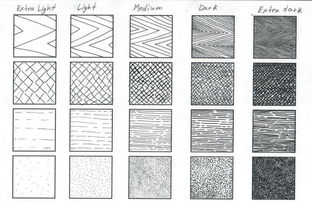
I started trying out different shades on a separate sheet. I specifically like linking the dots however it can take longer the execute. For inking between light and dark I’ve either drew the patterns closer together or use a different pen size.
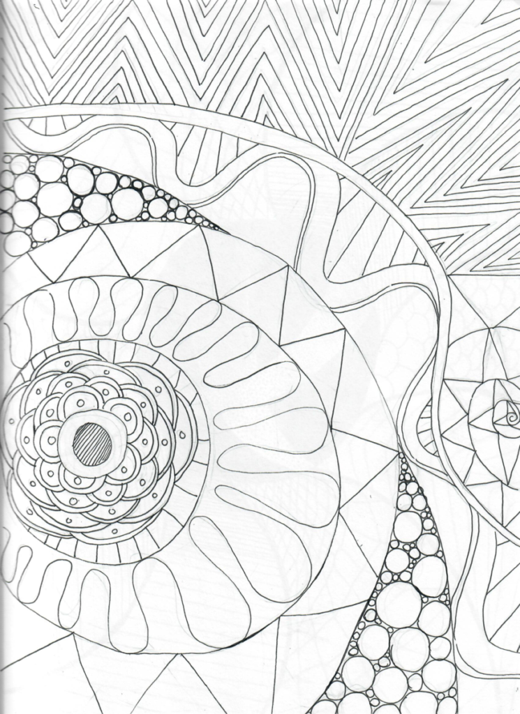
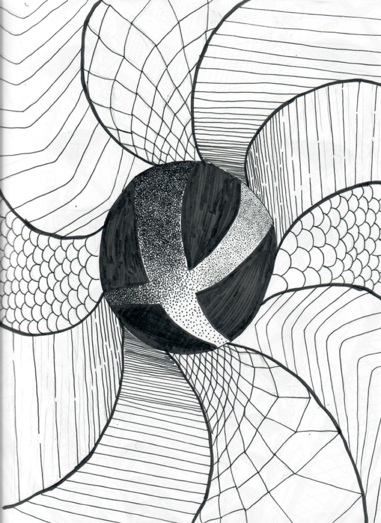
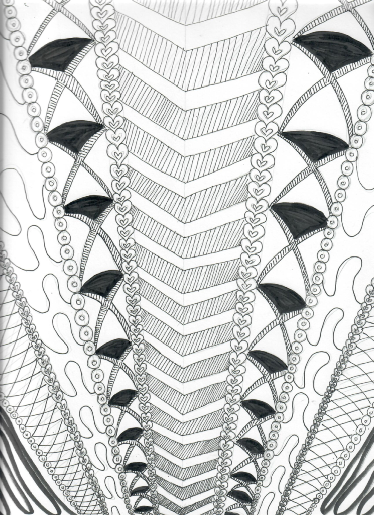
My first value sketch was more “random.” I tried to fit as many patterns on one page as much as I can. When I finished it, I was satisfied how it turned out. For my next two, I wanted to experiment more with perspective. For the second value sketch, I used a combination of the 1, 08, 01 and the brush pen. I started with the circle in the center, then I drew outward with swerve lines then I filled them in with patterns that gradually changes sizes. This helped with the prospective effect. For the third I decided to play with diagonal lines instead of circles/curves. Curves are still present, but they also flow upward. I think I like this one more visually because of consistency. I mostly used the 01 for the hearts and inner value in 5the center. and I also used the 05 for the second to fifth section. The last pattern on the end is a pen brush.


Leave a Reply