Course: COMD 1200 Graphic Design Principles II
Assignment: Create a typographic ligature, hand-paint it, and animate the letterform.
Background: Letterforms combined to create a logo are recognizable due to our familiarity with the alphabet. However, in teaching COMD 1200, I realized students needed to think of letterforms differently and focus on their visual characteristics in addition to their phonetic attributes.
Personal Reflection: This project transitioned from The Ligature to the 27th Letter of the Alphabet. I introduced students to alternate letterforms and foreign alphabets, prompting them to consider what their 27th letter would sound like and where it would fit in our alphabet. This led to more efficient design work as students began creating both upper and lower case characters. A sample below:
This project also required reacquiring many craft skills that students have overlooked in the digital age, such as measuring with a ruler. I noticed that many students struggled to estimate measurements like two inches or two centimeters. Additionally, they needed to develop sensitivity to the nuances of letterforms, including serifs and thicks and thins, which hand-painting enhanced, fostering a stronger work ethic.
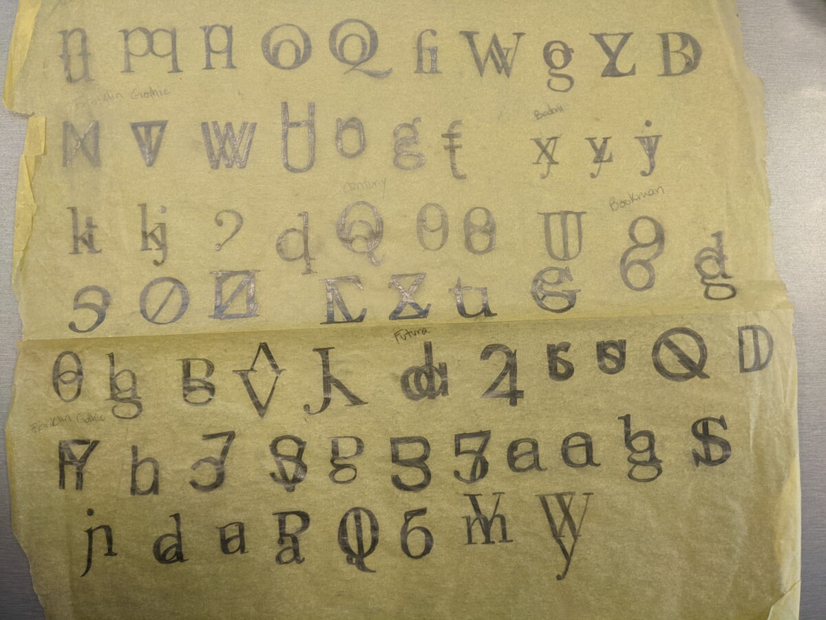
I provided a 9-page file of classic typefaces for students to print. The fonts listed in the book, https://www.designingwithtype.com/, were essential. James Craig, the author was my typography teacher in art school. Along with Rudy DeHarak, my design teacher, both inspired this project’s development.
The scaffolded skills:
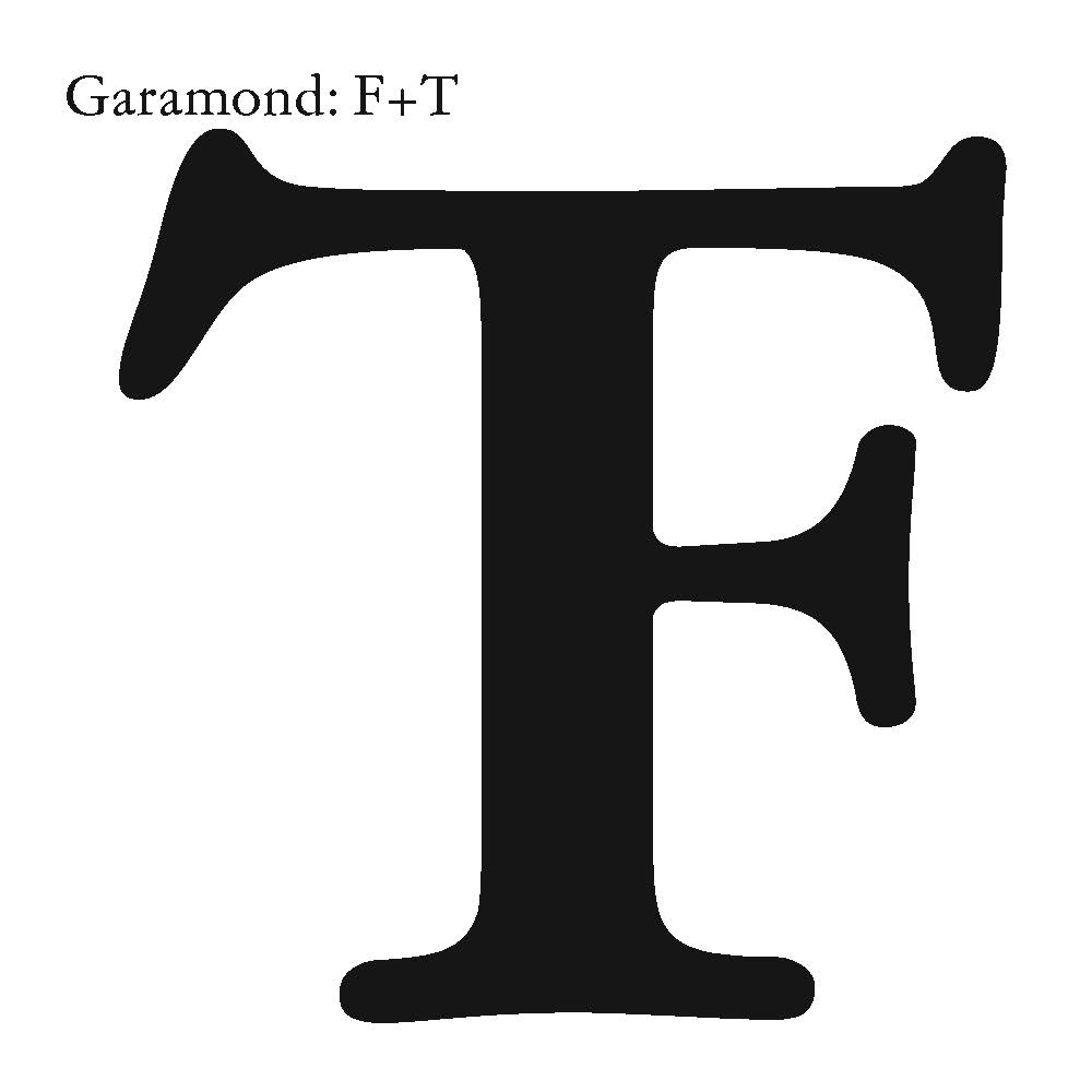
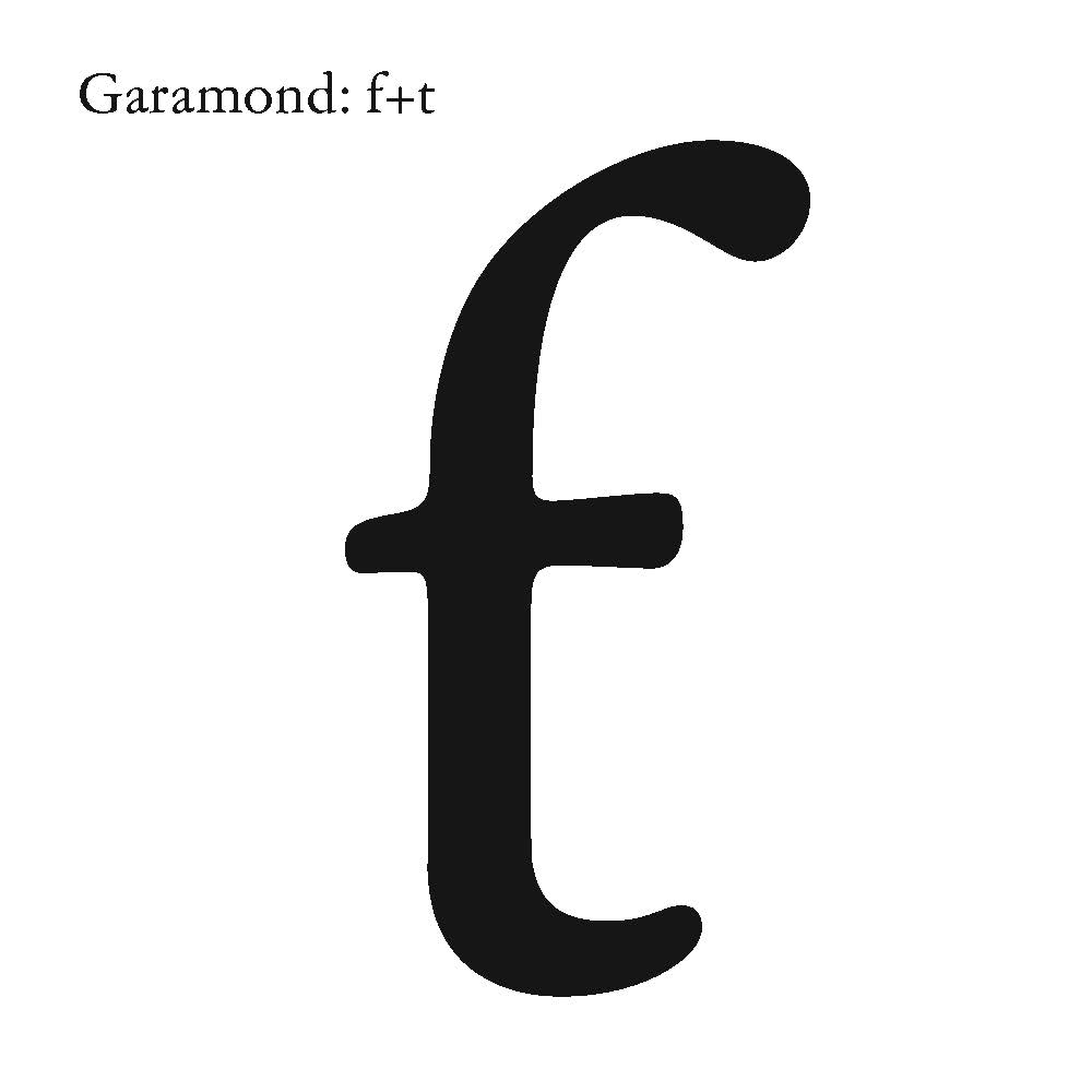
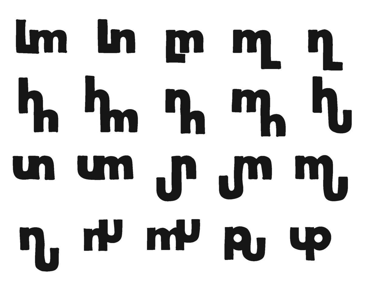
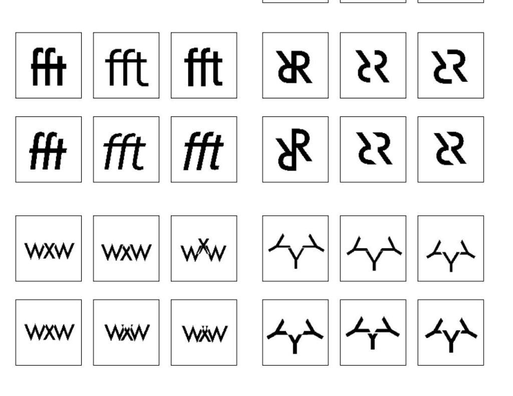
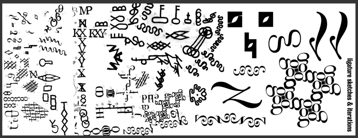
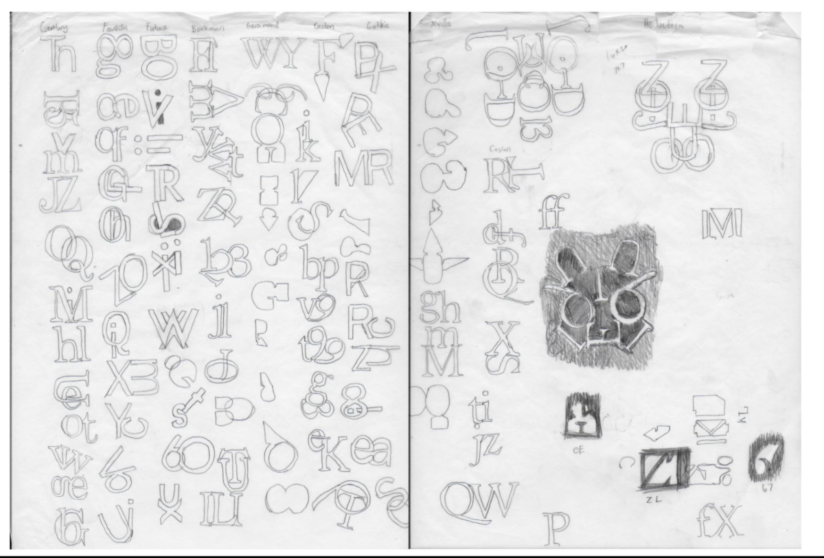
a) Exploration through repetition: students had to design 100 ligatures by combining two letterforms. They traced their letters from the Type Book they printed. Below are a few samples:
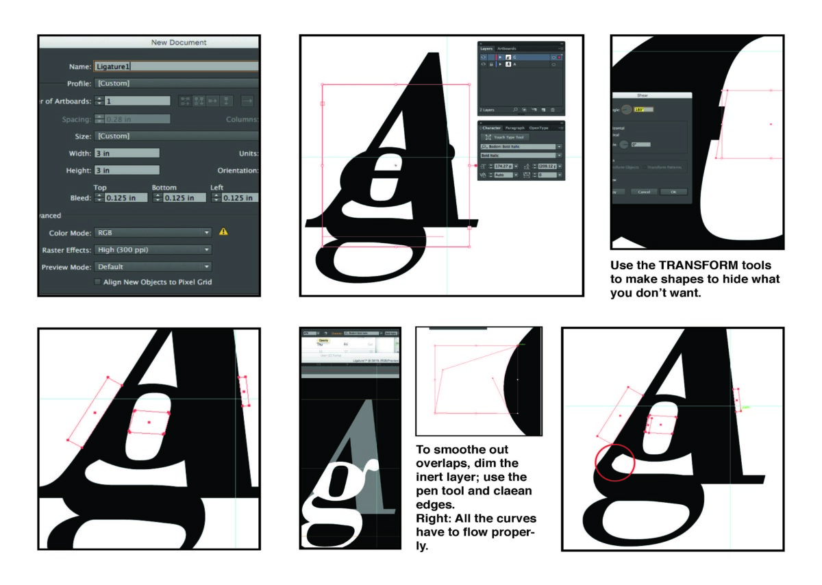
b) Using a “data sheet”–a six-pane how-to I created for the students–they brought their sketches to the computer and refined their ligatures. The data sheet is at the bottom of this entry.
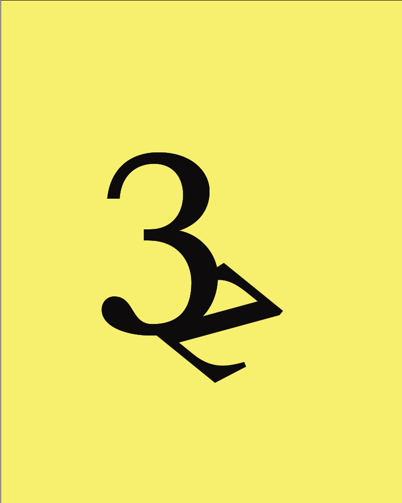
Below are student samples:


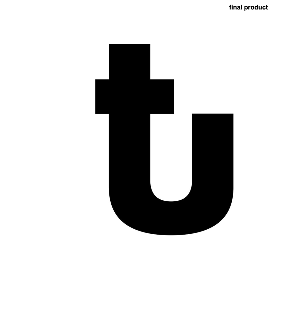

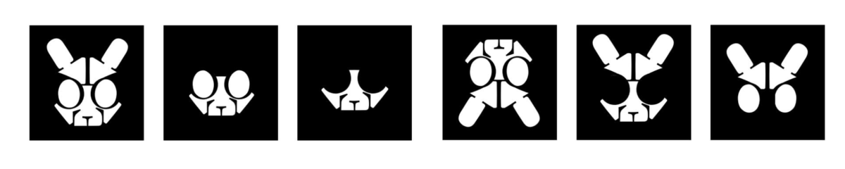
Some students pushed the letterform into a full illustration:
Animating the letterform was a diverse process. I introduced a GIF animation project in which students drew (designed) each cel independently, rather than relying on software filters to transform the image. The project commenced with students studying Eadweard Muybridge’s work, a pioneer of motion picture. They created brief videos of various subjects in motion. After mastering this exercise, students let their creativity flow and enjoyed the outcomes of animating their letterforms.
You can view a frame-by-frame animation of the letter “D” tumbling at https://imgur.com/a/dyF89rU, and here’s one of the whimsical animations created:
Data sheet I created for students to build the ligature in the computer: