Prof K Pelka : Tuesday 12:00 - 3:20

Category: Final Critique (Page 1 of 2)

Adrika – Final Critique

Rayven Vanoni

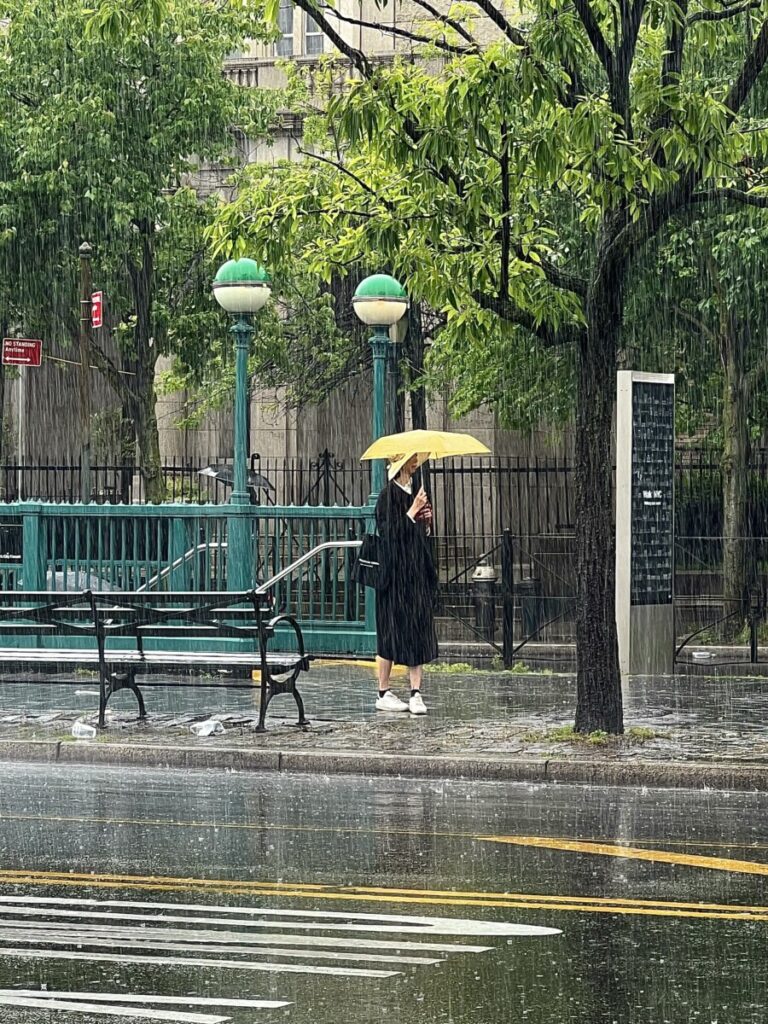
I really like how this photo exemplifies Rayven’s theme of “mundane life”. The woman’s yellow umbrella contrasts well with the buildings and street to help draw the eye to her. I like the texture created by the freeze …

Final Critique – Dayana

Rishon Cole

I like that in this one Rishon decided to go for a kind of high angle because it really helps demonstrate that figure-background relationship, giving the girl half of the frame including a corner, and then showing the …

Final critique

I chose this photo from Faariah because the way the light falls on the wood is compelling and the texture of the wood is very interesting to look at. It is a very warm close up picture.

Kennths photo is …

Final Critique

IMG_7337
I really like how Adrika integrated the negative space, leading lines and light all into one photo. The negative space makes you focus more on the color of the leaves. The leading lines are shown with the telephone wires and

Final Critique (eddy)

« Older posts