Prof K Pelka : Tuesday 12:00 - 3:20
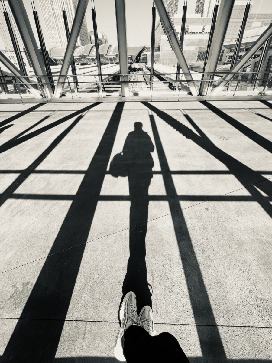
I really like the composition of Rishon’s photo here with the direct harsh lighting and long shadows. There’s a high contrast between light and dark and the leading lines help elongate and draw the viewer’s eye forward. The …

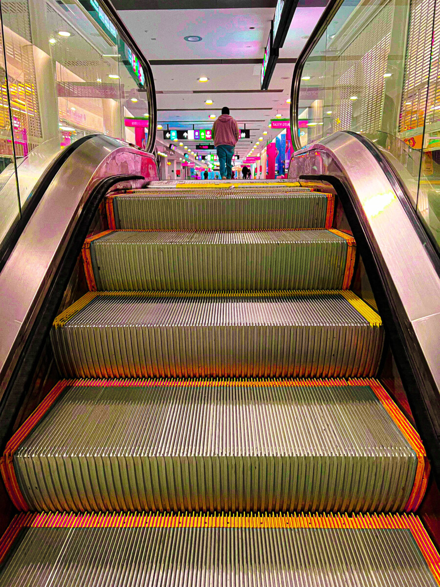
For me the colors, use of vibrance and saturation stood out to me the most. The rule of thirds in Antonio ‘s empathizes the person although it does blurr a little, the leading line via the …

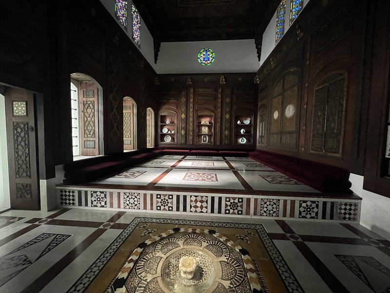
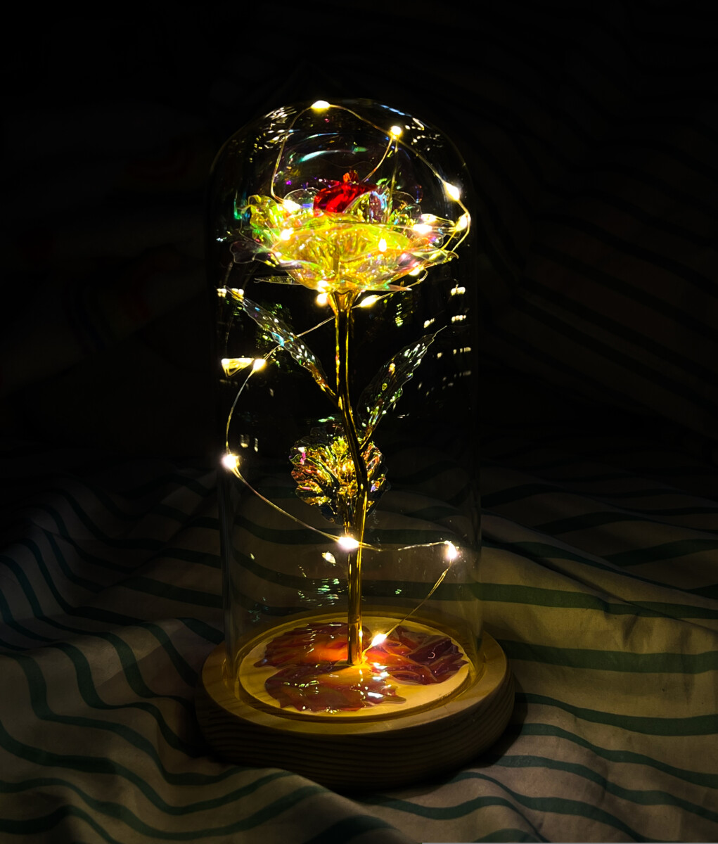
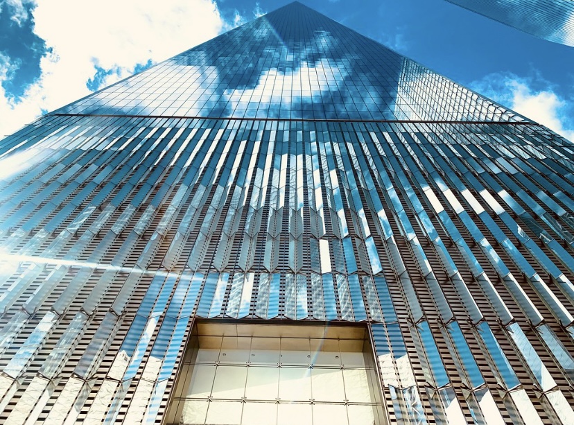
Rishon Cole: I love the colors going on in this building. The way the walls and floors seem very detailed with designs and dark soft toned colors. And the top middle shines a colorful stained glass …

© 2024 COMD1340D087 Photography 1,Spring 2023
Theme by Anders Noren — Up ↑
The OpenLab is an open-source, digital platform designed to support teaching and learning at City Tech (New York City College of Technology), and to promote student and faculty engagement in the intellectual and social life of the college community.


Recent Comments