Lee Friedlander is an American photographer who was born in Aberdeen, Washington in 1934. He discovered his passion for photography when he was just 14 years old, and decided to study in Los Angeles in 1953 to then move to New York in 1956 where he is currently residing. He is known for capturing the social landscape along with visual materials ubicated in dynamic places to create innovative images of the city and its people without making it look messy. In his work we can mostly find portraits of people, signs and inanimate objects, overlaps of light, and reflections of himself, which is kind of unusual for street photographs given that he gives it the same or equal importance as the main element of the work.
After going through the photographers given, I finally decided to choose Lee Friedlander because I like the way he puts elements in the frame to give all of them a meaning and importance. Normally when people work on street photographs, they try to find materials and elements that work within the photo and eliminate the ones who don’t. However, Friedlander uses all of them, he doesn’t get rid of any element because what he’s trying to accomplish is demonstrate the social landscape as it actually is. This is really interesting, for the photos should look out of order and messy overall given the quantity of elements that appear in them, but they don’t. He uses certain points of view to give every single one of them a space in the frame and makes it work somehow using different types of lens, tones and others.

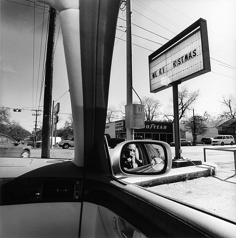
The photo that I chose is from a collection presented at the Whitney Museum in 2010 called America by Car. For this collection he decided to adventure himself through more than 50 states of the United States using only rental cars to capture a different point of view of the landscape in other places apart from New York City. This photo was taken in Texas in 2006, and we can find many different elements inside it. We can see the left side of the interior of the car which makes kind of a frame that separates into two parts the street, on one side is this sign saying “Merry Christmas” with some letters that have fallen as well as a car store while on the other side, we can find the traffic light relatively close to the photographer, and a car in movement going in front of the rental car.
What strikes me about the photo is where the elements are placed. When we take a picture, we know that each element should have a respective place, so that there’s harmony within them. However, when I see this picture, I can kind of divide it into two different frames thanks to the corner of the interior of the car. On the right side we can explore a more calm street, for there is not a single car in movement and it’s kind of frozen; however, in comparison with the left side, we can determine that it’s a more active street due to the blur in the car that is in front of the photographer which means that it’s in movement. This photo looks really common, so it’s easy to relate to it. In here we find a man inside his car going through a normal street in a state of the US, and since we need cars and trains to transport between one place and another, this kind of scenes are easy to find, specially in places that are not too crowded like, in my case, some zones of Queens.
In this collection we know that the main purpose of Friedladner was to capture the landscape of different geographic zones of the US using a different point of view, in this case, using the inside of a car as well as recording some elements that were tendencies and “obsessions” during this period of time. I would say that the compositional elements he used were of real help, for we can find some of these tendencies inside the photo (the signal saying “Merry Christmas” in this case). Some of the compositional elements that I could find in this picture were the point of view, frame within a frame, and tonal and color contrasts. When talking about the point of view, we can see that it’s more of a slight combination between low angle and eye level. I say it’s eye level because when we see the reflection of the photographer in the mirror, we can see that the camera is at a normal, stable angle. However, since the subject (photographer) is sitting inside the car and the sign is closer to him than the end of the street, we can see that the sign is kind of elevated, but this could be just from its height in comparison to the person. The frame within a frame element was mentioned earlier when I talked about how Friedladner uses the borders of the front mirror and the right side one to create two different frames inside the whole picture. And finally, we can see how this photo is in black-and-white which is a characteristic of Lee Friedladners’ work, for in most of his projects and individual photos, we can notice that he always turns the picture into this tone to help make normal, boring aspects of our life more interesting, surreal and strange in some kind of way.


Leave a Reply