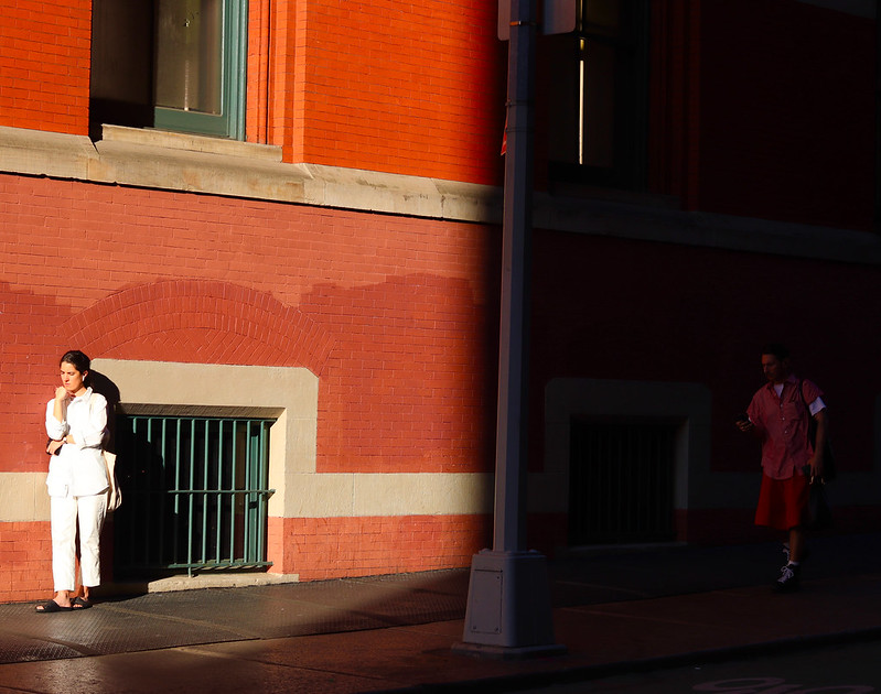
I like rishon’s photo because I love the way the lights and dark are in it and the picture looks cinematic. Also has a magazine feel to it.
Kenneth’s photo i like as well because of how much perspective is in it. And this portrait shot is so clean complimented with the edit. It almost looks like grass taller than humans.


Leave a Reply