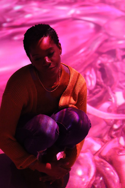
I like that in this one Rishon decided to go for a kind of high angle because it really helps demonstrate that figure-background relationship, giving the girl half of the frame including a corner, and then showing the floor with texture. We also can see that this picture has a lot of contrast due to the direct light presented by looking at the lights and shadows in the person, especially in her forehead where we can find some strong light.

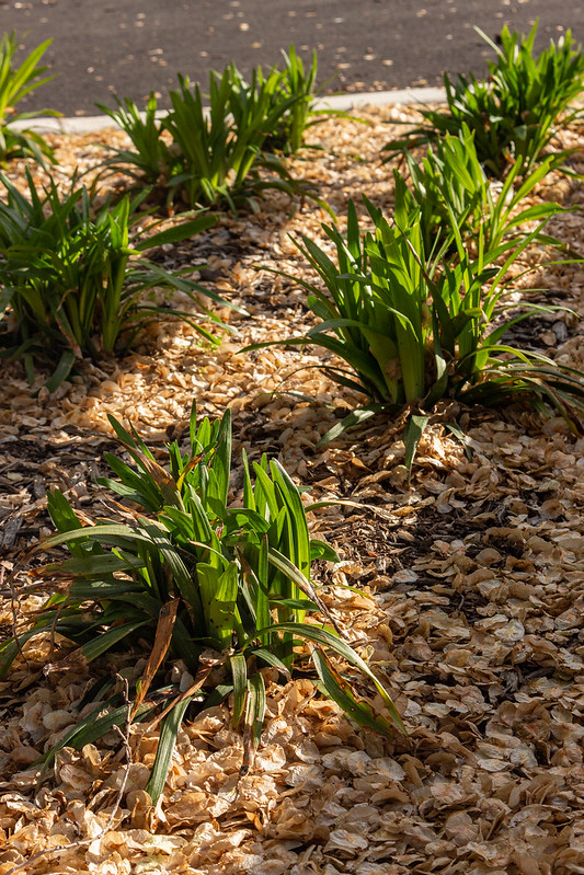
I like how Adrika decided to go for more of a close up in this photo because we can see the texture of the leaves clearly as well as where the light is hitting each of the elements in the frame. Repetition of elements is presented here, and we can also see how the light coming from above is creating some diagonal lines that emphasizes the main plants in the picture.


Leave a Reply