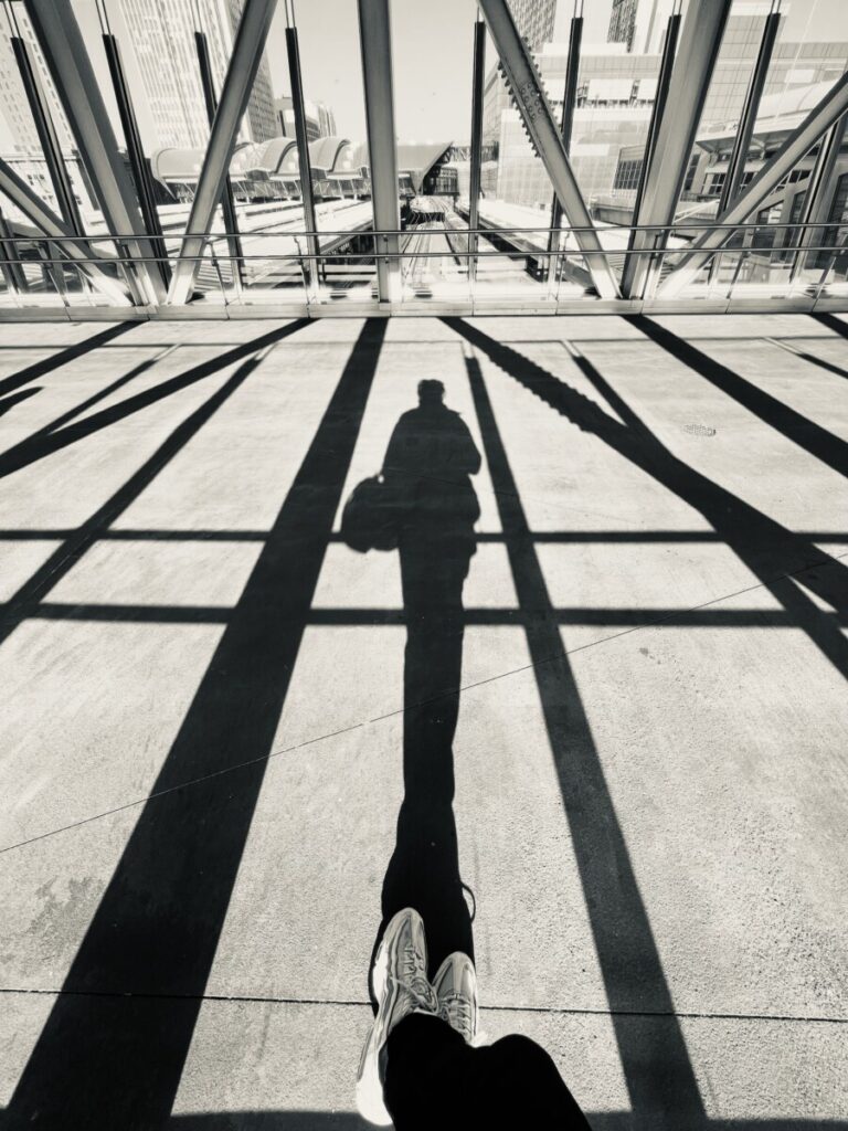
I really like the composition of Rishon’s photo here with the direct harsh lighting and long shadows. There’s a high contrast between light and dark and the leading lines help elongate and draw the viewer’s eye forward. The shadows also help create a pattern that frames the persons shadow.

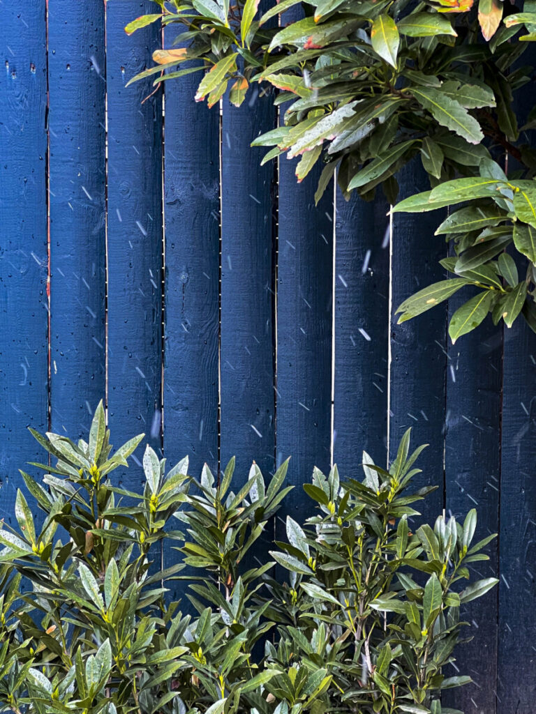
Rayven’s photo has a really good close up framing and composition with an asymmetrical diagonal balance. The blue and green color really play off each other well and the slight motion blur from the snow adds a lot of visual interest. The vertical lines in the photo also help draw the eye from top to bottom.


Leave a Reply