

Virtual Field Trip Report
For my virtual field trip, I was tasked with visiting both the Nassau County Museum Exhibit Blue and performing a task based on art from the Cooper Hewitt Digital Museum. Through both digital exhibits, we viewed paintings and art pieces that all shared one commonality: the use of the color blue. Each and every piece used the color blue in some way. At the end of viewing both exhibits, I was tasked with writing my personal reflection on the piece Huxley’s Guide to Switzerland by Christopher Winter. In this report, I will be going into further detail on Huxley’s Guide to Switzerland as well as Shichirigahama in Sagami Province by Katsushika Hokusai and Ethereal Evolving I by Han Qin.
Huxley’s Guide to Switzerland, Christopher Winter, (130 x 230 cm), Acrylic on canvas
The first piece I will be discussing is Christopher Winter’s “Huxley’s Guide to Switzerland”. This piece is an acrylic painting on canvas measuring 130 x 230 cm. The subject is abstract. I chose this piece because this was the first piece I was assigned to analyze during the virtual field trip. Besides needing to analyze the piece during the virtual field trip, I personally enjoy this piece. We can see a man and a woman hovering over a body of water. The man is wearing a white dress shirt with dark khaki shorts and dark brown shoes whilst the woman is wearing a pink dress with white polka dots, a white undershirt and white slipper shoes. In the painting, the man and woman are standing side by side and hovering over the water below them, their reflections barely visible near the bottom of the painting. The painting uses various different shades and tints of blue with tints and shades of blue being used in the mountains to give them texture. The painting itself has a landscape composition to it as we can see not only the man and woman but also the mountains around them. The mountains in the background are dull and contain lighter tints of blue compared to the mountains in the foreground which use darker shades of blue. There is no text accompanying this painting.
Shichirigahama in Sagami Province, Katsushika Hokusai, (25.7 x 38.1 cm), Woodblock print; ink and color on paper
The second piece I will be analyzing is Shichirigahama in Sagami Province by Katsushika Hokusai. This piece is a woodblock print with ink and color on paper. It measures at 25.7 x 38.1 cm and the subject is meant to be landscape. I chose this piece because I have a personal love and appreciation for Japanese woodblock prints. I adore the aesthetic and designs of Japanese woodblock prints and when I saw this print as a part of the Blue exhibit, I knew I had to discuss it. In this woodblock print, we can see a landscape filled with hills, trees and mountains. In the foreground, we can see a grassy teal hilltop with dark teal bushes and trees accompanying it. Further back, we see a grassy field with more shrubbery accompanying it and in the back, we see an icy teal mountain with a dark blue sky in the background. In this painting, Hokusai uses thick lines on places like the field and mountain to signify detail and texture. This inclusion gives the piece depth and transports the viewer into the piece. The use of blue is somewhat sparse in this painting as the only pieces we can see are in the sky and the rocky blue landform within the middle of the field. Throughout the rest of the painting, we can see the use of teal and green meant to signify grass. The composition is wide and the woodblock uses a landscape composition. To the top-left of the woodblock, we can see the use of Japanese typography. It is unknown what this typography is meant to represent.
Ethereal Evolution 8, Han Qin, (82 x 47 in), Cyanotype on paper
The third piece I will be analyzing is Ethereal Evolution 8 by Han Qin. This piece is a cyanotype on paper. It measures at 82 x 47 in and the subject is meant to be abstract. I chose this piece because I enjoy the abstract nature of it. It’s unclear what is going on within this cyanotype and I would like to analyze this piece regardless. In this cyanotype, we can see the abstract form of a woman moving. Dark blue surrounds the figure which is shown to have white and light blue colors. There is no way to tell who the figure is or what it is doing and it is left to the viewer’s own interpretation. There is no typography within this cyanotype. However, the area around this figure has this wispy looking effect to it and it makes the figure seem almost supernatural or ghostly. This piece is a very good example of the use of positive and negative space as the light, wispy figure contrasts with the dark blue background.
Overall, the experience of visiting a virtual exhibit was vastly different from visiting a museum in person. Viewing photographs of these pieces online didn’t give me the same intimate feeling that I would get if I saw it hanging on the wall of a museum. I lost that intimate feeling that you get as a viewer when you view a piece up close in a museum. I personally didn’t think the virtual exhibit was all that effective. I believe what would improve this virtual exhibit greatly is if we were to have some sort of commentary from a museum curator about the piece. Getting to hear about the context behind the piece as well as some background information about the artist would help greatly in getting the viewer invested to learn more about the art and engage with it more.
A brief look into the history of the Riot Games logo.
Teamfight Tactics. Valorant. League of Legends. Some of the most popular multiplayer games in today’s video game market. And we can give thanks to Brandon Beck and Marc Merrill for helping to found the studio that delivered all these great titles; Riot Games. While most people who follow the company may focus on and give praise to the games made by them, for this paper, I want to bring your attention over to something about Riot Games that seemingly goes undiscussed; the logo. In this paper, I’ll be going over the early history and inception of the original Riot Games logo, how and where the first logo was used and how Riot Games eventually came to the decision to redesign and show off their new logo in 2019.
When Riot Games was first founded by Brandon Beck and Marc Merrill in 2006, technology was still relatively young. Logos for big companies like Pepsico and Apple didn’t have the minimalist designs that are seemingly commonplace today. Logos during this time had a distinct shimmer to them. They glowed and radiated, catching the attention of consumers. Riot Games was no exception and their original logo would stand out with a personality all its own. Designed in-house by Riot Games employees and designers from Rinker Design, both studios chose a unique approach during the thought process of the original logo’s design. In an online article posted on the Riot Games website titled “Refreshing Our Logo”, Riot Games employees state that when Brandon and Marc needed a logo, “it needed to be something uniquely recognizable, something with a punch. And thus, the fist was born.” Keeping this idea in mind, the designers at Rinker Design and Riot Games indeed created a logo that was uniquely recognizable and packed a huge punch. The logo was completely drawn by hand with no known typeface of the logo being available to the public. From 2006 all the way up until 2018, Riot Games used this logo in promotional material for their games and even as a visual signifier for their developers in live streams. For 13 years, everything about the logo from its design, to the typography, to even the colors were handmade and went unchanged. However, as time went on, Marc, Brandon, and Riot Games employees would begin to notice the imperfections of the logo. Noticing these imperfections is what eventually led the company to fix where they went wrong and create what would become the new logo for Riot Games.

The original logo for Riot Games which was used from 2006 to 2019.
On April 15, 2019, Riot Games released an article onto their official website titled “Refreshing Our Logo” in which they discussed the thought process of their old logo design, how it was created and even what imperfections the designer teams at Rinker Design and Riot Games later noticed in the original logo’s design. In the article, employees from Riot Games detailed the process of designing the first logo and how when their first art director designed the logo “no one thought about readability for app use or scaling.” The article also discussed how as technology advanced and the team began introducing their logo into new environments such as YouTube videos and Twitch livestreams, “it became clear that the logo we used for so long and had grown so fond of needed a rework.”
“After working closely with Marc and Brandon, and our CEO Nicolo, we created, what we think, is something that captures the spirit of our original logo while giving it the update it needed.”
Some examples of how the original Riot Games logo was used.
A day earlier on April 14, 2019, Riot Games had released a short teaser video onto their YouTube channel, showing off the redesign of the logo. A day later in their web article, the design team elaborated more on the thought process behind this new redesign. The Riot Games design team had once again chosen to work with Rinker Design in order to create the logo redesign. However, this time, they were not going to make the same mistakes that had been made during the creation of the original logo. The design teams at Riot Games and Rinker Design banded together with a singular goal in mind: redesign the original logo to match with current design trends while keeping the personality of the original Riot Games logo intact. They wanted to capture the same “punch” that the original logo gave off while at the same time, updating it to match current logo design trends. The final result was a logo that the two teams became greatly fond of.
Top: Logomark behind an illustration of a character from League of Legends, a MOBA developed by Riot Games. Bottom-left: Riot Games logo in a black and red color scheme. Bottom-mid: Logo in a black and white color scheme. Bottom-right: Logo and logomark in a red and white color scheme.
The new logo was carefully constructed by both Rinker Design and Riot Games designers to be easily recognizable while still keeping the spirit of the original logo intact. In the “Refreshing Our Logo” article, the team at Riot Games went into detail about some of the decisions that transpired between both teams during the redesigning process. After testing and placing the old logo in places where it was normally featured (namely in company merchandise, social media and the Riot Games company website), the designers ultimately came to the decision to separate the fist from the main logo text. In the team’s own words, the decision was made so that the fist could be used separately as a recognizable logomark for any apps, publications or merchandise made by Riot Games. The text of the logo also took on a more blocky and angular look when compared to the original’s graffiti-esque lettering. The designers at Rinker Design and Riot Games have created their own typeface for this logo that is currently unavailable to the general public. In their article, they also listed some of the more obscure details of the redesigned logo such as the swapping of the hand’s position from left to right that was meant to “mirror the letter ‘R’ in the logo text”. In the photo seen below, Riot Games designers even chose to showcase some more obscure details such as the intricate angles that the text and logomark take on. Currently, the fist is being used as a logomark in Riot Games’ merchandise (ex: purchasable gift cards and clothing) and it can be seen on the official Riot Games website.
Some official design notes of the new logo for Riot Games. The designers made sure that the lettering in the logo text mirrored up with the fist.
When the redesigned logo for Riot Games first debuted, it was met with mixed reception. Some liked and appreciated the more streamlined and minimalistic design while other people such as famous League of Legends streamer, Tyler1, denounced it, claiming it as “too basic and too minimalist”. The results were polarizing and the designers of the new logo suffered criticism from many who didn’t appreciate the changes from the original logo to the redesigned one. Despite the negative criticism though, it is clear that the new logo for Riot Games shows an evolution in the company’s image. With their logo, Riot Games has moved away from the graffiti-esque text and screaming logo design that was popularized by the early 2000s. Technology has changed and many companies including Riot Games have been forced to adapt and rebrand themselves to match current trends. The designers at Riot Games and Rinker Design worked to fix what the previous designers and art directors of the original logo failed to do. With this new logo, the designers have managed to recapture the spirit of the original logo while updating it to make it legible and uniquely recognizable. Riot Games has successfully adapted to changing technologies and design trends and created a new logo that matches the minimalist designs that have been popularized during the 2010s and that other companies use to this day. In a society dominated by minimalist logos, the designers at Riot Games have managed to stand out from the rest of the crowd and create a logo that truly does pack a punch.
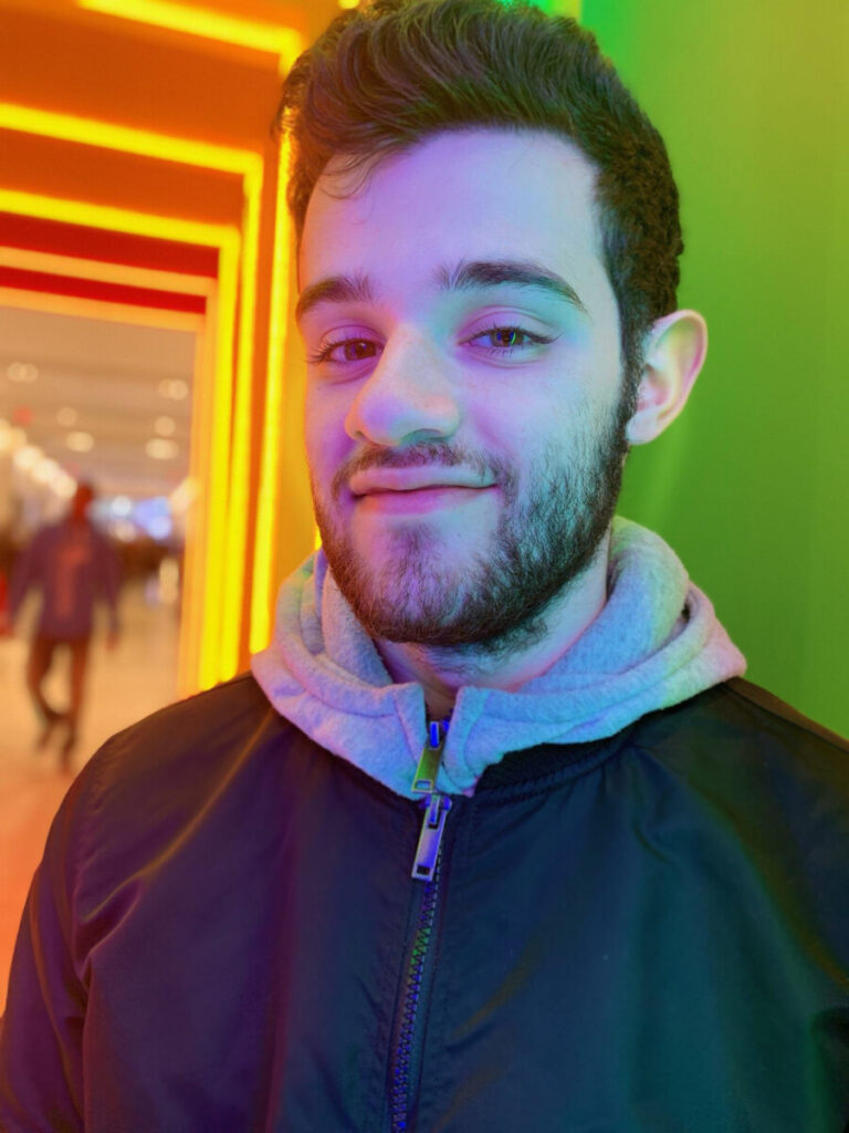
Hello and welcome to my ePortfolio. My name is Nicholas Albanese and I am a junior year Commmunication Design student at City Tech. I was born in Brooklyn, NY and I enjoy all things, illustration, graphic design and animation. I have a deep admiration for 80s and 90s designs and I often use art from those periods as inspiration for most of my design works.
When I first started attending City Tech, I was originally a student in the Computer Systems Technology major. Initially, I wanted to learn how to program and code so I could become a video game developer once I graduated. However, after seeing some of the work created by students in the Communication Design major, I decided to pursue that major instead. I wanted to regain the passion that I had lost for art when I started college and become an artists like I always dreamed of. In Fall of 2019, I officially became a Communication Design student and I haven’t looked back ever since. I’m determined to become a graphic designer and fulfill the dream I always had: to create stylish and memorable works of art.
Currently, I am continuing my education through online classes as the coronavirus has shut down any possibilities of me continuing in-person classes. I am currently doing my best to stay on top of all my work and find whatever opportunities I can to become a better artist and better designer. If you wish to see more of my design work or want to learn more about me as a designer, you can visit my ePortfolio where I post any design work I do.