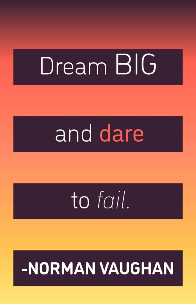
For this first interpretation of the quote, I wanted to use a color scheme that evoked calm dreams. For me, pastel colors emanate a calm aura and so I decided to use a palette of all pastel colors. The inclusion of the moon and stars is meant to represent nighttime, the time when people typically go to sleep and have dreams. The thought bubble is meant to represent thoughts and dreaming. As for the font that I chose, I used a cursive font to give the text a sense of elegance and fluidity.For this second visual interpretation of the quote, I chose to use a color palette that was meant to resemble a sunset. I intentionally chose these colors because I believed they would be aesthetically pleasing. As for the font, I chose DIN Light as I wanted to continue the light and elegant nature of dreams from my last visual interpretation. However, when it came to the words “big” “dare” and “fail”, I intentionally chose to emphasize them by making them different from the rest of the sentence. I increased the size of the word “big” and used a slightly heavier version of the DIN typeface. For the word “dare”, I chose to emphasize it and make it stand out by using a bright, warm color from my color palette. For the word “fail”, I chose to decrease the weight of the font as well as italicize it to give it more emphasis and help it stand out. I also chose to put Norman Vaughan’s name in bold face as well as a heavier version of DIN in order to emphasize him as the author of the quote.For my final visual interpretation of the quote, I chose to use Century Gothic as the main typeface. I believe that Century Gothic itself is a more childish font and I believe that plays into the idea of dreams and children being more subject to having them. Since this last interpretation was meant to have a photograph accompanying it, I chose to use a photo of a starry night sky since it relates to night; a time when people are usually asleep and dreaming. I chose to use the same method that I applied to my text within my last visual interpretation and emphasize the last words of each portion of the sentence through size, color, and font style. However, I chose to arrange each portion of the quote in different ways. I intentionally arranged the text so that it would be read from left to right. Finally, I decided to place the author of the quote at the bottom left of the piece as well as italicize it for emphasis.