Virtual Field Trip Report
For my virtual field trip, I was tasked with visiting both the Nassau County Museum Exhibit Blue and performing a task based on art from the Cooper Hewitt Digital Museum. Through both digital exhibits, we viewed paintings and art pieces that all shared one commonality: the use of the color blue. Each and every piece used the color blue in some way. At the end of viewing both exhibits, I was tasked with writing my personal reflection on the piece Huxley’s Guide to Switzerland by Christopher Winter. In this report, I will be going into further detail on Huxley’s Guide to Switzerland as well as Shichirigahama in Sagami Province by Katsushika Hokusai and Ethereal Evolving I by Han Qin.
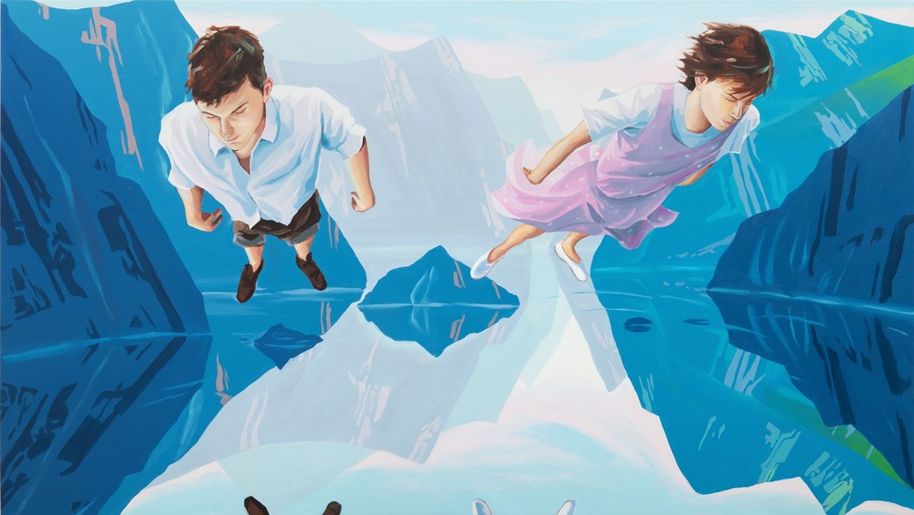
Huxley’s Guide to Switzerland, Christopher Winter, (130 x 230 cm), Acrylic on canvas
The first piece I will be discussing is Christopher Winter’s “Huxley’s Guide to Switzerland”. This piece is an acrylic painting on canvas measuring 130 x 230 cm. The subject is abstract. I chose this piece because this was the first piece I was assigned to analyze during the virtual field trip. Besides needing to analyze the piece during the virtual field trip, I personally enjoy this piece. We can see a man and a woman hovering over a body of water. The man is wearing a white dress shirt with dark khaki shorts and dark brown shoes whilst the woman is wearing a pink dress with white polka dots, a white undershirt and white slipper shoes. In the painting, the man and woman are standing side by side and hovering over the water below them, their reflections barely visible near the bottom of the painting. The painting uses various different shades and tints of blue with tints and shades of blue being used in the mountains to give them texture. The painting itself has a landscape composition to it as we can see not only the man and woman but also the mountains around them. The mountains in the background are dull and contain lighter tints of blue compared to the mountains in the foreground which use darker shades of blue. There is no text accompanying this painting.

Shichirigahama in Sagami Province, Katsushika Hokusai, (25.7 x 38.1 cm), Woodblock print; ink and color on paper
The second piece I will be analyzing is Shichirigahama in Sagami Province by Katsushika Hokusai. This piece is a woodblock print with ink and color on paper. It measures at 25.7 x 38.1 cm and the subject is meant to be landscape. I chose this piece because I have a personal love and appreciation for Japanese woodblock prints. I adore the aesthetic and designs of Japanese woodblock prints and when I saw this print as a part of the Blue exhibit, I knew I had to discuss it. In this woodblock print, we can see a landscape filled with hills, trees and mountains. In the foreground, we can see a grassy teal hilltop with dark teal bushes and trees accompanying it. Further back, we see a grassy field with more shrubbery accompanying it and in the back, we see an icy teal mountain with a dark blue sky in the background. In this painting, Hokusai uses thick lines on places like the field and mountain to signify detail and texture. This inclusion gives the piece depth and transports the viewer into the piece. The use of blue is somewhat sparse in this painting as the only pieces we can see are in the sky and the rocky blue landform within the middle of the field. Throughout the rest of the painting, we can see the use of teal and green meant to signify grass. The composition is wide and the woodblock uses a landscape composition. To the top-left of the woodblock, we can see the use of Japanese typography. It is unknown what this typography is meant to represent.
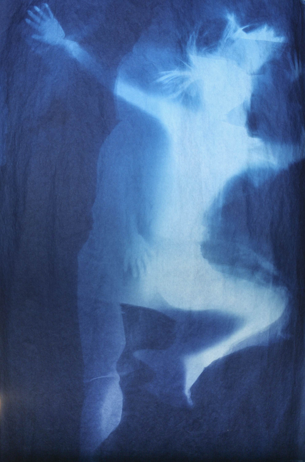
Ethereal Evolution 8, Han Qin, (82 x 47 in), Cyanotype on paper
The third piece I will be analyzing is Ethereal Evolution 8 by Han Qin. This piece is a cyanotype on paper. It measures at 82 x 47 in and the subject is meant to be abstract. I chose this piece because I enjoy the abstract nature of it. It’s unclear what is going on within this cyanotype and I would like to analyze this piece regardless. In this cyanotype, we can see the abstract form of a woman moving. Dark blue surrounds the figure which is shown to have white and light blue colors. There is no way to tell who the figure is or what it is doing and it is left to the viewer’s own interpretation. There is no typography within this cyanotype. However, the area around this figure has this wispy looking effect to it and it makes the figure seem almost supernatural or ghostly. This piece is a very good example of the use of positive and negative space as the light, wispy figure contrasts with the dark blue background.
Overall, the experience of visiting a virtual exhibit was vastly different from visiting a museum in person. Viewing photographs of these pieces online didn’t give me the same intimate feeling that I would get if I saw it hanging on the wall of a museum. I lost that intimate feeling that you get as a viewer when you view a piece up close in a museum. I personally didn’t think the virtual exhibit was all that effective. I believe what would improve this virtual exhibit greatly is if we were to have some sort of commentary from a museum curator about the piece. Getting to hear about the context behind the piece as well as some background information about the artist would help greatly in getting the viewer invested to learn more about the art and engage with it more.

