Yeonseon Lee
COMD 1100
05.22.19. WED
Museum Visit
Artist name: Jackson Pollock
Medium: Oil paint
Date of the art piece: 1950
The date of visiting museum: 05.19.18
I went to the Museum of Modern Art to see “One: Number 31, 1950”. It has ambiguous
figure. It is hard to find out which elements go with foreground and background. This art piece
has texture. The feeling is so intensive and rough due to scatting painting. When seeing this
piece, it contains all the grayscales as well. It is really whimsical, active, and intensive. It has
quick and violence movements as well. Its color is in mostly through all the grayscales and some
brown. For using achromatic color, it gave us cold feeling; in the meanwhile, it gave angry
feeling. This artwork is covered the big part of wall. Despite of huge size of artwork, the feeling
became to increase. I felt that art work expressed the mixed feeling: angry, confusion, sadness.
People feel complex and several feelings not just one feeling. I think the artwork might look
differently to people depending on what people feel at that moment. It does not have various
colors, but I can feel many things and make me think rather than seeing color art works.
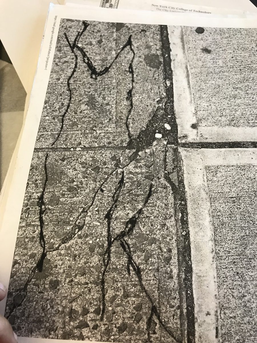
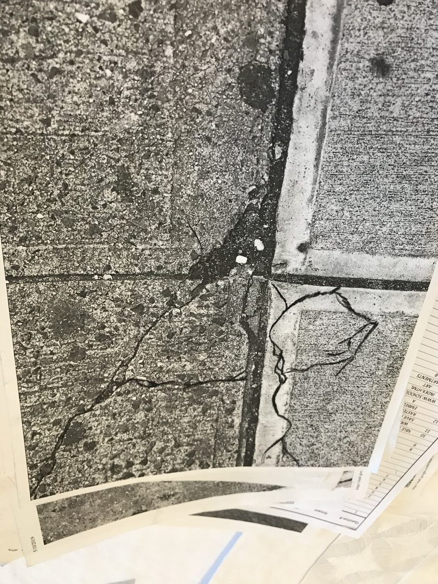
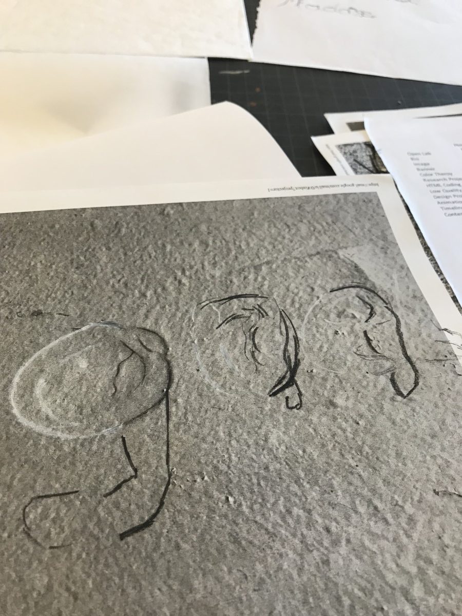
I chose the desert line work that I have done. This art piece has different figure than first
work that I saw in the museum. The art piece that I have done has obvious figure rather than art
work and also contains smooth and calm feeling. It, however, has same texture work and black
and white picture. Even though those of works are texture and similar color, they give me
completely different feeling due to material of medium.
Page 1 / 2
Zoom 100%


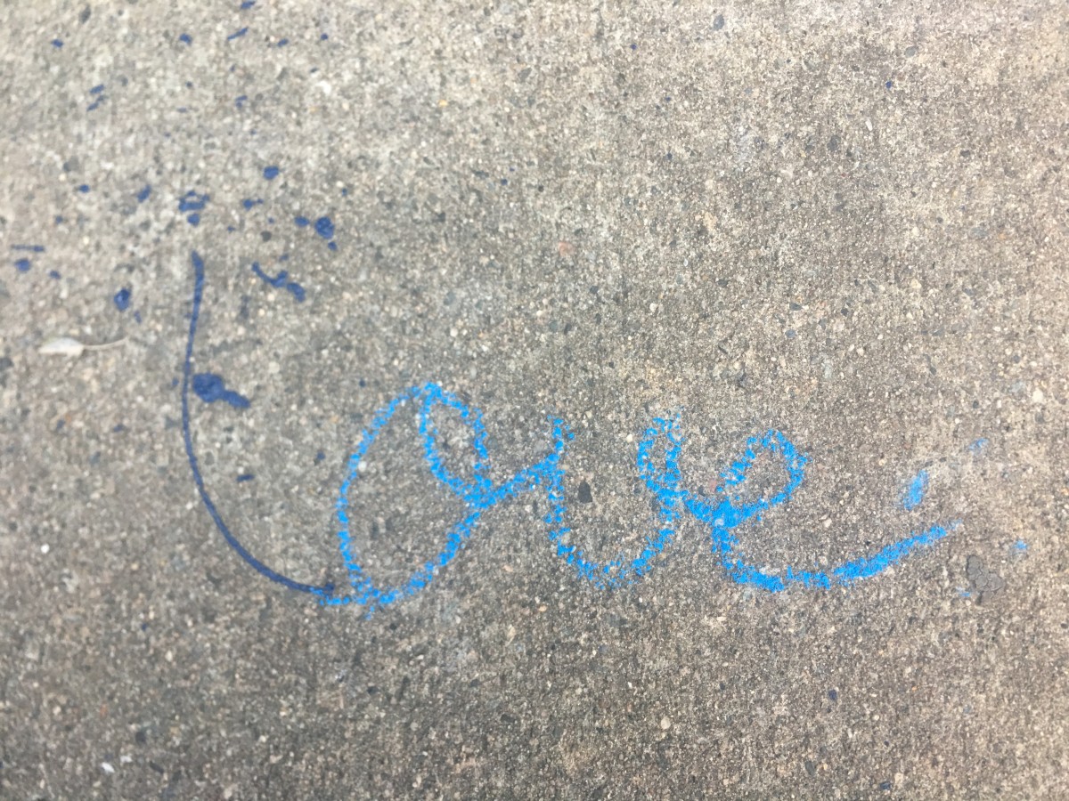


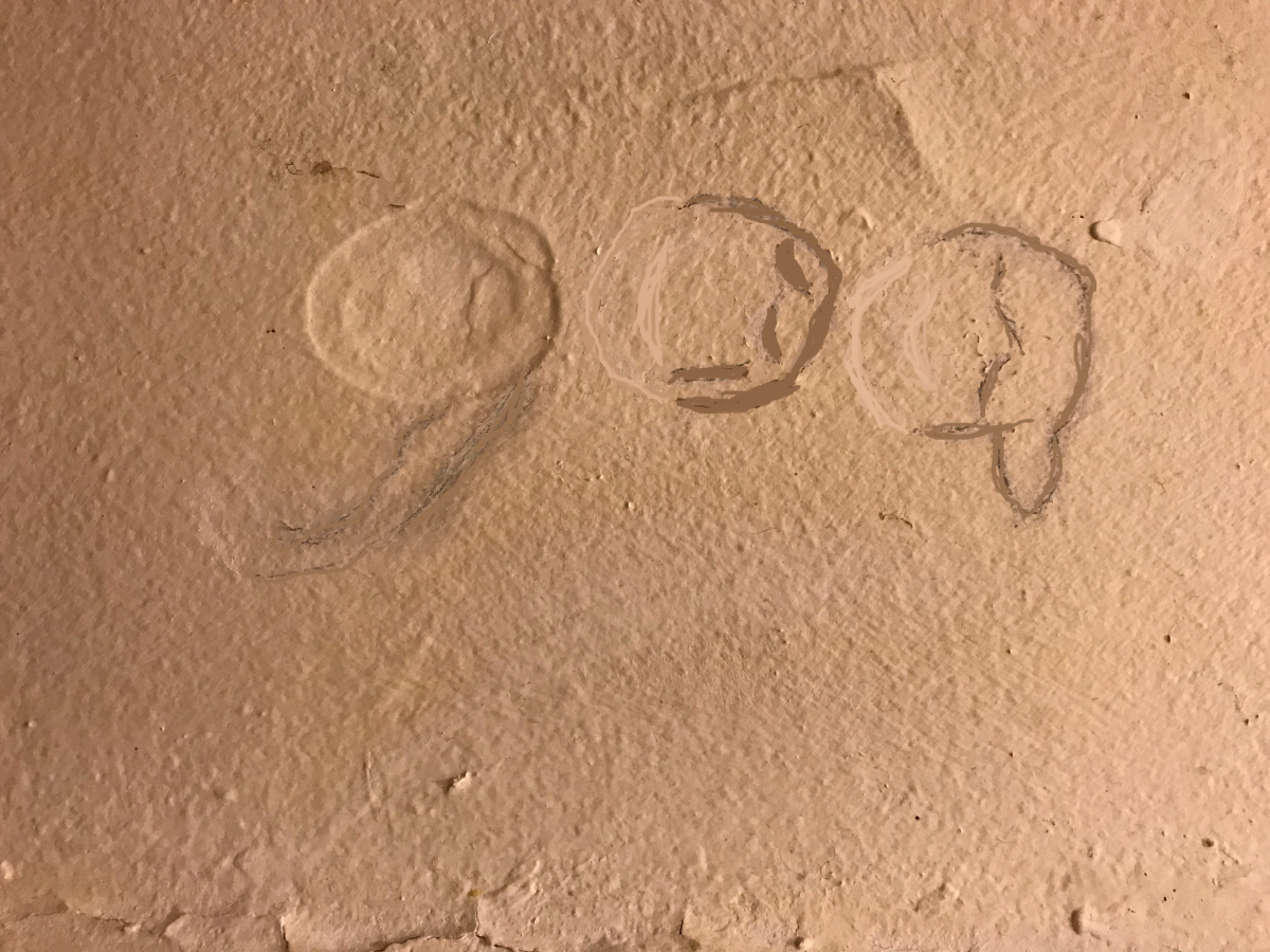

 Sketch 1
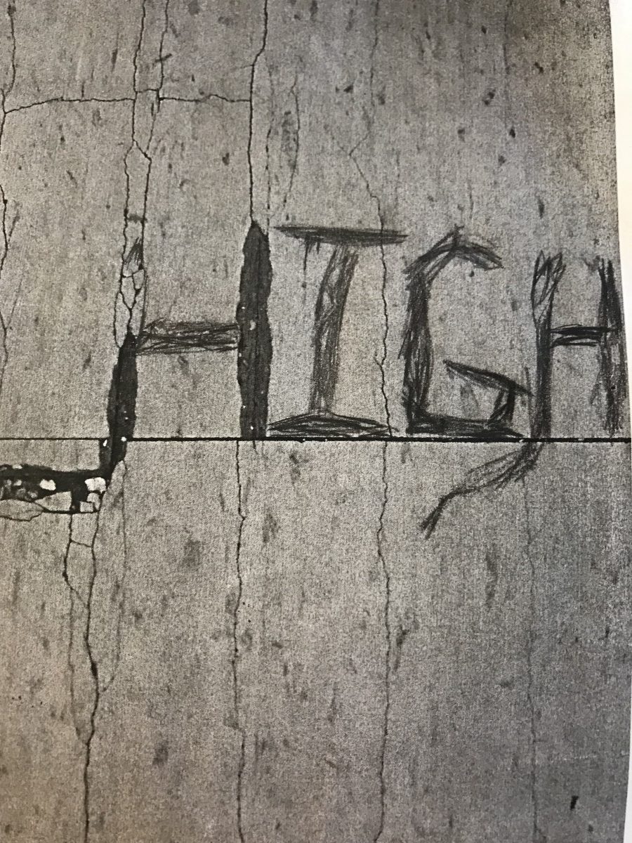 Sketch 2
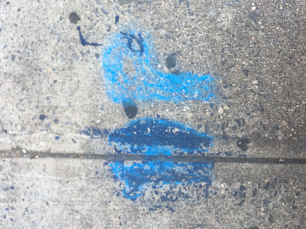
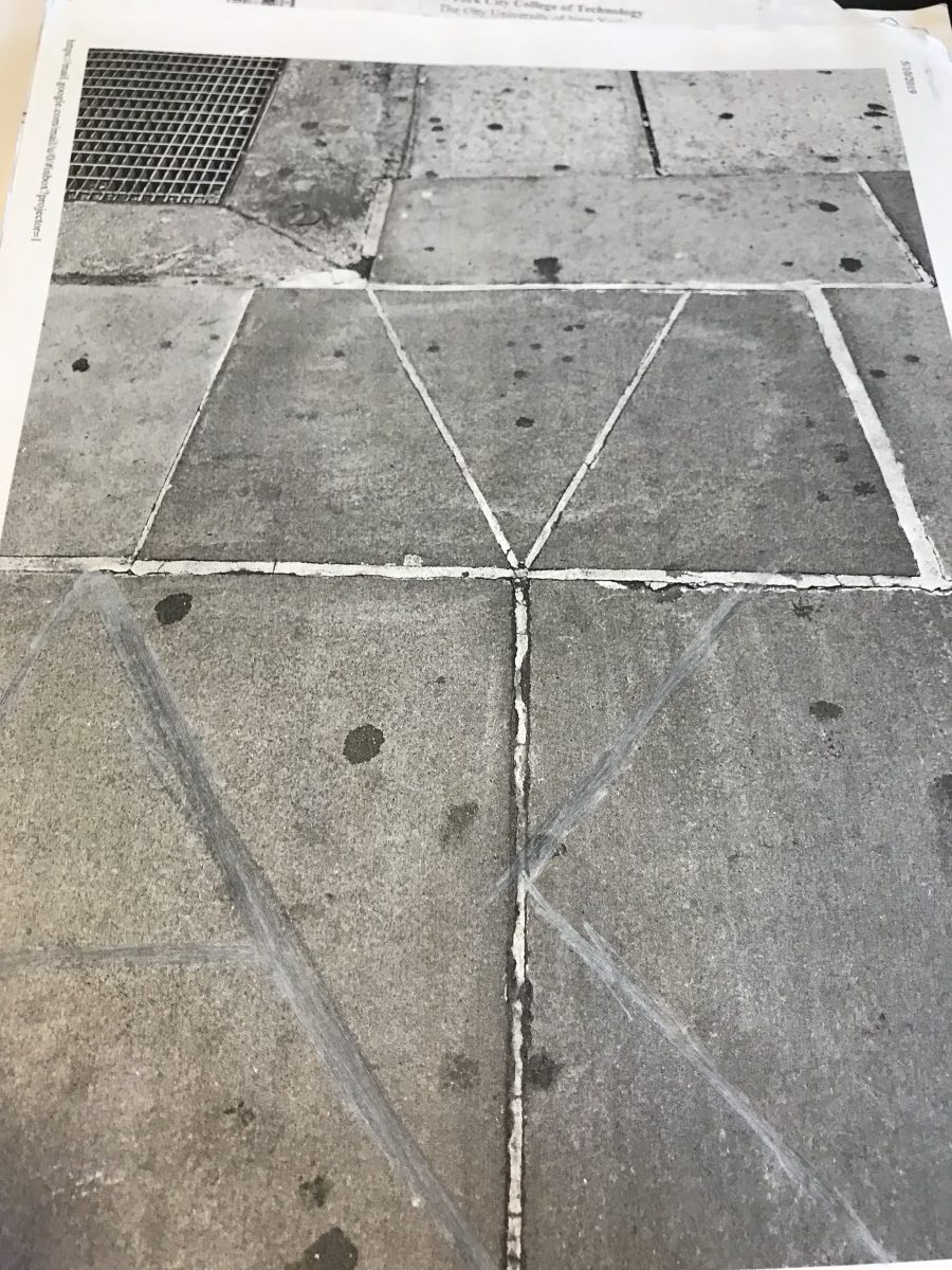
 Sketch 1
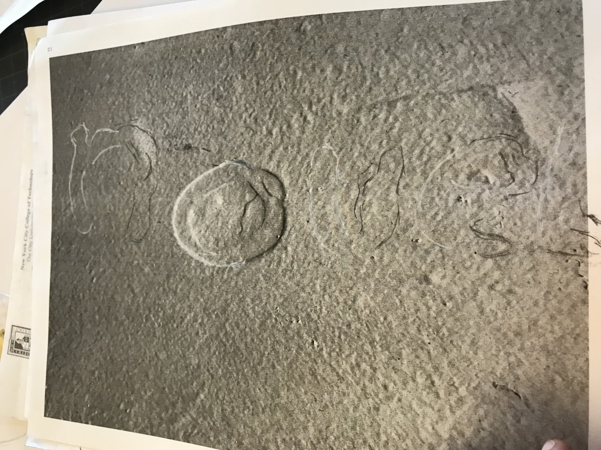 Sketch 2