Author: daniel (Page 1 of 2)
As an Architecture student in New York City, I can say that I am very lucky to see and experience the amazing architecture that the city offers. For me, the impact of studying outside the classroom was to be more interested in architecture and the history behind the buildings. I took other history classes before, where the lectures where giving inside the classroom and honestly, I didn’t put attention to the class lecture and I felt that it was a waste of time, an unnecessary class. But after experiencing architecture outside the classroom it changes the way I think about history class. I started to like the history of architecture and realize the importance of history maybe because I experience it throughout my own eyes and not just by illustrations or lectures inside the classroom.
I think studying outside the class is more interesting and productive. For example, going outside with professor Montgomery was a unique experience where I learned not just about history but I learned about new places and buildings, even though I lived in New York City I had never visited some of the buildings we visited on Montgomery class and if I went, I never put attention to it until I went with the professor. The way in which the professor explains the history and the design and characteristics of each building was one of the factors that made the class interesting. I believed by looking and experiencing architecture outside the classroom i learned more because I got to know more about the design and the site in which the building is placed, how it interacts with the city and what makes it successful among other buildings around it. I also took some ideas from the buildings we visited for my design class which is great, every time i visited a building it gave me new ideas for my architectural design’s projects.
I believed that students should study architecture out of the classroom because they can learn more about architecture by experience it throughout their own eyes and learn about the different kinds of architectural designs in New York City.
How does the MoMA garden relate to other spaces in the city? What makes it
special? How does the architecture relate to the space?
The Museum of Modern Art is a unique institution that provides modern art, historical culture, architectural designs and most importantly a beautiful garden which in my opinion makes the museum to stand up again other museums in New York City. At the museum, each floor at the museum is well categorized and organized which on one floor you can enjoy and observed amazing architectural models and drawings. I believed that the museum not only represents modern architecture but also shows the important connection between modern architecture and nature.
The garden is one of the spaces that interact and connects to the building combining both architecture and nature creating a unique special place to be. In my opinion, the garden is an important open space of the museum which attracts the attention of people as they walk through the museum because the garden is visible through the windows at the upper levels. There are sculptures, rectangular pools, fountains and several seating areas where you can relax and contemplate the beautiful views and features that this garden offers.
If I have to relate the garden of the Museum of Modern Art it would be the Lincoln Center ground design which in my opinion has similar designs and features. For example, both have rectangular pools, incorporated sculptures and enclosed spaces surrounded by buildings. I can tell that both spaces represent modern architecture with nature and modern features.
In conclusion, the garden at MoMA is one of the unique and special spaces in New York City with an amazing view of modern art and modern architecture incorporating nature that give a unique image to the building design which both building and garden coherence one each other.
Compare placemaking and urban planning at Hudson Yards to Battery Park City.
New York City is a beautiful place full of skyscrapers with different neighborhoods and communities that have improved through the years. The Hudson yards is the newest neighborhood in Manhattan with massive towers made of steel and glass that resemble the future of the city development. The design and structure of the Hudson Yards is way different than the planning design at Battery Park City.
The Hudson Yards provides a unique image of the city, the opportunity to contemplate amazing views of skyscrapers built of steel and glass which reflects the light of the sun giving an amazing view and experience to see. Also, it represents the future of a new generation full of largest buildings with different designs and shapes. The Hudson Yards not only have amazing towers but it also has on its favor the High Line which in my opinion played an important role in the Hudson Yards development. As you walk through the high line the Hudson Yards is visible and as you are getting closer to the Hudson Yards for a moment makes you feel that you are about to enter to another city.
On the other hand, Battery Park City has a more calculated and circulated space with more suitable residential buildings that have an amazing waterfront environment and green space with no massive towers. Compared to Battery Park City, the Hudson yards is more suitable for reaches people and high-income salaries.
In conclusion, the Hudson Yards marks a new begging and the future to the city development while Battery park city reflects the present that we are now. But in the end, both planning designs are built to take full potential of the land used to generate a well-urbanized city.
Compare the Lincoln Center urban renewal planning to Battery Park City’s
planning. How does the spatial experience of the Tower in the Park differ from
the urbanism of Battery Park City?
The Lincoln Center and Battery Park City are places that incorporate open spaces and green architecture to its designs but each one is different in terms of symmetry and use of space. both planning designs compared to the location in which each site is located.
For example, at Battery Park City the design, greens space, and waterfront environment give a unique experience to the site itself creating a beautiful place to be. There are mainly high-rise buildings and open spaces where you can enjoy the views of the city and the Hudson River. Compared to battery Park city, the Lincoln Center is more of an enclosed space surrounded by the city with a symmetrical design. Its performance as a public space its more of an open space surrounded by massive structures and wide spaces to perform different kind of activities.
I feel that the Lincoln Center is more for people that perform arts, the whole site incorporates modern designs and art that are not just incorporated on the buildings but in stairs, fountains, and sculpture, while Battery Park City provide an integration of open space and building that generates a unique area from the city that takes full advantages of the waterfront ambient which in my opinion attract more people.
In conclusion, both the Lincoln Center and Battery park city share some similarities like the open spaces and green architecture that are visible and distinguish from one another but its functionality and planning differ in terms of design which battery park city is a more circulated space and green space that creates a unique community to the city while the Lincoln Center has more art on it architectural design which bring more people that perform arts.
How do civic centers like Lincoln Center relate to the city around them? Describe
the nature of the public plaza in this civic center.
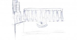
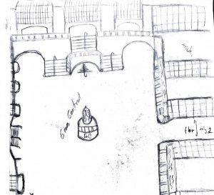
The Lincoln Center is a postmodern architecture similar to classic style with a unique composition and urban space where the structure design is the main design of the building supporting a window wall. The Lincoln Center buildings have a massive sculpture with a regular scale with a unique structure that seems to be columns supporting the building but is just one massive structure or composition. The façade of each building is facing the center of the public space which there is a fountain located at the center of the Lincoln Center. The center is an open space separated from the street with different elevation from the street. Also, this site seems to be separated from the city where the streets are marking a separation between the city and the Lincoln Center. When you are at this place is quite you can only hear the noise of the water and cars passing through the street and for a moment you just disconnect from the city noise to just this particular site. At this site, planning was useful in an approach of urban planning making this site to be successful in the way the space was used. Each proportion and space have a meaning and purpose because of the way it was designed.
For example, the nature of the public space gives people a different experience at the site where people can enjoy and relax at this place. The design and details that are on this site like a fountain, trees, curved stairs, pool, art figures and building facing each other or facing at the center of the public space define the circulation of the site.
Compare the evolution of the exterior skin of these modern office/institutional
buildings. Compare their massing strategies.
With the end of World War two a new era began and a new beginning of modern architecture, architects start to define a new architectural image of the city by creating and reimagining buildings through massing, materials and exterior skin of the building and relationship to the ground. The Lever House, Seagram Building, Citicorp, lipstick building, ford foundation, and United Nations building are examples of modern architecture. Nowadays, we can see this building as an inspiration for architecture that at the time start a new beginning for architecture.
The Seagram building and lever House are similar in terms of shape and design in which both are great examples of the evolution of material and skin treatment, for example, the Seagram building structure has this unique glass material covering the entire building with columns on the outside and inside of the building. The ground floor is where the structure of the building is visible, we can see the use of glass and steel. The entrance is the main attraction as you enter the building you can see this big column which seems to be placed at the middle of the building acting as a support of the building. The Lever House building structure is also visible from the first floor to the beginning of the second floor in which after that is covered with this massive curtain wall made of glass and steel. From the outside at the front facing the Seagram building, this building seems to be floating in space which is an amazing view to look. Also, this building brings nature at the roof of the second floor filled with trees giving a unique experience at the building which is similar to the Ford Foundation building which has nature on the inside of the building supported by these massive beams and massive columns.
The Citicorp Center building and the lipstick building are also modern buildings that not only show an evolution of material and skin treatment but shape and color. For example, the Citicorp building has this unique curve shape and massive columns supporting the entire building elevating the building at a high elevation to the floor. On the other hand, the lipstick building is a circular building with circular columns at the entrance of the building with three compositions above one another.
The united nations building is a glass tower and one of the modern buildings that is not above the ground floor but is connected to the ground floor which was built to represent peace. Modern architecture brings new ways of construction by integrating new ways of design and new materials that not only change the ways buildings were built but a new way of light pass through the buildings.


Recent Comments