Category Archives: Homework

Hw#1 Wijnanda Deroo

Jessica Echevarria                                                                                                          8/30/12

Prof. Michaels

GRA 2330


                                                                Wijnanda Deroo- Seeing Photos


1. The photograph I chose to examine “Tenement, Orchard Street, 1988” is of an abandoned old Tenement on Orchard Street in New York City. It’s probably being photographed to then be restored and fixed and then rented. The walls and lighting are chipped and outdated. The space is also small as most original tenements were in the 1950s.


2. The photograph was probably trying to depict life during the Industrial Revolution when tenements were first built. They were small, cramped, and poorly built. Often time’s large numbered families lived in them. The picture shows cracks in the wall, chipping paint probably containing lead. There is one small window shining light into the entire small room. This is perfect picture of living in New York City tenement.


3. The photographer focused on the main corner of the room to fit in a view of the walls, window, lighting, and shelf. The floor isn’t what grabs your focus until the light shining from the window glares down on it. The walls are in bad conditions and the photographer wanted you to focus on that and the old light bulb fixture.


4. Wijnanda grabbed perfect focus of the room; it was enough for you to see it entirely. I can see all the walls, the doorway, the walls all in one angle. It made me realize how small the room was.


5. The photo is in low contrast mostly containing middle gray tones throughout the room. Every wall and the window create curved lines, and it’s implied that he is looking into the room. You can therefore see the photographers view from an expanded perspective. The perspective deep space allows you to see the distance between objects in the room.


6. The photographer reveals that the date on this photos shows that New York were not living in modernized tenements. Many of the tenements remained in the same poor conditions as before, and even the spaces remained small. I can see that this was more valued for its location then its living conditions.


7. This photo induces sorrow reminds me how some people of the past and today pay to live in poor condition in the city. Most apartments are outdated, but they are paying for the locations. Knowing information on how tenements were in the 1950s this photo is proof that many people lived like this even into the 1980s. The window seems to be the focus of probably the most beautiful view the city. The only thing that could make this tenement worth living in is probably seeing what was going on outside of it on the streets.


8. The photographer likes to delve into different spaces and in particular New York she explores work spaces, hotels, and living spaces. You can see that she even wants to experience how the people working and living in these places feels. Most are famous landmarks, cultural, religious, and family related environments. By looking deeper then the environment you can get a feel to the emotion of the people looking or living there experiences it. Wijnanda photographs these spaces to get an emotional feel and then convey it through photography. She is driven by old popular restaurants, and the industrial movement in our city as seen in her photos.

1 Comment

Filed under HW1

Kristina Blum HW1

The photograph i Look at was of Bryant Park taking my Jeff Chien.The photo can be used in an ad to show one of the many beautiful parks of new york. This photo conveys the movement of New York by showing the people walking in different directions and also a place of relaxation has you see some people on the left of the photo siting and enjoy the day.He use selective focus to emphasis the beauty of the park by sharping the park and the people are not in focus.The photo has any impact of the movement of living in the city.

1 Comment

Filed under HW1, Uncategorized

Jonathan’s Homework 1

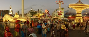
The photographer I chose was Jeff Chien-Hsing Liao. I chose the photo Lynn’s Trapeze from one of his gallery which the theme was amusement parks. The photo can be an advertising ad about amusement parks. I believe Liao is trying to point out how beautiful Coney Island is, by the rides and the way people are enjoying themselves. I also see low key and contrast. In my opinion, Liao chose the whole photo as one focus point. I believe the photo does have some hinder but it doesn’t take much from the photo. In this photo my eyes does flow around since theres lights and different things that are happening. The physical impact that this photograph have are happiness and peacefulness. Many of Liao’s photos are amusement parks and stadiums. I believe he wants to explain how enjoyable and peaceful these places are and I strongly agree with him.

1 Comment

Filed under HW1

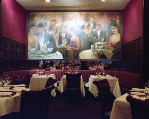
Delmonico’s, 56 Beaver Street, 2009

WIJANDA DEROO

The photographer that I chose is Robert Mann’s image #17.  Mr. Mann depicts this image of Delmonico as warm and inviting which was created by the dark tones.  This advertisement also represents the glamor of New York City.  Mr. Mann’s main goal is to create focus.  He wanted to direct the viewer’s attention to this bold portrait-which creates a great conversational piece.  This image was taken solely for advertising purposes.

The photographer emphasized on scale to convey selective focus.

Technical matters did not hinder the image in this setting.  Mr. Mann intentionally did not place anyone into the frame, so he can capture the beauty of this scene and not to subtract from the image’s focal point.

Graphic elements are important in this image.  In this one point perspective advertisement, the gigantism of the portrait is my view point, and its where my  focus returns to, which in turn, creates positive space.

The illuminating lights on the photograph place emphasis on the portrait’s focal point.  In addition, the lighting creates a sense of texture on the walls.

The hues of this photograph creates contrast with a low key tone.

This advertisement of Delmonico, relates to the other images by tone and contrast.


1 Comment

Filed under HW1

Joanna Motyl HOMEWORK 1


Empire State Building, Study 2, New York City, USA, 2006

1. This is a photograph of Empire State Building and other buildings which appear smaller in the photograph and Empire State Building is tall and big.

2. The photographer intentions were to take a beautiful picture, and shows the biggest building in New York at night with all the lights even if the picture is black and white

3. The photograph is sharp overall.

4. No, the photographer kept his distance very good with the picture, it shows a good part of the building and the rest of the smaller buildings behind the biggest one.

5. Yes, graphic elements are important. In this photograph tone such as full scale is used. Straight line is used too, and for perspective is deep space.

6. This photograph also shows that the night is calm and the sky is clear. How beautiful the buildings are at night, and how most floors have their lights on.

7. The emotions in this photograph are amusement and peaceful.

8. This photograph can relate to other photographs done by Michael Kenna, but some of his photographs are a lot different.

1 Comment

Filed under HW1, Uncategorized

Melanie Gonzalez Homework #1

The photographer I chose was Eugene Richards. I chose a photo from his series, “Cocaine True, Cocaine Blue” which is a series of photos about cocaine addicts.

1. The title, “Cocaine True, Cocaine Blue” shows its a controversial topic. I would say this type of photography falls into a documentary category. Its very intimate and detailed, completely uncensored. Very low key and low contrast.

2. The purpose of this photography is to display the lives of real cocaine addicts. Its informative of the lives these people live.

3. In the specific photograph I chose there is selective focus on one of the cocaine addicts face. The focus is completely on her face. You can see every small detail of her face mean while the background behind her is extremely blurry. There is emphasized texture because you can literally see the characters pores, that is how focused the photo is, you can see the point of the needle clearly.

4. This photograph actually has no technical matters, the photograph is really sharp even though there is selective focus on the main characters face. The photo is taken at an eye-level so its really clear.

5. In terms of perspective I would say there is shallow space just because its such a close shot. I would also say there is a compressed perspective about the photo because of the intimacy of it.

6. This photograph is completely straight forward. The needle is evident, the desperation for the needle is evident in the characters eyes. The deterioration in the characters teeth is evident of drug use. Everything is clear about this photo.

7.  This photograph has a lot of emotional impact that’s exactly why I chose it I love this kind of photography. Its raw material, makes your uncomfortable because of how intimate it is. Cocaine is a scary drug and the way it affects people as well, as evident in the photograph. This photo has both a dramatic and kind of sad impact.

8. All the photos in the, “Cocaine True, Cocaine Blue” series are all shot with the same intent, to show the emotional impact of cocaine to these real people in that period of time. All the photographs are black and white and I like that they all depict different aspects of the drug use.


Leave a Comment

Filed under HW1

hw1

Kenneth Melendez hw1

Brooklyn bridge study 1


The photo that shows underneath the Brooklyn bridge taken by Michael Kenna, is the one I chose. It is in black and white, with a grey gradient. It’s the first image in the gallery on her website. This photo is a Landscape, showing off underneath the bridge and the city from a distance. The photographer’s intentions was to capture the beauty of NYC in a full scale tone. The photo shows emphasis on the overhead bridge and city in the background. The technical matters help the image. Overall the photo is sharp and clear. I believe the graphic elements are important. When I look at the photo it has a nice overhead view with the city in the background. The Image is in low contrast and when you stare at the image you can see the city. The photo gives off a gloomy vibe because of the low keys. All of the photos appear the same in tone.

1 Comment

Filed under HW1, Uncategorized

hw1

Nivaaj kanan

1. what type of photograph is it?

this is a digital photo from India.

2. what can you tell about the photographers intention?

to capture the hard life this people have to life threw.

3.what emphasis has the photographer created and how has that been done?

the photographer made sure to focus on the people on the bus then anything else.

4. Do technical matters help or hinder the image?

no it does not

5. are graphic elements important such as tone ,line or perspective ?

the most important element is light that hows how the people really feel.

6. what else does the photograph reveal besides what is immediately evident ?

how this people feel trapped and need help to get out

7. what emotional or physical impact does the photograph have?

that he feels there pain about being trapped.

8. How does this photograph relate to others in the same series by the same photographer?

he shows relation by capturing peoples emotions and explaining there pain.

1 Comment

Filed under HW1

Brittany’s HW

The photograph I looked at was taken by Michael Kenna. It is a photograph of Gramercy Park on a winter morning in New York City. The photo has an extensive depth of field, but also has a soft focus. It is a serene and quiet photo showing no one, but the park covered in a blanket of soft, white, snow. I believe the photographer wants to portray the beauty and serenity of the park. This photo relates to the others in the same series, because all of the photos are taken in low contrast. Also all of Kenna’s photos show important and popular places in New York City.

1 Comment

Filed under Homework

Jia Qi’s Homework

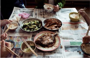
The photograph I choose was taken by Thomas Holton from “The Lams of Ludlow Street-5 Years later”. The dishes, chopsticks and the newspaper on the table supported my point of view that it is a Chinese dinner. The photographer uses overhead point view as the technical matter to help the image. It reduces other unnecessary element in order to focus on the theme of the photograph. The dishes on the center catch my eyes first and become the focus than the rice and the newspaper. The image shows the traditional Chinese table manner, which sit together for the dinner time. Also it gives me a feeling of warm and happiness.

1 Comment

Filed under HW1