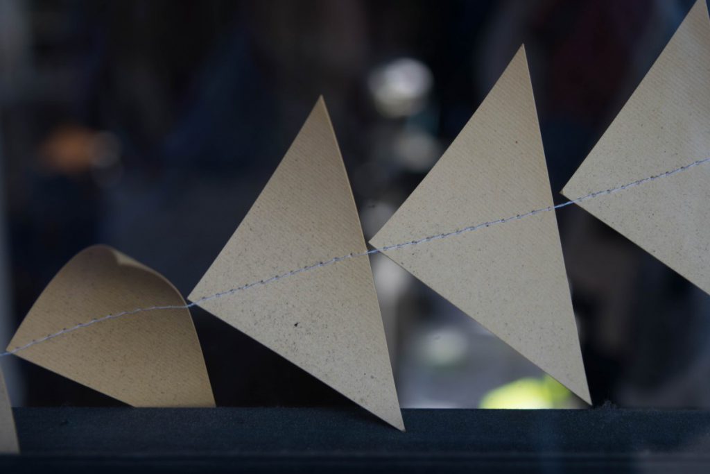
Honestly, it was pretty difficult choosing my best photo from our class trip to the Brooklyn Bridge Park. Out of the 160 photos I took that day, this photo stood out to me the most. This photo was taken while we were walking to the Brooklyn Bridge Park. There was a children’s store (I believe it was) on the corner of the street that had these paper window decorations. I liked that the point of the triangles were going in a slanted direction to the left, the sharp pattern, the line running through the middle (close to the middle) of the triangles, the dark store background that makes the decorations pop, the close-up framing at which this photo was shot, and the details on each of the triangles. Also, I liked that the triangle all the way to the right was cut out in the shot because even if it’s not fully shown, it still demonstrates a pattern. Furthermore, there is one more part of this picture that I failed to mention. The triangle at the bottom left of the photo is curved and has lost its original shape. This was particularly interesting because it displays a disruption of pattern. It stands on its own, has a darker tone of color, and has its own depth to it.
-
Recent Posts
Recent Comments
Categories
- Homework
- HW-Exhibit Review
- HW1-photo description
- Learning Logs
- LL1-What makes a great photograph?
- LL2-Composition and Camera Angle
- LL3-Composition-Pattern, Angle and the Rule of Thirds
- LL4-Lighting Direction
- LL5-Portrait Lighting
- LL6-Portrait Lighting for mood
- LL7-Shutter Speed and Capturing Motion
- LL8-Painting with Light
- Uncategorized


